Appearance
Canonical layouts
Contents
- Libraries and APIs
- Demos
- General implementation
- List View demo
- Feed demo
- Single View Hero demo
- Supporting Panel demo
The canonical layout demos found in the MDC catalog are examples of adaptive layouts in which components and views change depending on device configuration, such as screen size, orientation, and/or the presence of a physical fold.
This doc discusses the general logic that can be applied to implementations like the one in the general implementation section, while each demo section discusses its specific implementation.
Tip: Follow along with the source code to better understand the concepts in this documentation.
Libraries and APIs
To use the Material library, you will need to add a dependency to the Material Components for Android library. For more information, see the Getting started page.
The AndroidX ConstraintLayout and WindowManager libraries are used to achieve layout adaptivity. For more information about them, see the following:
For more information about the navigation components used in these demos, check out their documentation:
Demos
The catalog's Adaptive demo has implementations of the following canonical layouts:
- List View demo
- Feed demo
- Single View Hero demo
- Supporting Panel demo
General implementation
Each demo has a main Activity class that displays the appropriate navigation component based on screen size, displays a main Fragment, and communicates with that Fragment class.
We use ConstraintLayout and ConstraintSet to allow the layouts to adapt to multiple screen and device configurations, and the WindowManager library to capture specific foldable states.
Navigation components
The demos all display different navigation components according to the screen size: small screens have a bottom navigation, medium screens have a navigation rail, and large screens have a standard navigation drawer. Medium screens also display a modal navigation drawer if the navigation header's button is clicked.
On the Activity XML of each demo, we add all of the navigation components mentioned:
xml
<androidx.drawerlayout.widget.DrawerLayout xmlns:android="http://schemas.android.com/apk/res/android"
  xmlns:app="http://schemas.android.com/apk/res-auto"
  android:id="@+id/drawer_layout"
  android:layout_width="match_parent"
  android:layout_height="match_parent">
  <androidx.constraintlayout.widget.ConstraintLayout
      android:id="@+id/activity_container"
      ... >

    <!-- Container of the nav rail or nav drawer. -->
    <FrameLayout
      android:id="@+id/nav_container"
      ...>
      <!-- Navigation drawer to be used for large screens. -->
      <com.google.android.material.navigation.NavigationView
        android:id="@+id/nav_drawer"
        android:visibility="gone"
        ... />

      <!-- Navigation rail to be used for medium screens. -->
      <com.google.android.material.navigationrail.NavigationRailView
        android:id="@+id/nav_rail"
        android:visibility="gone"
        ... />
    </FrameLayout>

    <!-- FAB and bottom nav to be used for small screens. -->
    <com.google.android.material.floatingactionbutton.FloatingActionButton
      android:id="@+id/fab"
      ... />

    <!-- Bottom nav to be used for small screens. -->
    <com.google.android.material.bottomnavigation.BottomNavigationView
      android:id="@+id/bottom_nav"
      ... />

    <!-- The demo's fragment container. -->
    <FrameLayout
      android:id="@+id/fragment_container"
      android:layout_width="0dp"
      android:layout_height="0dp"
      android:layout_weight="1"
      app:layout_constraintStart_toEndOf="@id/nav_container"
      app:layout_constraintEnd_toEndOf="parent"
      app:layout_constraintTop_toTopOf="parent"
      app:layout_constraintBottom_toTopOf="@id/bottom_nav"/>
  </androidx.constraintlayout.widget.ConstraintLayout>

  <!-- Modal nav drawer to be shown on medium screens on menu button click. -->
  <com.google.android.material.navigation.NavigationView
    android:id="@+id/modal_nav_drawer"
    ... />
</androidx.drawerlayout.widget.DrawerLayout>
We arrange the views so it defaults to a mobile layout (note how most of the components have android:visibility="gone"). We also set each app:layout_constraint* so that the views will look correct no matter which navigation component is currently visible.
In code, in the Activity class, we adjust each component visibility by checking the current screen width. We also set a click listener on the navigation rail's header button so that it triggers a modal navigation drawer to be shown. Take a look at AdaptiveUtils.java to see in detail how that is done.
Displaying the main Fragment
On the XML code snippet above, we have a FrameLayout that we use to load our demo's Fragment.
In the Activity class:
java
@Override
protected void onCreate(@Nullable Bundle bundle) {
  ...

  demoFragment = new DemoFragment();

  getSupportFragmentManager()
      .beginTransaction()
      .replace(R.id.fragment_container, demoFragment)
      .commit();
}
Monitoring foldable device states
The Activity monitors the demo's foldable device state with the WindowManager library, similar to this AndroidX FoldableExperiments example.
The Activity has a StateContainer inner class that implements Consumer<WindowLayoutInfo>, where it checks for specific foldable configurations:
java
private class StateContainer implements Consumer<WindowLayoutInfo> {

  public StateContainer() {}

  @Override
  public void accept(WindowLayoutInfo windowLayoutInfo) {

    List<DisplayFeature> displayFeatures = windowLayoutInfo
      .getDisplayFeatures();

    for (DisplayFeature displayFeature : displayFeatures) {
      if (displayFeature instanceof FoldingFeature) {
        FoldingFeature foldingFeature = (FoldingFeature) displayFeature;

        // Check for specific FoldingFeatures here and communicate with the
        // demo fragment as needed. Here's also where we can find the fold
        // position.
          ...
      }
    }
      ...
  }
}
You can find the position of the fold and check whether it's a hinge by using foldingFeature.getBounds(). That is useful for changing the position of a guideline in order to rearrange views. In the demos, we make use of the ReactiveGuide to do so.
Using ConstraintSet
An easy way to rearrange views in a ConstraintLayout is by creating ConstraintSets. You can create a constraint set for a specific device configuration in the Fragment class and then update the layout as needed.
For example, the Supporting Panel demo's Fragment has the updatePortraitLayout, updateLandscapeLayout, and updateTableTopLayout methods that the Activity calls when it detects that the device is in portrait, landscape, or table top mode, respectively.
List View demo
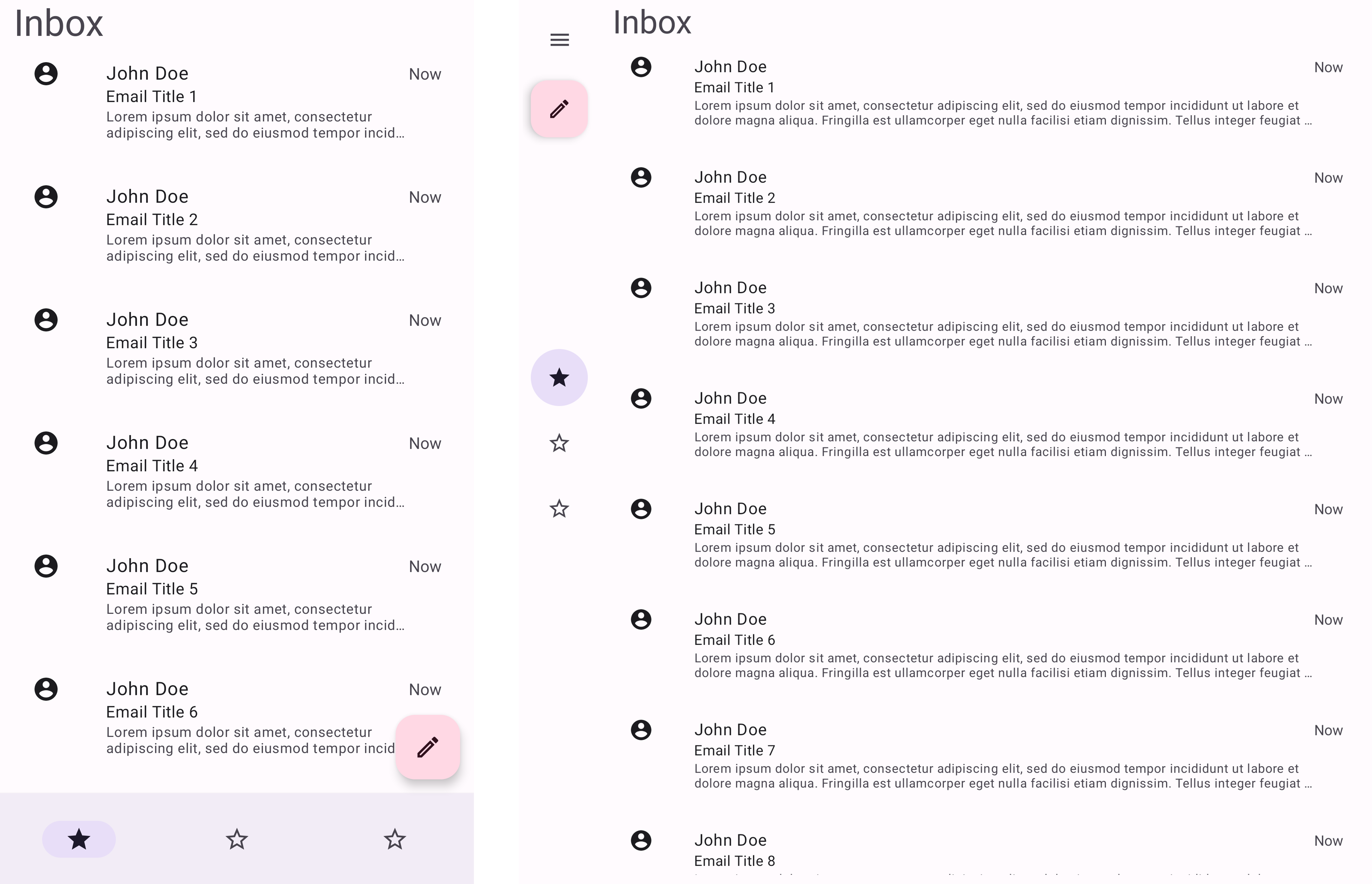
The following shows screenshots of the List View demo on different devices and screen sizes.
Portrait:
Landscape:
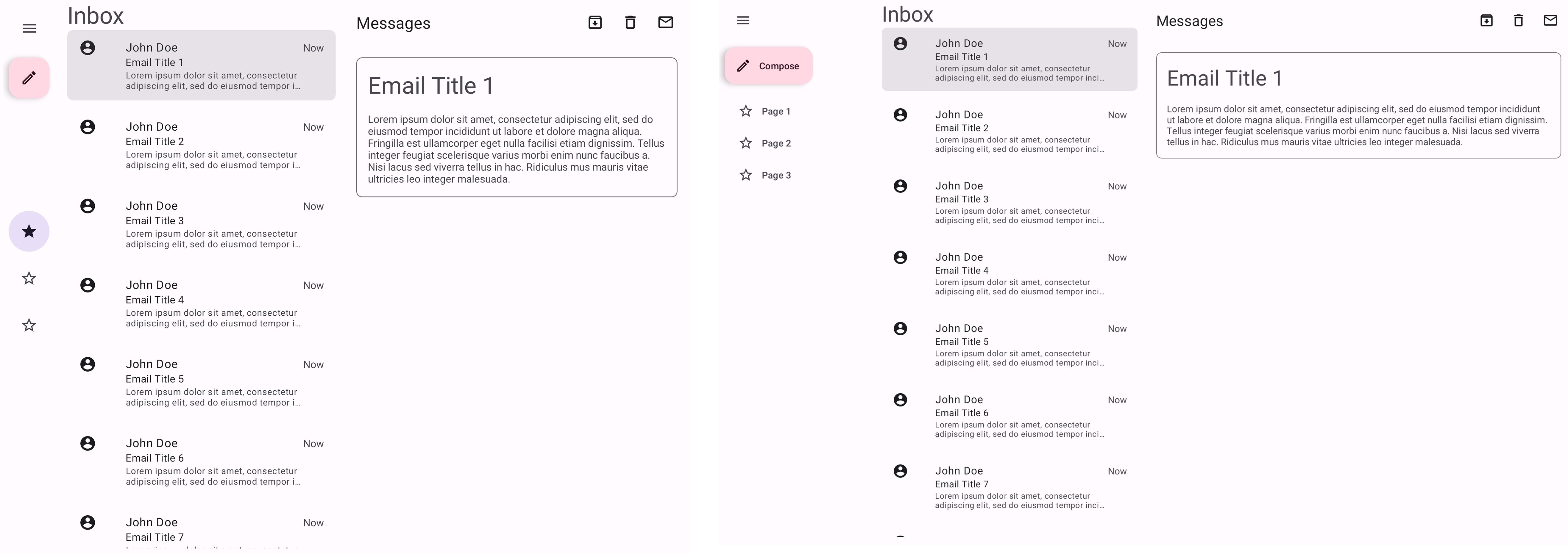
This demo is an example of an email inbox layout, where there's a list of items that can be clicked to show a detailed view.
In portrait it shows only the list of emails, but in landscape it also shows a selected email view by its side.
Implementation
Source code:
This demo differs a bit from the others because it uses two fragments.
AdaptiveListViewDemoActivity.java
The AdaptiveListViewDemoActivity follows the logic described in the general implementation section above.
The Activity either displays an AdaptiveListViewDemoFragment that fills the screen (portrait layout) or both an AdaptiveListViewDemoFragment and an AdaptiveListViewDetailDemoFragment side by side (landscape layout).
In its StateContainer class, it updates the layout according to the device orientation, and if it's in landscape, it also checks for a vertical fold in order to update the position of the vertical ReactiveGuide. If there's no vertical fold then the guideline is positioned at the middle of the screen.
AdaptiveListViewDemoFragment.java
The AdaptiveListViewDemoFragment class represents the email list. It inflates cat_adaptive_list_view_fragment.xml and sets up the emailList recycler view. It also contains the mock Email data and class.
In its emailAdapterListener, it creates an instance of AdaptiveListViewDetailDemoFragment and displays it either in its own container if the device is in portrait, or in the id/list_view_detail_fragment_container from the Activity XML if it's in landscape.
AdaptiveListViewDetailDemoFragment.java
The AdaptiveListViewDetailDemoFragment class represents an opened email view. It inflates cat_adaptive_list_view_detail_fragment.xml and updates the email title according to the emailId.
Note: You can also implement this demo to achieve something similar with SlidingPaneLayout.
Feed demo
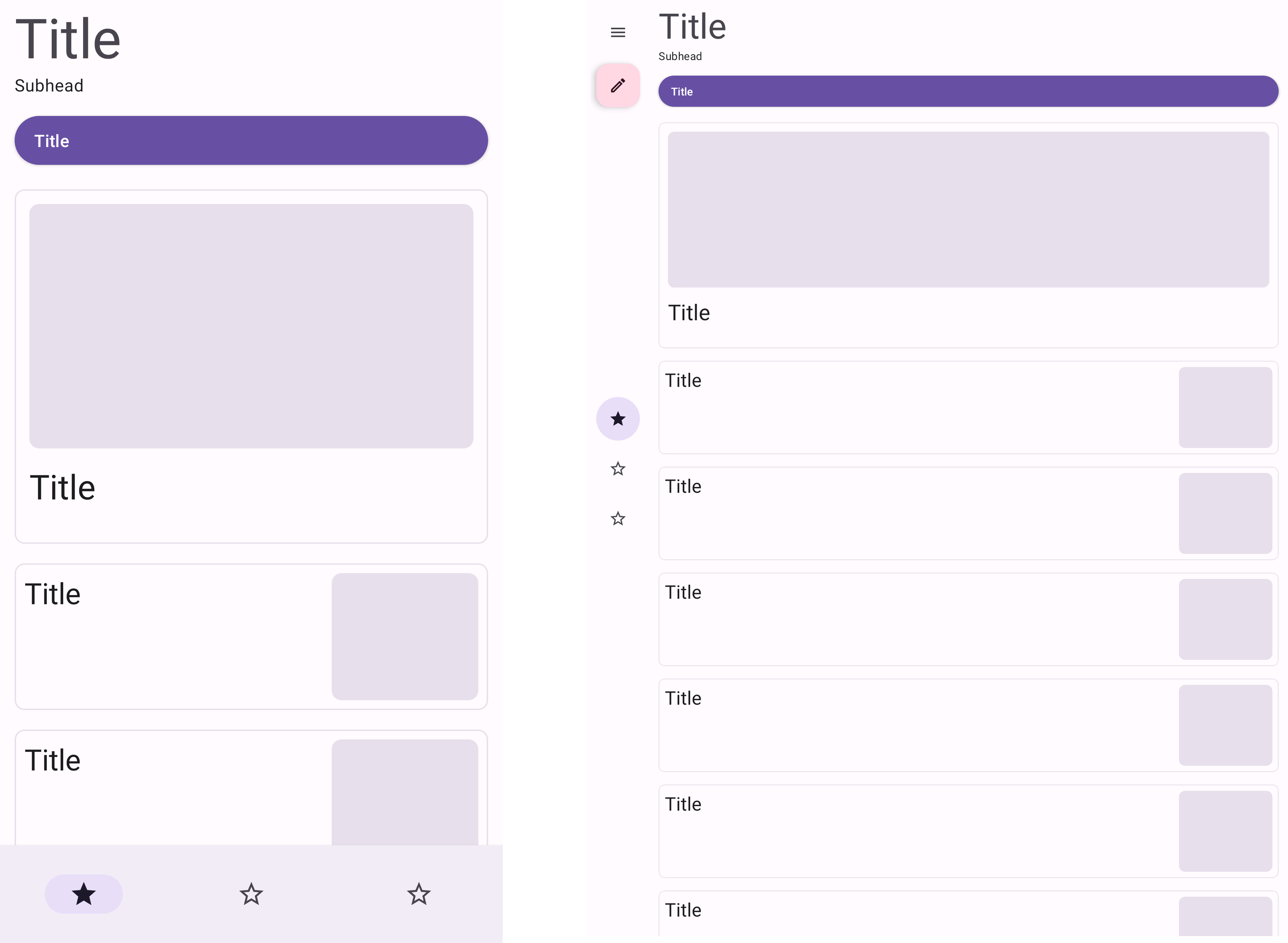
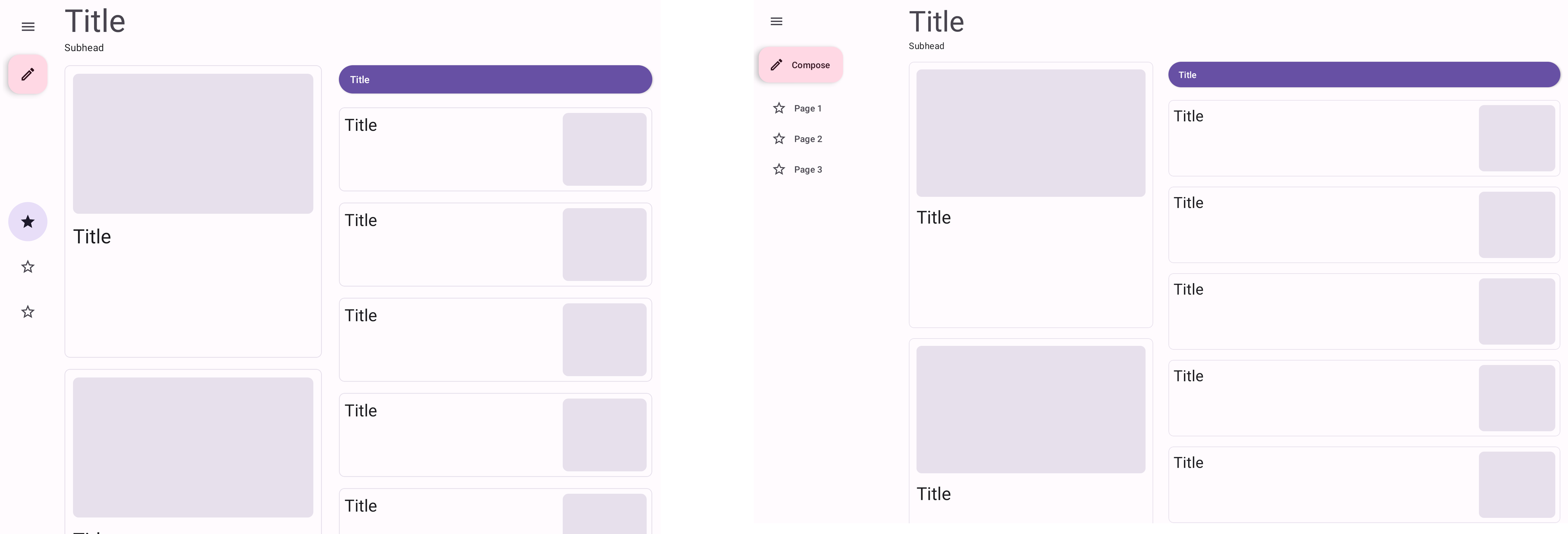
The following shows screenshots of the Feed demo on different devices and screen sizes.
Portrait:
Landscape:
Open foldable in portrait:
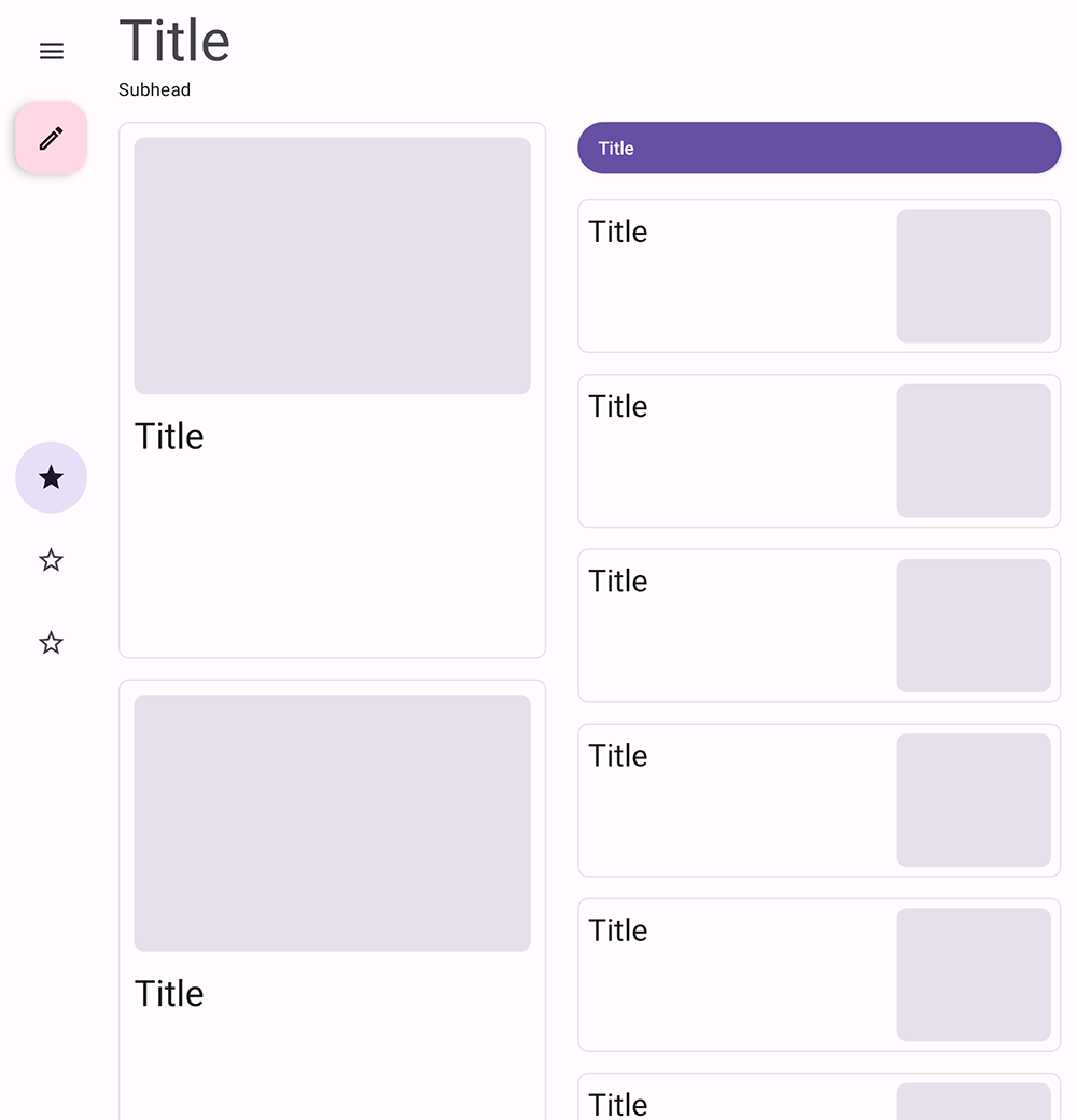
This demo is an example of a news feed layout.
Implementation
Source code:
AdaptiveFeedDemoFragment.java
The AdaptiveFeedDemoFragment class inflates cat_adaptive_feed_fragment.xml and sets up two RecyclerViews, a smallContentList that holds small cards and a largeContentList that holds large ones.
The Fragment also sets up two constraint sets, a closedLayout and an openLayout.
For non-foldable devices, they are displayed as follows:
| Orientation | Layout |
|---|---|
| Portrait | closedLayout |
| Landscape | openLayout |
For foldables:
| Orientation | State | Layout |
|---|---|---|
| Portrait | closed | closedLayout |
| Portrait | open | openLayout |
| Landscape | any | openLayout |
The default layout is the closedLayout, which displays cat_adaptive_feed_fragment.xml. There, the largeContentList has android:visibility="gone", as it only displays one large card (with id highlight_content_card).
The openLayout hides the highlight_content_card, displays the largeContentList, and rearranges the position of the different components. It does so by using the ReactiveGuide in the XML as reference.
For example, the MaterialButton has app:layout_constraintStart_toStartOf="parent" by default, so we change its position by calling
java
constraintSet.connect(R.id.top_button, ConstraintSet.START, R.id.fold, ConstraintSet.END)making it appear on the right side of the guideline.
We change the position of the ReactiveGuide by either setting it at the fold position if it's a vertical fold, or by setting it to the middle of the screen if it's not or if the device isn't foldable.
AdaptiveFeedDemoActivity.java
The AdaptiveFeedDemoActivity follows the logic described in the general implementation section above.
In its StateContainer class, it calls the AdaptiveFeedDemoFragment methods responsible for updating the layout and the ReactiveGuide position.
Single View Hero demo
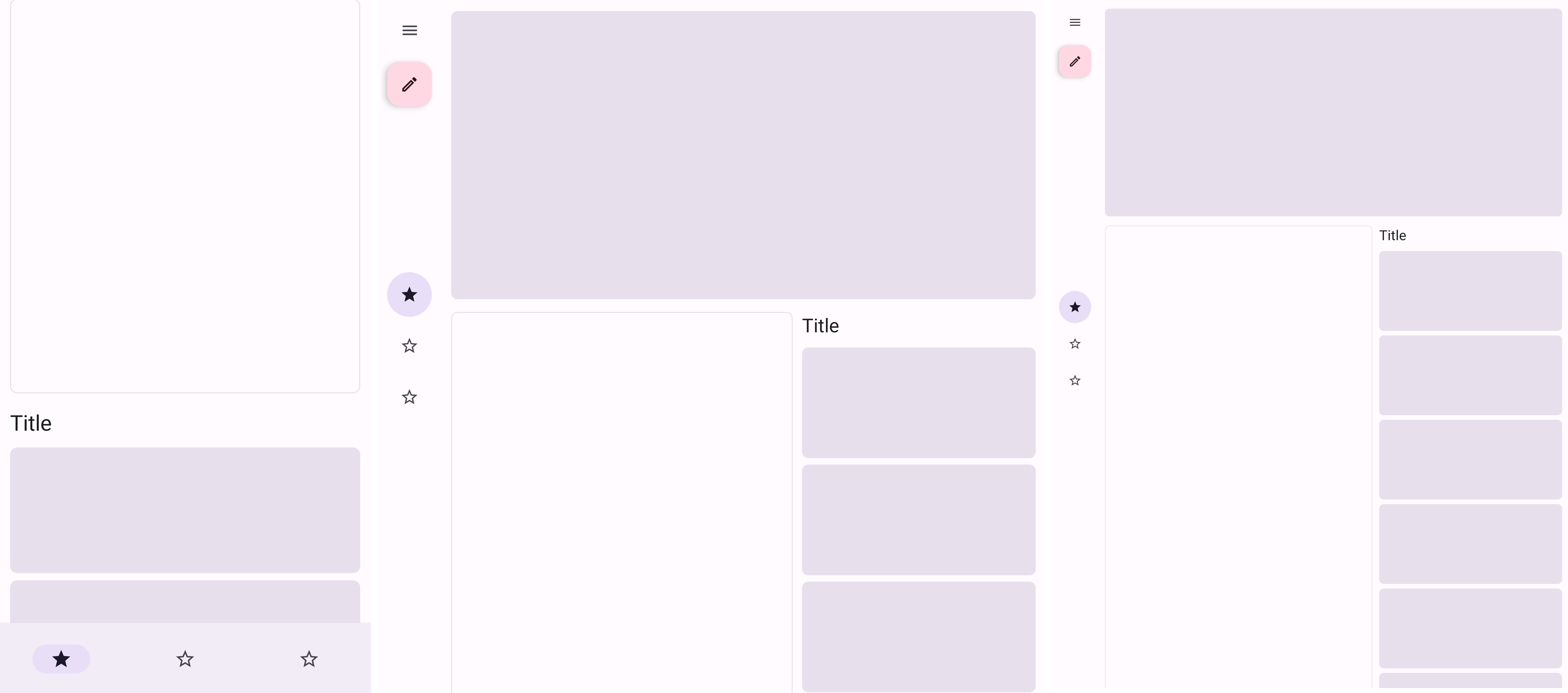
The following shows screenshots of the Single View Hero demo on different devices and screen sizes.
Portrait:
Landscape:
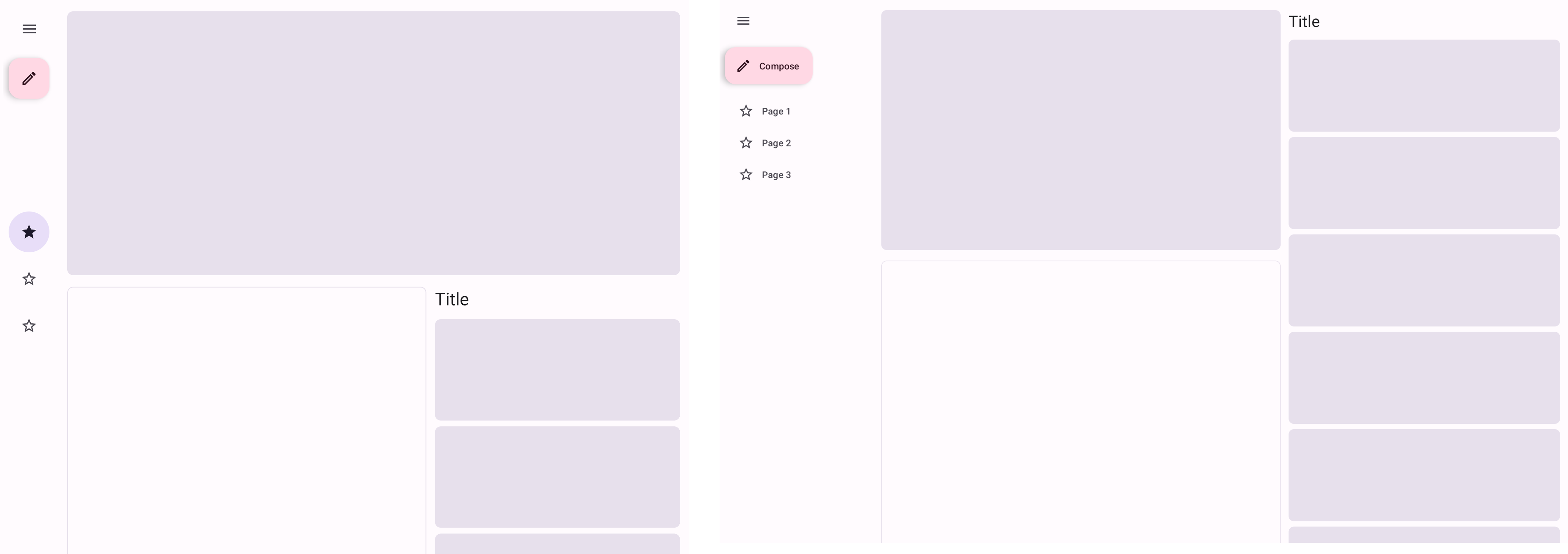
This demo shows a large top content view on top of the layout, also called a hero view, as well as a main content view and a list view of supporting items. The hero and other containers take on different layout configurations depending on the screen size.
Implementation
Source code:
AdaptiveHeroDemoFragment.java
The AdaptiveHeroDemoFragment class inflates cat_adaptive_hero_fragment.xml and sets up a recycler view sideContentList, and three different constrain sets, smallLayout, mediumLayout, and largeLayout.
The change of layouts is based exclusively on screen size:
| Size | Layout |
|---|---|
| small | smallLayout |
| medium | mediumLayout |
| large | largeLayout |
The default layout is the smallLayout, which displays cat_adaptive_hero_fragment.xml.
The mediumLayout changes the sideContentList position from below the main content card to its right. It also displays a large top content card at the top of both views.
The largeLayout changes the sideContentList position again, but it displays at the right side of the top content card view instead of below it.
AdaptiveHeroDemoActivity.java
The AdaptiveHeroDemoActivity follows the logic described in the general implementation section above, but since its changes are based only on screen size, it does not worry about foldable states.
Supporting Panel demo
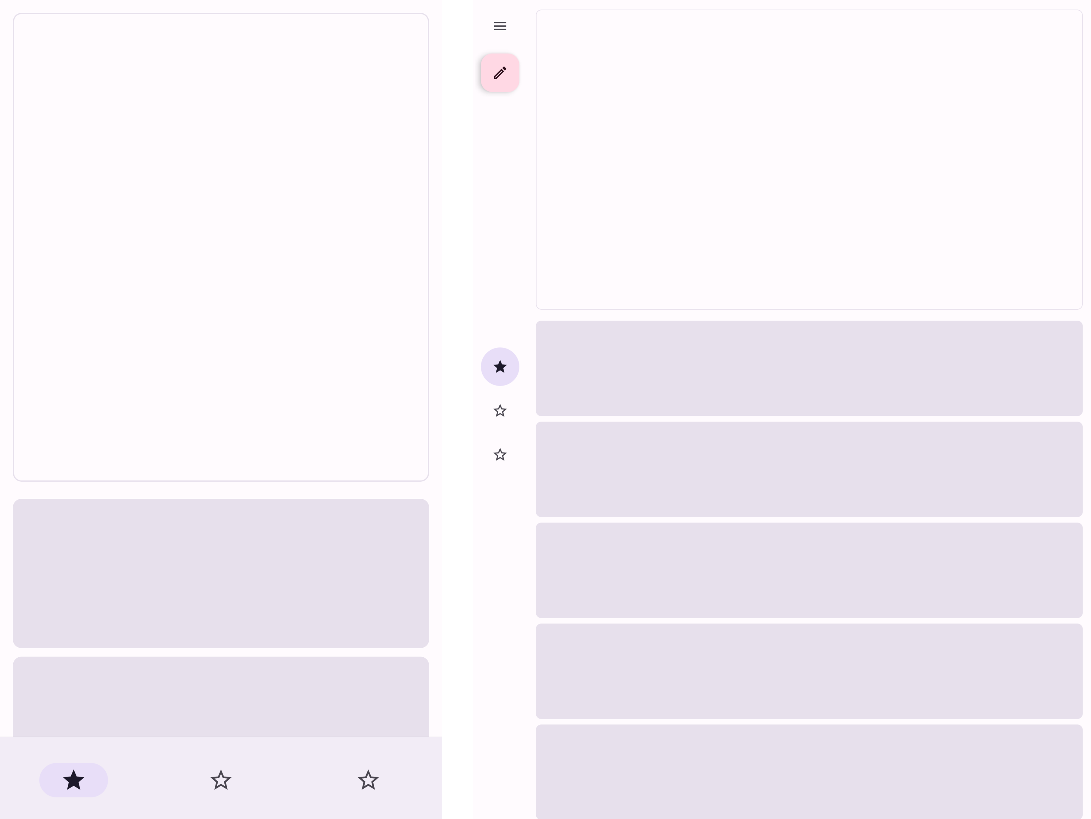
The following shows screenshots of the Supporting Panel demo on different devices and screen sizes.
Portrait:
Landscape:
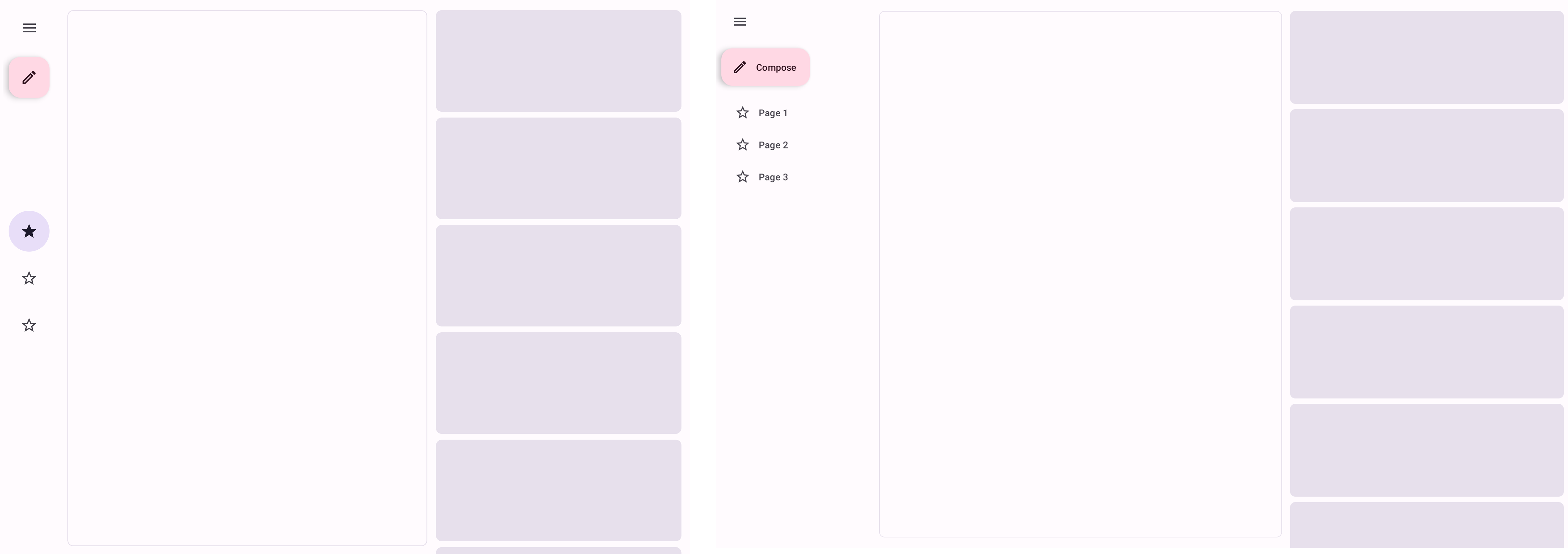
This demo is an example of a layout that has an always visible main content view, followed by a supporting panel with a list of items that changes position depending on certain screen configurations.
Implementation
Source code:
AdaptiveSupportingPanelDemoFragment.java
The AdaptiveSupportingPanelDemoFragment class inflates cat_adaptive_supporting_panel_fragment.xml and sets up a recycler view supportingPanelList, and three constraint sets, portraitLayout, landscapeLayout, and tableTopLayout.
The change of layouts is based on device orientation:
| Orientation | Layout |
|---|---|
| portrait | portraitLayout |
| landscape | landscapeLayout |
For foldables, it also depends on state and fold orientation:
| Orientation | FoldingFeature.State | FoldingFeature.Orientation | Layout |
|---|---|---|---|
| any | HALF.OPENED | HORIZONTAL | tableTopLayout |
| any | HALF.OPENED | VERTICAL | portraitLayout |
| portrait | FLAT or none | any | portraitLayout |
| landscape | FLAT or none | any | landscapeLayout |
The default layout is the portraitLayout, looking like the cat_adaptive_supporting_panel_fragment.xml as it is.
The landscapeLayout changes the supportingPanelList position from below the main content to its right.
The tableTopLayout is similar to the portraitLayout, but it makes sure that the main content is limited to being displayed above the fold, while the supportingPanelList is displayed below it.
We change the position of the ReactiveGuide by setting it at the fold when the device is in table top mode.
AdaptiveSupportingPanelDemoActivity.java
The AdaptiveSupportingPanelDemoActivity follows the logic described in the general implementation section above.
In its StateContainer class, it calls the AdaptiveSupportingPanelDemoFragment methods responsible for updating the layout.