Appearance
Floating action buttons
A floating action button (FAB) represents the primary action of a screen.
Contents
Design and API Documentation
Using FABs
A FAB performs the primary, or most common, action on a screen. It appears in front of all screen content, typically as a boxy shape with an icon in its center.
Before you can use Material FABs, you need to add a dependency to the Material Components for Android library. For more information, go to the Getting started page.
Note: If the FloatingActionButton is a child of a CoordinatorLayout, you get certain behaviors for free. It will automatically shift so that any displayed Snackbars do not cover it, and will automatically hide when covered by an AppBarLayout or BottomSheetBehavior.
Making FABs accessible
You should set a content description on a FAB via the android:contentDescription attribute or setContentDescription method so that screen readers like TalkBack are able to announce their purpose or action. Text rendered in Extended FABs is automatically provided to accessibility services, so additional content labels are usually unnecessary.
Visibility
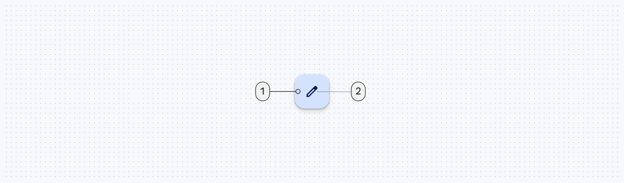
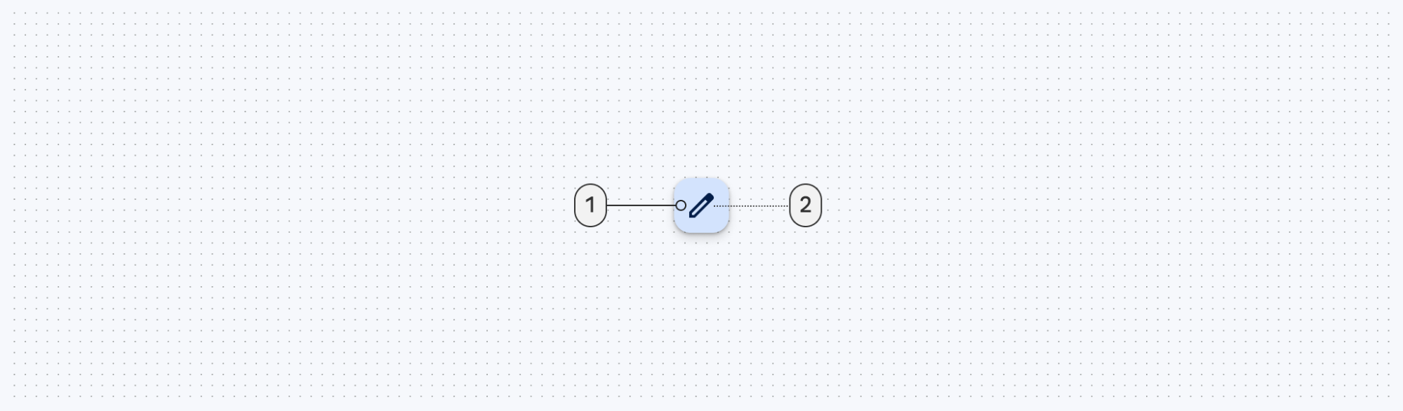
Use the show and hide methods to animate the visibility of a FloatingActionButton or an ExtendedFloatingActionButton. The show animation grows the widget and fades it in, while the hide animation shrinks the widget and fades it out.
kt
// To show:
fab.show()
// To hide:
fab.hide()
Extending and Shrinking
Use the extend and shrink methods to animate showing and hiding the text of an ExtendedFloatingActionButton. The extend animation extends the FAB to show the text and the icon. The shrink animation shrinks the FAB to show just the icon.
kt
// To extend:
extendedFab.extend()
// To shrink:
extendedFab.shrink()
Sizing FABs
The FloatingActionButton can be sized either by using app:fabCustomSize or for the large/small FAB (M3 only) by applying the desired style. The app:fabSize discrete size mode is deprecated in Material3 style. If the app:fabSize is overridden in your FAB style, which inherits from one of these styles:
Widget.Material3.FloatingActionButton(.Large).PrimaryWidget.Material3.FloatingActionButton(.Large).SecondaryWidget.Material3.FloatingActionButton(.Large).TertiaryWidget.Material3.FloatingActionButton(.Large).Surface
Please consider one of the following migration options:
- If
normalsize is used, set the parent style toWidget.Material3.FloatingActionButton.{Color}and removeapp:fabSize. - If
minisize is used, set the parent style toWidget.Material3.FloatingActionButton.Small.{Color}and removeapp:fabSize. - If FAB size changes in runtime by either setting
fabSizeorfabCustomSize, and relative sized corners are desired, setshapeAppearanceOverlayas@style/ShapeAppearanceOverlay.Material3.FloatingActionButtonin the style.
If you'd like to use the small FAB, apply one of these style attributes:
?attr/floatingActionButtonSmallStyle?attr/floatingActionButtonSmallPrimaryStyle?attr/floatingActionButtonSmallSecondaryStyle?attr/floatingActionButtonSmallTertiaryStyle?attr/floatingActionButtonSmallSurfaceStyle
If you'd like to use the large FAB, apply one of these style attributes:
?attr/floatingActionButtonLargeStyle?attr/floatingActionButtonLargePrimaryStyle?attr/floatingActionButtonLargeSecondaryStyle?attr/floatingActionButtonLargeTertiaryStyle?attr/floatingActionButtonLargeSurfaceStyle
Types
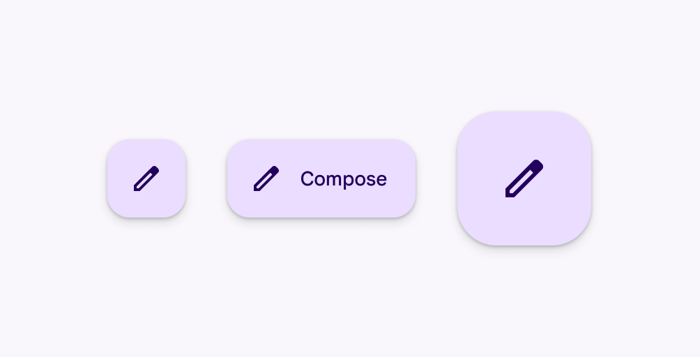
There are four types of FABS: 1. FABs, 2. Small FABs, 3. Large FABs
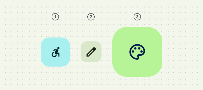
And 4. Extended FABs
FABs
FABs are the default size and style for a primary action button.
API and source code:
FloatingActionButton
FAB example
The following example shows a regular FAB with a plus icon.
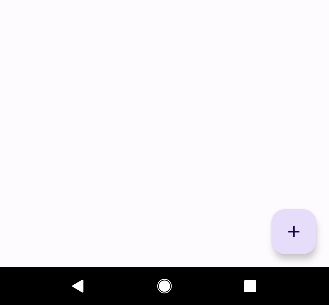
In the layout:
xml
<androidx.coordinatorlayout.widget.CoordinatorLayout
    ...
    android:layout_width="match_parent"
    android:layout_height="match_parent">

  <!-- Main content -->

  <com.google.android.material.floatingactionbutton.FloatingActionButton
      android:id="@+id/floating_action_button"
      android:layout_width="wrap_content"
      android:layout_height="wrap_content"
      android:layout_gravity="bottom|end"
      android:layout_margin="16dp"
      android:contentDescription="@string/fab_content_desc"
      app:srcCompat="@drawable/ic_plus_24"/>

</androidx.coordinatorlayout.widget.CoordinatorLayout>
In code:
kt
fab.setOnClickListener {
    // Respond to FAB click
}
Anatomy
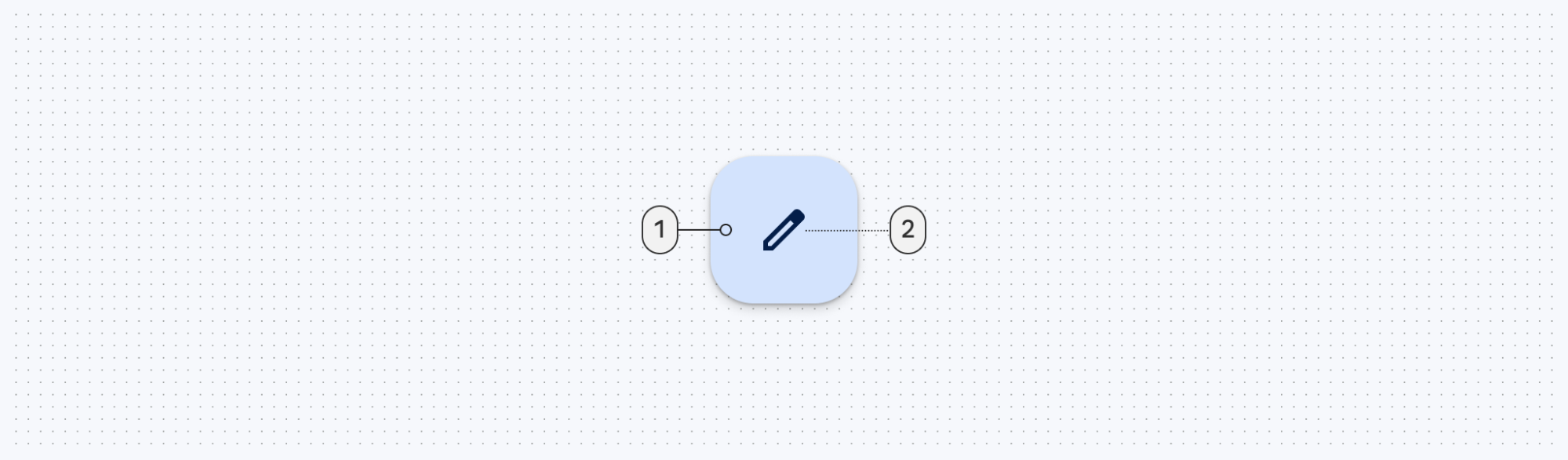
A regular FAB has a container and an icon.
- Container
- Icon
Small FABs
A small FAB should be used on smaller screens.
Small FABs can also be used to create visual continuity with other screen elements.
API and source code:
FloatingActionButton
Small FAB example
The following example shows a small FAB with a plus icon.
In the layout:
xml
<androidx.coordinatorlayout.widget.CoordinatorLayout
    ...
    >

  <!-- Main content -->

  <com.google.android.material.floatingactionbutton.FloatingActionButton
      ...
      style="?attr/floatingActionButtonSmallStyle"/>

</androidx.coordinatorlayout.widget.CoordinatorLayout>
In code:
kt
fab.setOnClickListener {
    // Respond to FAB click
}
Anatomy
A small FAB has a container and an icon.
- Container
- Icon
Large FABs
A large FAB is useful when the layout calls for a clear and primary action that the user is most likely to take, and where a larger footprint would help them to engage. For example, when appearing on taller and larger device screens.
API and source code:
FloatingActionButton- Class description
- Class source
Large FAB example
The following example shows a large FAB with a plus icon.
In the layout:
xml
<androidx.coordinatorlayout.widget.CoordinatorLayout
    ...
    >

  <!-- Main content -->

  <com.google.android.material.floatingactionbutton.FloatingActionButton
      ...
      style="?attr/floatingActionButtonLargeStyle"/>

</androidx.coordinatorlayout.widget.CoordinatorLayout>
In code:
kt
fab.setOnClickListener {
    // Respond to FAB click
}
Anatomy
A large FAB has a container and an icon.
- Container
- Icon
Regular, small, and large FAB key properties
Container attributes
| Element | Attribute | Related method(s) | Default value |
|---|---|---|---|
| Color | app:backgroundTint | setBackgroundTintListgetBackgroundTintList | ?attr/colorPrimaryContainer (see all states) |
| Stroke | app:borderWidth | N/A | 0dp |
| Size | app:fabSizeapp:fabCustomSize | setSizesetCustomSizeclearCustomSizegetSizegetCustomSize | auto |
| Shape | shapeAppearanceshapeAppearanceOverlay | setShapeAppearanceModelgetShapeAppearanceModel | ShapeAppearanceOverlay.Material3.FloatingActionButton |
| Elevation | app:elevation | setElevationgetCompatElevation | 6dp |
| Hovered/Focused elevation | app:hoveredFocusedTranslationZ | setCompatHoveredFocusedTranslationZgetCompatHoveredFocusedTranslationZ | 2dp |
| Pressed elevation | app:pressedTranslationZ | setCompatPressedTranslationZgetCompatPressedTranslationZ | 6dp |
| Ripple | app:rippleColor | setRippleColorgetRippleColorgetRippleColorStateList | variations of ?attr/colorOnPrimaryContainer, see all states |
| Motion | app:showMotionSpecapp:hideMotionSpec | set*MotionSpecset*MotionSpecResourceget*MotionSpec | @null |
Icon attributes
| Element | Attribute | Related method(s) | Default value |
|---|---|---|---|
| Icon | app:srcCompat | setImageDrawablesetImageResourcegetDrawable | null |
| Color | app:tint | setImageTintListgetImageTintList | ?attr/colorOnPrimaryContainer (see all states) |
Styles
| Element | Style |
|---|---|
| Default style | Widget.Material3.FloatingActionButton.Primary |
Default style theme attribute: ?attr/floatingActionButtonStyle
See the full list of styles and attrs.
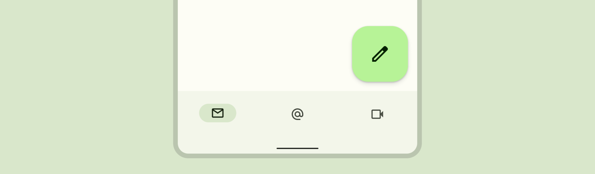
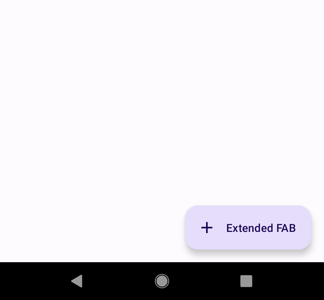
Extended FABs
The extended FAB is wider, and it includes a text label.
Note: ExtendedFloatingActionButton is a child class of MaterialButton, rather than FloatingActionButton. This means that several attributes which are applicable to FloatingActionButton have different naming in ExtendedFloatingActionButton. For example, FloatingActionButton uses app:srcCompat to set the icon drawable, whereas ExtendedFloatingActionButton uses app:icon. See the attributes tables below for more details.
API and source code:
ExtendedFloatingActionButton
Extended FAB example
The following example shows an extended FAB with a plus icon.
In the layout:
xml
<androidx.coordinatorlayout.widget.CoordinatorLayout
    ...
    >

  <!-- Main content -->

  <com.google.android.material.floatingactionbutton.ExtendedFloatingActionButton
    android:id="@+id/extended_fab"
    android:layout_width="wrap_content"
    android:layout_height="wrap_content"
    android:layout_margin="16dp"
    android:layout_gravity="bottom|end"
    android:contentDescription="@string/extended_fab_content_desc"
    android:text="@string/extended_fab_label"
    app:icon="@drawable/ic_plus_24px"/>

</androidx.coordinatorlayout.widget.CoordinatorLayout>
In code:
kt
extendedFab.setOnClickListener {
    // Respond to Extended FAB click
}
Anatomy and key properties
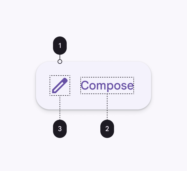
An extended FAB has a text label, a transparent container and an optional icon.
- Container
- Text label
- Icon (Optional)
Container attributes
| Element | Attribute | Related method(s) | Default value |
|---|---|---|---|
| Color | app:backgroundTint | setBackgroundTintListgetBackgroundTintList | ?attr/colorPrimaryContainer (see all states) |
| Stroke color | app:strokeColor | setStrokeColorgetStrokeColor | null |
| Stroke width | app:strokeWidth | setStrokeWidthgetStrokeWidth | 0dp |
| Size | app:collapsedSize | N/A | |
| Extend Strategy | app:extendStrategy | N/A | wrap_content |
| Shape | app:shapeAppearanceapp:shapeAppearanceOverlay | setShapeAppearanceModelgetShapeAppearanceModel | ShapeAppearanceOverlay.Material3.FloatingActionButton |
| Elevation | app:elevation | setElevationgetElevation | 6dp |
| Hovered/Focused elevation | app:hoveredFocusedTranslationZ | N/A | 2dp |
| Pressed elevation | app:pressedTranslationZ | N/A | 6dp |
| Ripple | app:rippleColor | variations of ?attr/colorOnPrimaryContainer, see all states | |
| Motion | app:showMotionSpecapp:hideMotionSpecextendMotionSpecshrinkMotionSpec | set*MotionSpecset*MotionSpecResourceget*MotionSpec | see animators |
Icon attributes
| Element | Attribute | Related method(s) | Default value |
|---|---|---|---|
| Icon | app:icon | setIconsetIconResourcegetIcon | null |
| Color | app:iconTint | setIconTintsetIconTintResourcegetIconTint | ?attr/colorOnPrimaryContainer (see all states) |
| Size | app:iconSize | setIconSizegetIconSize | 24dp |
| Padding between icon and text | app:iconPadding | setIconPaddinggetIconPadding | 12dp |
Text label
| Element | Attribute | Related method(s) | Default value |
|---|---|---|---|
| Text label | android:text | setTextgetText | null |
| Color | android:textColor | setTextColorgetTextColor | ?attr/colorPrimaryContainer (see all states) |
| Typography | android:textAppearance | setTextAppearance | ?attr/textAppearanceLabelLarge |
Styles
| Element | Style |
|---|---|
| Default style | Widget.Material3.ExtendedFloatingActionButton.Icon.Primary |
| Text-only when extended style | Widget.Material3.ExtendedFloatingActionButton.Primary |
Default style theme attribute: ?attr/extendedFloatingActionButtonStyle
See the full list of styles and attrs.
Theming FABs
FAB theming example
API and source code:
FloatingActionButtonExtendedFloatingActionButton
The following example shows a regular, small, and extended FAB with Material Theming.
Implementing FAB theming
Use theme attributes and styles in res/values/styles.xml to add themes to all FABs. This affects other components:
xml
<style name="Theme.App" parent="Theme.Material3.*">
    ...
    <item name="colorPrimaryContainer">@color/purple_500</item>
    <item name="colorOnPrimaryContainer">@color/purple_700</item>
</style>
Use a default style theme attribute, styles and a theme overlay. This themes all FABs in your app but does not affect other components:
xml
<style name="Theme.App" parent="Theme.Material3.*">
    ...
    <item name="extendedFloatingActionButtonStyle">@style/Widget.App.ExtendedFloatingActionButton</item>
    <item name="floatingActionButtonStyle">@style/Widget.App.FloatingActionButton</item>
</style>

<style name="Widget.App.ExtendedFloatingActionButton" parent="Widget.Material3.ExtendedFloatingActionButton.Icon.Primary">
    <item name="materialThemeOverlay">@style/ThemeOverlay.App.FloatingActionButton</item>
</style>

<style name="Widget.App.FloatingActionButton" parent="Widget.Material3.FloatingActionButton.Primary">
    <item name="materialThemeOverlay">@style/ThemeOverlay.App.FloatingActionButton</item>
</style>

<style name="ThemeOverlay.App.FloatingActionButton" parent="">
    <item name="colorContainer">@color/purple_500</item>
    <item name="colorOnContainer">@color/purple_700</item>
</style>
Use one of the styles in the layout. That affects only this FAB:
xml
<com.google.android.material.floatingactionbutton.FloatingActionButton
    ...
    style="@style/Widget.App.FloatingActionButton"
/>