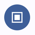
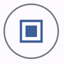
Appearance
Buttons
Buttons allow users to take actions, and make choices, with a single tap.
Contents
- Design and API Documentation
- Using buttons
- Elevated button
- Filled button
- Filled tonal button
- Outlined button
- Text button
- Button groups
- Toggle button group
- Icon button
- Theming
Design and API Documentation
Using buttons
Before you can use Material buttons, you need to add a dependency to the Material Components for Android library. For more information, go to the Getting started page.
Note: <Button> is auto-inflated as <com.google.android.material.button.MaterialButton> via MaterialComponentsViewInflater when using a Theme.Material3.* theme.
Making buttons accessible
Buttons support content labeling for accessibility and are readable by most screen readers, such as TalkBack. Text rendered in buttons is automatically provided to accessibility services. Additional content labels are usually unnecessary.
For more information on content labels, go to the Android accessibility help guide.
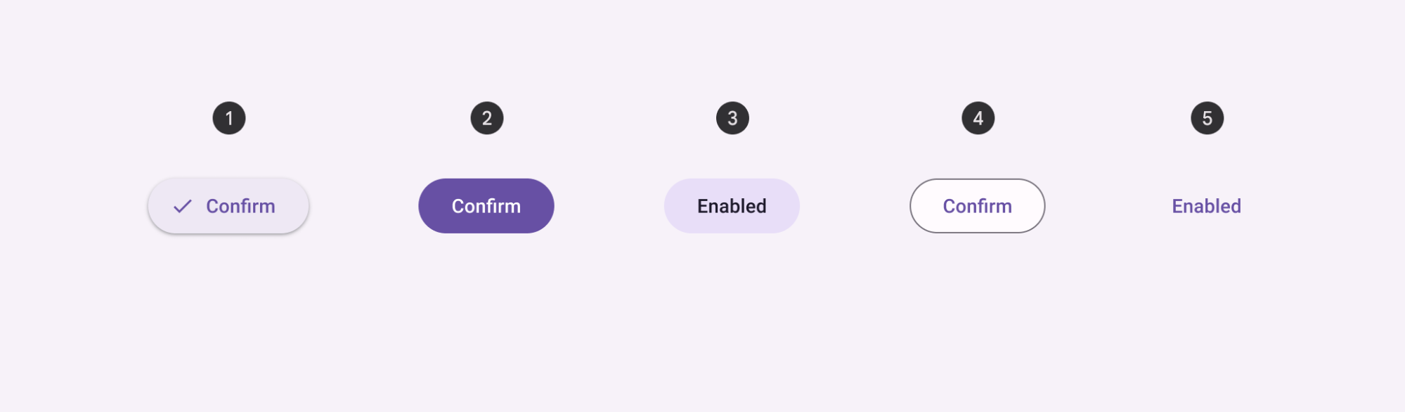
Types
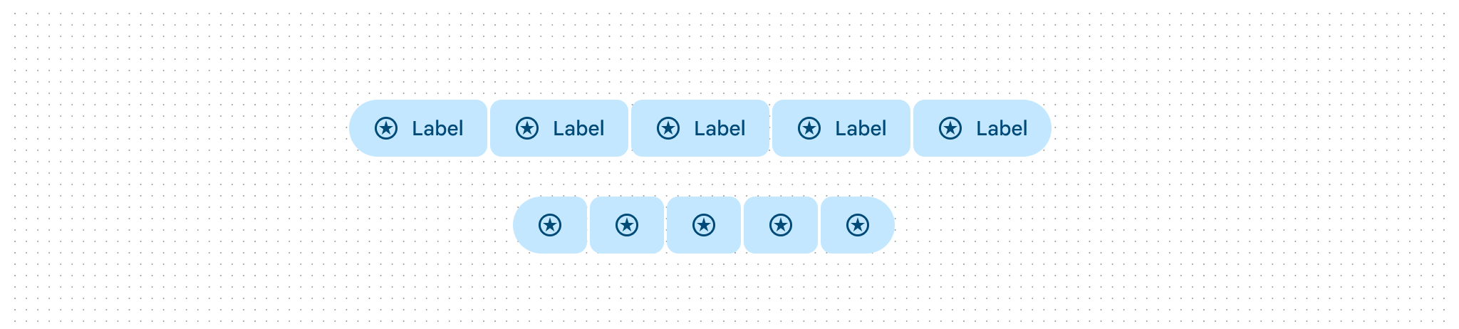
There are five types of common buttons: 1. Elevated button, 2. Filled button, 3. Filled tonal button, 4. Outlined button, 5. Text button.
Toggle button is an additional pattern using a segmented container or icon.
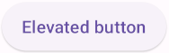
Elevated button
Elevated buttons are essentially outlined buttons with a shadow. To prevent shadow creep, only use them when absolutely necessary, such as when the button requires visual separation from a patterned background.
Elevated button examples
API and source code:
MaterialButton
The following example shows an elevated button with a text label.
In the layout:
xml
<Button
    style="@style/Widget.Material3.Button.ElevatedButton"
    android:id="@+id/elevatedButton"
    android:layout_width="wrap_content"
    android:layout_height="wrap_content"
    android:text="Elevated button"
/>
In code:
kt
elevatedButton.setOnClickListener {
// Respond to button press
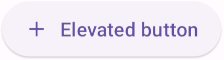
}Adding an icon to an elevated button
The following example shows an elevated button with an icon.
In the layout:
xml
<Button
    style="@style/Widget.Material3.Button.ElevatedButton.Icon"
    ...
    app:icon="@drawable/ic_add_24dp"
/>
Anatomy and key properties
An elevated button has a text label, a stroked container and an optional icon.
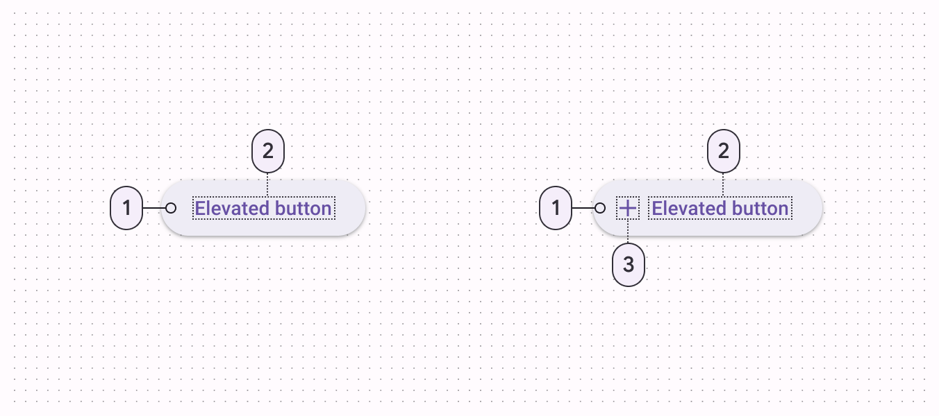
- Container
- Label text
- Icon
Text label attributes
| Element | Attribute | Related method(s) | Default value |
|---|---|---|---|
| Text label | android:text | setTextgetText | null |
| Color | android:textColor | setTextColorgetTextColor | ?attr/colorOnSurface (see all states) |
| Typography | android:textAppearance | setTextAppearance | ?attr/textAppearanceLabelLarge |
Container attributes
| Element | Attribute | Related method(s) | Default value |
|---|---|---|---|
| Color | app:backgroundTint | setBackgroundColorsetBackgroundTintListgetBackgroundTintList | ?attr/colorSurfaceContainerLow (see all states) |
| Stroke color | app:strokeColor | setStrokeColorsetStrokeColorResourcegetStrokeColor | null |
| Stroke width | app:strokeWidth | setStrokeWidthsetStrokeWidthResourcegetStrokeWidth | 0dp |
| Shape | app:shapeAppearance | setShapeAppearanceModelgetShapeAppearanceModel | ?attr/shapeAppearanceSmallComponent |
| Elevation | app:elevation | setElevationgetElevation | 1dp |
| Ripple color | app:rippleColor | setRippleColorsetRippleColorResourcegetRippleColor | ?attr/colorOnSurface at 16% opacity (see all states) |
Icon attributes
| Element | Attribute | Related method(s) | Default value |
|---|---|---|---|
| Icon | app:icon | setIconsetIconResourcegetIcon | null |
| Color | app:iconTint | setIconTintsetIconTintResourcegetIconTint | ?attr/colorOnSurface (see all states) |
| Size | app:iconSize | setIconSizegetIconSize | wrap_content |
| Gravity (position relative to text label) | app:iconGravity | setIconGravitygetIconGravity | start |
| Padding (space between icon and text label) | app:iconPadding | setIconPaddinggetIconPadding | 8dp |
Styles
| Element | Style |
|---|---|
| Default style | Widget.Material3.Button.ElevatedButton |
| Icon style | Widget.Material3.Button.ElevatedButton.Icon |
Default style theme attribute: ?attr/materialButtonElevatedStyle
See the full list of styles and attrs.
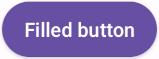
Filled button
Filled button's contrasting surface color makes it the most prominent button after the FAB. It’s used for final or unblocking actions in a flow.
Note The filled button is the default style if the style is not set.
Filled button examples
API and source code:
MaterialButton
The following example shows a filled button with a text label and a filled container.
In the layout:
xml
<Button
    android:id="@+id/filledButton"
    android:layout_width="wrap_content"
    android:layout_height="wrap_content"
    android:text="Filled button"
/>
Note: Since this is the default type, you don't need to specify a style tag as long as you are using a Material Components Theme. If not, set the style to @style/Widget.Material3.Button.
In code:
kt
filledButton.setOnClickListener {
// Respond to button press
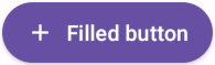
}Adding an icon to a filled button
The following example shows a filled button with an icon.
In the layout:
xml
<Button
    style="@style/Widget.Material3.Button.Icon"
    ...
    app:icon="@drawable/ic_add_24dp"
/>
Anatomy and key properties
A filled button has a text label, a filled container and an optional icon.
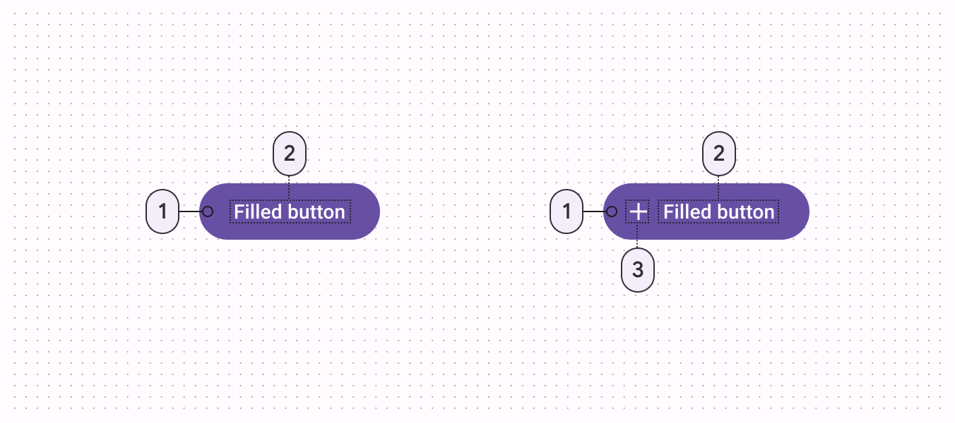
- Container
- Label text
- Icon
Text label attributes
| Element | Attribute | Related method(s) | Default value |
|---|---|---|---|
| Text label | android:text | setTextgetText | null |
| Color | android:textColor | setTextColorgetTextColor | ?attr/colorOnPrimary (see all states) |
| Typography | android:textAppearance | setTextAppearance | ?attr/textAppearanceLabelLarge |
Container attributes
| Element | Attribute | Related method(s) | Default value |
|---|---|---|---|
| Color | app:backgroundTint | setBackgroundColorsetBackgroundTintListgetBackgroundTintList | ?attr/colorPrimary (see all states) |
| Stroke color | app:strokeColor | setStrokeColorsetStrokeColorResourcegetStrokeColor | null |
| Stroke width | app:strokeWidth | setStrokeWidthsetStrokeWidthResourcegetStrokeWidth | 0dp |
| Shape | app:shapeAppearance | setShapeAppearanceModelgetShapeAppearanceModel | ?attr/shapeAppearanceSmallComponent |
| Elevation | app:elevation | setElevationgetElevation | 2dp |
| Ripple color | app:rippleColor | setRippleColorsetRippleColorResourcegetRippleColor | ?attr/colorOnPrimary at 16% opacity (see all states) |
Icon attributes
| Element | Attribute | Related method(s) | Default value |
|---|---|---|---|
| Icon | app:icon | setIconsetIconResourcegetIcon | null |
| Color | app:iconTint | setIconTintsetIconTintResourcegetIconTint | ?attr/colorOnPrimary (see all states) |
| Size | app:iconSize | setIconSizegetIconSize | wrap_content |
| Gravity (position relative to text label) | app:iconGravity | setIconGravitygetIconGravity | start |
| Padding (space between icon and text label) | app:iconPadding | setIconPaddinggetIconPadding | 8dp |
Styles
| Element | Style |
|---|---|
| Default style | Widget.Material3.Button |
| Icon style | Widget.Material3.Button.Icon |
| Unelevated style | Widget.Material3.Button.UnelevatedButton |
| Unelevated icon style | Widget.Material3.Button.UnelevatedButton.Icon |
Default style theme attribute: ?attr/materialButtonStyle
See the full list of styles and attrs.
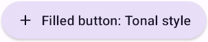
Filled tonal button
Filled tonal buttons have a lighter background color and darker label color, making them less visually prominent than a regular filled button. They’re still used for final or unblocking actions in a flow, but may be better when these actions don’t require quite so much emphasis.
Filled tonal button examples
API and source code:
MaterialButton
The following example shows a filled tonal button with a text label and a filled container.
In the layout:
xml
<Button
    style="@style/Widget.Material3.Button.TonalButton"
    android:id="@+id/filledTonalButton"
    android:layout_width="wrap_content"
    android:layout_height="wrap_content"
    android:text="Filled tonal button"
/>
In code:
kt
filledTonalButton.setOnClickListener {
    // Respond to button press
}
Adding an icon to a filled tonal button
The following example shows a filled tonal button with an icon.
In the layout:
xml
<Button
    style="@style/Widget.Material3.Button.TonalButton.Icon"
    ...
    app:icon="@drawable/ic_add_24dp"
/>
Anatomy and key properties
A filled tonal button has a text label, a filled container and an optional icon.
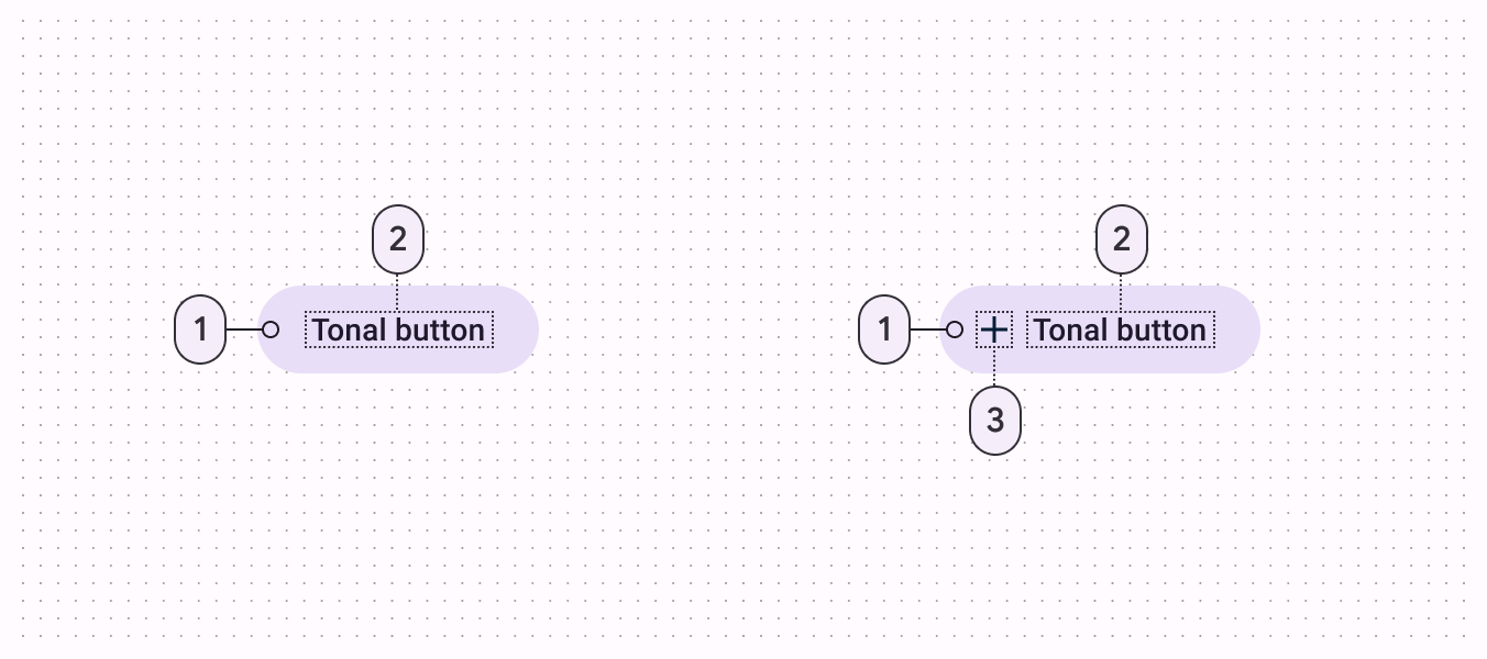
- Container
- Label text
- Icon
Text label attributes
| Element | Attribute | Related method(s) | Default value |
|---|---|---|---|
| Text label | android:text | setTextgetText | null |
| Color | android:textColor | setTextColorgetTextColor | ?attr/colorOnSecondaryContainer (see all states) |
| Typography | android:textAppearance | setTextAppearance | ?attr/textAppearanceLabelLarge |
Container attributes
| Element | Attribute | Related method(s) | Default value |
|---|---|---|---|
| Color | app:backgroundTint | setBackgroundColorsetBackgroundTintListgetBackgroundTintList | ?attr/colorSecondaryContainer (see all states) |
| Stroke color | app:strokeColor | setStrokeColorsetStrokeColorResourcegetStrokeColor | null |
| Stroke width | app:strokeWidth | setStrokeWidthsetStrokeWidthResourcegetStrokeWidth | 0dp |
| Shape | app:shapeAppearance | setShapeAppearanceModelgetShapeAppearanceModel | ?attr/shapeAppearanceSmallComponent |
| Elevation | app:elevation | setElevationgetElevation | 2dp |
| Ripple color | app:rippleColor | setRippleColorsetRippleColorResourcegetRippleColor | ?attr/colorOnSecondaryContainer at 16% opacity (see all states) |
Icon attributes
| Element | Attribute | Related method(s) | Default value |
|---|---|---|---|
| Icon | app:icon | setIconsetIconResourcegetIcon | null |
| Color | app:iconTint | setIconTintsetIconTintResourcegetIconTint | ?attr/colorOnSecondaryContainer (see all states) |
| Size | app:iconSize | setIconSizegetIconSize | wrap_content |
| Gravity (position relative to text label) | app:iconGravity | setIconGravitygetIconGravity | start |
| Padding (space between icon and text label) | app:iconPadding | setIconPaddinggetIconPadding | 8dp |
Styles
| Element | Style |
|---|---|
| Default style | Widget.Material3.Button.TonalButton |
| Icon style | Widget.Material3.Button.TonalButton.Icon |
Default style theme attribute: ?attr/materialButtonTonalStyle
See the full list of styles and attrs.
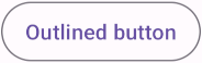
Outlined button
Outlined buttons are for actions that need attention but aren’t the primary action, such as “See all” or “Add to cart.” This is also the button used to give someone the opportunity to change their mind or escape a flow.
Outlined button examples
API and source code:
MaterialButton
The following example shows an outlined button with a text label and stroked container.
In the layout:
xml
<Button
    style="?attr/materialButtonOutlinedStyle"
    android:id="@+id/outlinedButton"
    android:layout_width="wrap_content"
    android:layout_height="wrap_content"
    android:text="Outlined button"
/>
In code:
kt
outlinedButton.setOnClickListener {
    // Respond to button press
}
Adding an icon to an outlined button
The following example shows an outlined button with an icon.
In the layout:
xml
<Button
    style="@style/Widget.Material3.Button.OutlinedButton.Icon"
    ...
    app:icon="@drawable/ic_add_24dp"
/>
Anatomy and key properties
An outlined button has a text label, a stroked container and an optional icon.
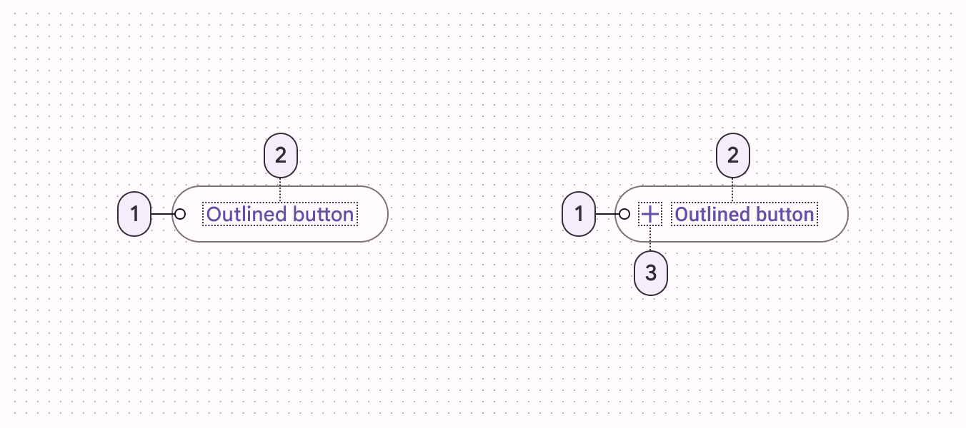
- Container
- Label text
- Icon
Text label attributes
| Element | Attribute | Related method(s) | Default value |
|---|---|---|---|
| Text label | android:text | setTextgetText | null |
| Color | android:textColor | setTextColorgetTextColor | ?attr/colorOnSurface (see all states) |
| Typography | android:textAppearance | setTextAppearance | ?attr/textAppearanceLabelLarge |
Container attributes
| Element | Attribute | Related method(s) | Default value |
|---|---|---|---|
| Color | app:backgroundTint | setBackgroundColorsetBackgroundTintListgetBackgroundTintList | @android:color/transparent (see all states) |
| Stroke color | app:strokeColor | setStrokeColorsetStrokeColorResourcegetStrokeColor | ?attr/colorOnSurface at 12% opacity (see all states) |
| Stroke width | app:strokeWidth | setStrokeWidthsetStrokeWidthResourcegetStrokeWidth | 1dp |
| Shape | app:shapeAppearance | setShapeAppearanceModelgetShapeAppearanceModel | ?attr/shapeAppearanceSmallComponent |
| Elevation | app:elevation | setElevationgetElevation | 0dp |
| Ripple color | app:rippleColor | setRippleColorsetRippleColorResourcegetRippleColor | ?attr/colorOnSurface at 16% opacity (see all states) |
Icon attributes
| Element | Attribute | Related method(s) | Default value |
|---|---|---|---|
| Icon | app:icon | setIconsetIconResourcegetIcon | null |
| Color | app:iconTint | setIconTintsetIconTintResourcegetIconTint | ?attr/colorOnSurface (see all states) |
| Size | app:iconSize | setIconSizegetIconSize | wrap_content |
| Gravity (position relative to text label) | app:iconGravity | setIconGravitygetIconGravity | start |
| Padding (space between icon and text label) | app:iconPadding | setIconPaddinggetIconPadding | 8dp |
Styles
| Element | Style |
|---|---|
| Default style | Widget.Material3.Button.OutlinedButton |
| Icon style | Widget.Material3.Button.OutlinedButton.Icon |
Default style theme attribute: ?attr/materialButtonOutlinedStyle
See the full list of styles and attrs.
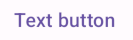
Text button
Text buttons have less visual prominence, so should be used for low emphasis actions, such as when presenting multiple options.
Text button examples
API and source code:
MaterialButton
The following example shows a text button with a text label.
In the layout:
xml
<Button
    style="@style/Widget.Material3.Button.TextButton"
    android:id="@+id/textButton"
    android:layout_width="wrap_content"
    android:layout_height="wrap_content"
    android:text="Text button"
/>
In code:
kt
textButton.setOnClickListener {
// Respond to button press
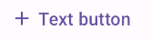
}Adding an icon to a text button
The following example shows a text button with an icon.
In the layout:
xml
<Button
    style="@style/Widget.Material3.Button.TextButton.Icon"
    ...
    app:icon="@drawable/ic_add_24dp"
/>
Anatomy and key properties
A text button has a text label, a transparent container and an optional icon.
- Label text
- Icon
Text label attributes
| Element | Attribute | Related method(s) | Default value |
|---|---|---|---|
| Text label | android:text | setTextgetText | null |
| Color | android:textColor | setTextColorgetTextColor | ?attr/colorOnSurface (see all states) |
| Typography | android:textAppearance | setTextAppearance | ?attr/textAppearanceLabelLarge |
Container attributes
| Element | Attribute | Related method(s) | Default value |
|---|---|---|---|
| Color | app:backgroundTint | setBackgroundColorsetBackgroundTintListgetBackgroundTintList | @android:color/transparent (see all states) |
| Stroke color | app:strokeColor | setStrokeColorsetStrokeColorResourcegetStrokeColor | null |
| Stroke width | app:strokeWidth | setStrokeWidthsetStrokeWidthResourcegetStrokeWidth | 0dp |
| Shape | app:shapeAppearance | setShapeAppearanceModelgetShapeAppearanceModel | ?attr/shapeAppearanceSmallComponent |
| Elevation | app:elevation | setElevationgetElevation | 0dp |
| Ripple color | app:rippleColor | setRippleColorsetRippleColorResourcegetRippleColor | ?attr/colorOnSurface at 16% opacity (see all states) |
Icon attributes
| Element | Attribute | Related method(s) | Default value |
|---|---|---|---|
| Icon | app:icon | setIconsetIconResourcegetIcon | null |
| Color | app:iconTint | setIconTintsetIconTintResourcegetIconTint | ?attr/colorOnSurface (see all states) |
| Size | app:iconSize | setIconSizegetIconSize | wrap_content |
| Gravity (position relative to text label) | app:iconGravity | setIconGravitygetIconGravity | start |
| Padding (space between icon and text label) | app:iconPadding | setIconPaddinggetIconPadding | 8dp |
Styles
| Element | Style |
|---|---|
| Default style | Widget.Material3.Button.TextButton |
| Icon style | Widget.Material3.Button.TextButton.Icon |
| Full Width Buttons | Widget.Material3.Button.TextButton.Dialog.FullWidth |
Default style theme attribute: ?attr/borderlessButtonStyle
See the full list of styles and attrs.
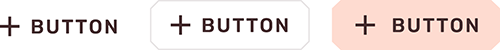
Button groups
Button groups organize buttons and add interactions between them.
There are two types of button groups based on their shapes:
Button group
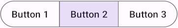
The default button group contains multiple related individual buttons. The individual button's shape is preserved.
Button group examples
Source code:
MaterialButtonGroupMaterialButton
The following example shows a button group with three buttons that have text labels.
In the layout:
xml
<com.google.android.material.button.MaterialButtonGroup
    android:id="@+id/buttonGroup"
    android:layout_width="wrap_content"
    android:layout_height="wrap_content">
    <Button
        android:id="@+id/button1"
        android:layout_width="wrap_content"
        android:layout_height="wrap_content"
        android:text="Button 1"
    />
    <Button
        android:id="@+id/button2"
        android:layout_width="wrap_content"
        android:layout_height="wrap_content"
        android:text="Button 2"
    />
    <Button
        android:id="@+id/button3"
        android:layout_width="wrap_content"
        android:layout_height="wrap_content"
        android:text="Button 3"
    />
</com.google.android.material.button.MaterialButtonGroup>
Connected button group
In addition to standard button groups, connected button group also overrides the individual button's shape to make them visually more belong to a group with 2dp spacing, 8dp inner corners, and fully rounded outer corners.
Connected button group examples
Source code:
MaterialButtonGroupMaterialButton
The following example shows a connected button group with three buttons that have text labels. To correctly style a button group as connected button group, the specific style needs to be set.
In the layout:
xml
<com.google.android.material.button.MaterialButtonGroup
    android:id="@+id/buttonGroup"
    style="@style/Widget.Material3.MaterialButtonGroup.Connected"
    android:layout_width="wrap_content"
    android:layout_height="wrap_content">
    <Button
        style="?attr/materialButtonOutlinedStyle"
        android:id="@+id/button1"
        android:layout_width="wrap_content"
        android:layout_height="wrap_content"
        android:text="Button 1"
    />
    <Button
        style="?attr/materialButtonOutlinedStyle"
        android:id="@+id/button2"
        android:layout_width="wrap_content"
        android:layout_height="wrap_content"
        android:text="Button 2"
    />
    <Button
        style="?attr/materialButtonOutlinedStyle"
        android:id="@+id/button3"
        android:layout_width="wrap_content"
        android:layout_height="wrap_content"
        android:text="Button 3"
    />
</com.google.android.material.button.MaterialButtonGroup>
Properties
| Element | Attribute | Related method(s) | Default value |
|---|---|---|---|
| Group shape (outer corners) | app:shapeAppearance | setShapeAppearancegetShapeAppearance | none |
| Size of inner corners | app:innerCornerSize | setInnerCornerSizegetInnerCornerSize | none |
| Spacing between buttons | android:spacing | setSpacinggetSpacing | 12dp |
| Child size change | app:childSizeChange | N/A | 15% in pressed,otherwise, 0% |
Styles and Theme attributes
| Element | Style | Theme Attribute |
|---|---|---|
| Default style | Widget.Material3.MaterialButtonGroup | ?attr/materialButtonGroupStyle |
Toggle button groups
Toggle button group (Segmented buttons) can be used to select from a group of choices.
There are two types of toggle buttons can be placed in a toggle button group:
Toggle button
To emphasize groups of related toggle buttons, a group should share a common container.
Toggle button examples
API and source code:
MaterialButtonToggleGroupMaterialButton
The following example shows a toggle button with three buttons that have text labels.
In the layout:
xml
<com.google.android.material.button.MaterialButtonToggleGroup
    android:id="@+id/toggleButton"
    android:layout_width="wrap_content"
    android:layout_height="wrap_content">
    <Button
        style="?attr/materialButtonOutlinedStyle"
        android:id="@+id/button1"
        android:layout_width="wrap_content"
        android:layout_height="wrap_content"
        android:text="Button 1"
    />
    <Button
        style="?attr/materialButtonOutlinedStyle"
        android:id="@+id/button2"
        android:layout_width="wrap_content"
        android:layout_height="wrap_content"
        android:text="Button 2"
    />
    <Button
        style="?attr/materialButtonOutlinedStyle"
        android:id="@+id/button3"
        android:layout_width="wrap_content"
        android:layout_height="wrap_content"
        android:text="Button 3"
    />
</com.google.android.material.button.MaterialButtonToggleGroup>
In code:
kt
toggleButton.addOnButtonCheckedListener { toggleButton, checkedId, isChecked ->
    // Respond to button selection
}
Implementing an icon-only toggle button
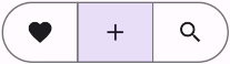
The following example shows a toggle button with three buttons that have icons.
In res/values/styles.xml:
xml
<style name="Widget.App.Button.OutlinedButton.IconOnly" parent="Widget.Material3.Button.OutlinedButton">
    <item name="iconPadding">0dp</item>
    <item name="android:insetTop">0dp</item>
    <item name="android:insetBottom">0dp</item>
    <item name="android:paddingLeft">12dp</item>
    <item name="android:paddingRight">12dp</item>
    <item name="android:minWidth">48dp</item>
    <item name="android:minHeight">48dp</item>
</style>
In the layout:
xml
<com.google.android.material.button.MaterialButtonToggleGroup
    ...>
    <Button
        style="@style/Widget.App.Button.OutlinedButton.IconOnly"
        ...
        app:icon="@drawable/ic_favorite_24dp"
    />
    <Button
        style="@style/Widget.App.Button.OutlinedButton.IconOnly"
        ...
        app:icon="@drawable/ic_add_24dp"
    />
    <Button
        style="@style/Widget.App.Button.OutlinedButton.IconOnly"
        ...
        app:icon="@drawable/ic_search_24dp"
    />
</com.google.android.material.button.MaterialButtonToggleGroup>
Anatomy and key properties
A toggle button has a shared stroked container, icons and/or text labels.

- Container
- Icon
Selection attributes
| Element | Attribute | Related method(s) | Default value |
|---|---|---|---|
| Single selection | app:singleSelection | setSingleSelectionisSingleSelection | false |
| Selection required | app:selectionRequired | setSelectionRequiredisSelectionRequired | false |
| Enable the group and all children | android:enabled | setEnabledisEnabled | true |
Container attributes
| Element | Attribute | Related method(s) | Default value |
|---|---|---|---|
| Size of inner corners | app:innerCornerSize | setInnerCornerSizegetInnerCornerSize | 0dp |
| Spacing between buttons | android:spacing | setSpacinggetSpacing | 0dp |
| Group shape (outer corners) | app:shapeAppearance | setShapeAppearancegetShapeAppearance | none |
Styles
| Element | Style |
|---|---|
| Default style | Widget.Material3.MaterialButtonToggleGroup |
Default style theme attribute: ?attr/materialButtonToggleGroupStyle
See the full list of styles and attrs.
Icon
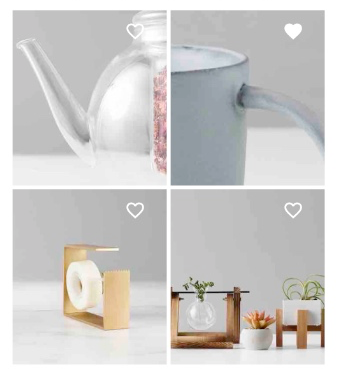
Icons can be used as toggle buttons when they allow selection, or deselection, of a single choice, such as marking an item as a favorite.
Icon example
API and source code:
CheckBox
Note: The CheckBox API is just one of several inputs that can implement the icon button. See other selection controls for more details.
The following example shows an icon that can be used independently or in items of a RecyclerView.
In the layout:
xml
<CheckBox
    android:id="@+id/icon"
    android:layout_width="wrap_content"
    android:layout_height="wrap_content"
    android:button="@drawable/sl_favourite_24dp"
    app:buttonTint="@android:color/white"
/>
In res/drawable/sl_favourite_24dp.xml:
xml
<selector>
    <item
        android:drawable="@drawable/ic_favourite_outlined_24dp"
        android:state_checked="false"
    />
    <item
        android:drawable="@drawable/ic_favourite_filled_24dp"
        android:state_checked="true"
    />
    <item android:drawable="@drawable/ic_favourite_outlined_24dp" />
</selector>
In code:
kt
icon.setOnCheckedChangeListener { checkBox, isChecked ->
    // Respond to icon toggle
}
Icon button
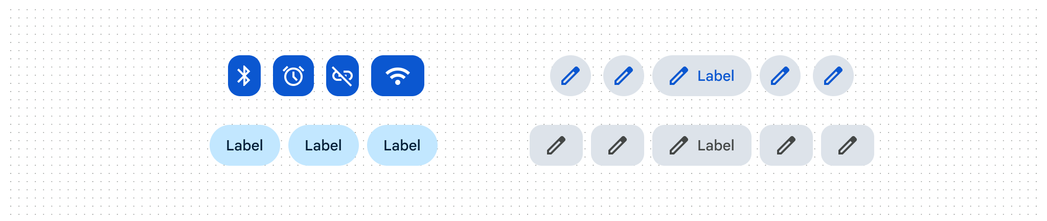
Icon buttons help users take supplementary actions with a single tap. There are two types of icon buttons: standard and contained.
- Standard icon button: By default icon buttons will not have a container.
- Contained icon button: Optionally, it is possible to have a container around the icon.
See Icon button examples section below for more information.
Usage
- Icon buttons should be used when a compact button is required, such as in a toolbar.
- Icon buttons can take the form of a wide range of system icons.
- Ensure the meaning of the icon is unambiguous.
- Ensure that the tooltip describes the button’s action, rather than the icon.
Note: The examples below show how to create an icon button using Button which will be inflated to MaterialButton when using a Material theme. There is a known performance issue where MaterialButton takes longer to initialize when compared to ImageButton or AppCompatImageButton, in large part because MaterialButton extends from AppCompatButton which supports more than just icon buttons. Consider using those pure icon button alternatives if the extra latency causes a noticeable issue for your app.
Icon button examples
API and source code:
MaterialButton
Standard Icon button
The following example shows a standard icon button.

In the layout:
xml
<Button
    style="?attr/materialIconButtonStyle"
    android:id="@+id/iconButton"
    android:layout_width="wrap_content"
    android:layout_height="wrap_content"
    android:contentDescription="@string/standard_icon_btn_desc"
    app:icon="@drawable/ic_icon_24dp"
/>
In code:
kt
iconButton.addOnButtonCheckedListener { iconButton, checkedId, isChecked ->
    // Respond to button selection
}
Filled Icon button
The following example shows a contained icon button that is filled.
In the layout:
xml
<Button
    style="?attr/materialIconButtonFilledStyle"
    android:id="@+id/iconButton"
    android:layout_width="wrap_content"
    android:layout_height="wrap_content"
    android:contentDescription="@string/filled_icon_btn_desc"
    app:icon="@drawable/ic_icon_24dp"
/>
Filled Tonal Icon button
The following example shows a tonal icon button.

In the layout:
xml
<Button
    style="?attr/materialIconButtonFilledTonalStyle"
    android:id="@+id/iconButton"
    android:layout_width="wrap_content"
    android:layout_height="wrap_content"
    android:contentDescription="@string/filled_tonal_icon_btn_desc"
    app:icon="@drawable/ic_icon_24dp"
/>
Outlined Icon button
The following example shows an outlined icon button.
In the layout:
xml
<Button
    style="?attr/materialIconButtonOutlinedStyle"
    android:id="@+id/iconButton"
    android:layout_width="wrap_content"
    android:layout_height="wrap_content"
    android:contentDescription="@string/outlined_icon_btn_desc"
    app:icon="@drawable/ic_icon_24dp"
/>
Styles and Theme attributes
| Element | Style | Theme Attribute |
|---|---|---|
| Default style | Widget.Material3.Button.IconButton | ?attr/materialIconButtonStyle |
| Filled Icon Button | Widget.Material3.Button.IconButton.Filled | ?attr/materialIconButtonFilledStyle |
| Filled Tonal Icon Button | Widget.Material3.Button.IconButton.Filled.Tonal | ?attr/materialIconButtonFilledTonalStyle |
| Outlined Icon Button | Widget.Material3.Button.IconButton.Outlined | ?attr/materialIconButtonOutlinedStyle |
See the full list of styles and attrs.
Theming buttons
Buttons support Material Theming and can be customized in terms of color, typography and shape.
Button theming example
API and source code:
MaterialButton
The following example shows text, outlined and filled button types with Material Theming.
Implementing button theming
Use theme attributes and styles in res/values/styles.xml to add the theme to all buttons. This affects other components:
xml
<style name="Theme.App" parent="Theme.Material3.*">
    ...
    <item name="colorPrimary">@color/shrine_pink_100</item>
    <item name="colorOnPrimary">@color/shrine_pink_900</item>
    <item name="textAppearanceLabelLarge">@style/TextAppearance.App.Button</item>
    <item name="shapeAppearanceSmallComponent">@style/ShapeAppearance.App.SmallComponent</item>
</style>

<style name="TextAppearance.App.Button" parent="TextAppearance.Material3.LabelLarge">
    <item name="fontFamily">@font/rubik</item>
    <item name="android:fontFamily">@font/rubik</item>
</style>

<style name="ShapeAppearance.App.SmallComponent" parent="ShapeAppearance.Material3.SmallComponent">
    <item name="cornerFamily">cut</item>
    <item name="cornerSize">4dp</item>
</style>
Use default style theme attributes, styles and theme overlays. This adds the theme to all buttons but does not affect other components:
xml
<style name="Theme.App" parent="Theme.Material3.*">
    ...
    <item name="borderlessButtonStyle">@style/Widget.App.Button.TextButton</item>
    <item name="materialButtonOutlinedStyle">@style/Widget.App.Button.OutlinedButton</item>
    <item name="materialButtonStyle">@style/Widget.App.Button</item>
</style>

<style name="Widget.App.Button.TextButton" parent="Widget.Material3.Button.TextButton">
    <item name="materialThemeOverlay">@style/ThemeOverlay.App.Button.TextButton</item>
    <item name="android:textAppearance">@style/TextAppearance.App.Button</item>
    <item name="shapeAppearance">@style/ShapeAppearance.App.SmallComponent</item>
</style>

<style name="Widget.App.Button.OutlinedButton" parent="Widget.Material3.Button.OutlinedButton">
    <item name="materialThemeOverlay">@style/ThemeOverlay.App.Button.TextButton</item>
    <item name="android:textAppearance">@style/TextAppearance.App.Button</item>
    <item name="shapeAppearance">@style/ShapeAppearance.App.SmallComponent</item>
</style>

<style name="Widget.App.Button" parent="Widget.Material3.Button">
    <item name="materialThemeOverlay">@style/ThemeOverlay.App.Button</item>
    <item name="android:textAppearance">@style/TextAppearance.App.Button</item>
    <item name="shapeAppearance">@style/ShapeAppearance.App.SmallComponent</item>
</style>

<style name="ThemeOverlay.App.Button.TextButton" parent="ThemeOverlay.Material3.Button.TextButton">
    <item name="colorOnContainer">@color/shrine_pink_900</item>
</style>

<style name="ThemeOverlay.App.Button" parent="ThemeOverlay.Material3.Button">
    <item name="colorContainer">@color/shrine_pink_100</item>
    <item name="colorOnContainer">@color/shrine_pink_900</item>
</style>
Use one of the styles in the layout. That will affect only this button:
xml
<Button
    style="@style/Widget.App.Button"
    ...
/>