Appearance
Chips
Chips are compact elements that represent an input, attribute, or action.
Contents
Design and API Documentation
Using chips
Before you can use Material chips, you need to add a dependency to the Material Components for Android library. For more information, go to the Getting started page.
Chips allow users to enter information, make selections, filter content, or trigger actions. While buttons are expected to appear consistently and with familiar calls to action, chips should appear dynamically as a group of multiple interactive elements.
Usage
A Chip can be added in a layout with the following:
xml
<com.google.android.material.chip.Chip
    android:id="@+id/chip"
    android:layout_width="wrap_content"
    android:layout_height="wrap_content"
    android:text="@string/text"/>
Changes to a chip can be observed with the following:
kt
chip.setOnClickListener {
   // Responds to chip click
}

chip.setOnCloseIconClickListener {
    // Responds to chip's close icon click if one is present
}

chip.setOnCheckedChangeListener { chip, isChecked ->
    // Responds to chip checked/unchecked
}
Making chips accessible
Chips support content labeling for accessibility and are readable by most screen readers, such as TalkBack. Text rendered in chips is automatically provided to accessibility services. Additional content labels are usually unnecessary.
Touch target
The Widget.Material3.Chip.* styles use an InsetDrawable to extend the chip's touch target when necessary to meet Android's recommended accessibility touch target size. Developers can override a chip's minimum touch target size using app:chipMinTouchTargetSize. Developers can set whether the chip should extend its bounds to meet the minimum touch target using app:ensureMinTouchTargetSize (true by default).
RTL-friendly chip layout
Call setLayoutDirection(int) with View.LAYOUT_DIRECTION_LOCALE to ensure that the chip's ancestor TextView renders the text with proper paddings. Without this, the initial rendering may look like the text has its padding set according to LTR direction.
kt
chip.layoutDirection = View.LAYOUT_DIRECTION_LOCALEGrouping chips with ChipGroup
Chips are most commonly used in groups. We recommend using ChipGroup because it is purpose-built to handle multi-chip layouts and behavior patterns, as opposed to a ViewGroup such as RecyclerView. A ChipGroup contains a set of Chips and manages their layout and multiple-exclusion scope, similarly to a RadioGroup.
Layout Mode
A ChipGroup rearranges chips across multiple rows by default.
xml
<com.google.android.material.chip.ChipGroup
    android:id="@+id/chipGroup"
    android:layout_width="match_parent"
    android:layout_height="wrap_content">

  <!-- Chips can be declared here, or added dynamically. -->

</com.google.android.material.chip.ChipGroup>
A ChipGroup can also constrain its chips to a single row using the app:singleLine attribute. Using a single row may necessitate wrapping the ChipGroup with a HorizontalScrollView.
xml
<HorizontalScrollView
    ... >
  <com.google.android.material.chip.ChipGroup
      ...
      app:singleLine="true">

    <!-- Chips can be declared here, or added dynamically. -->

  </com.google.android.material.chip.ChipGroup>
</HorizontalScrollView>
Chip spacing
A ChipGroup can insert spacing between chips in a row or between rows of chips using the app:chipSpacing attribute. Different horizontal and vertical spacing can be set using the app:chipSpacingHorizontal and app:chipSpacingVertical attributes.
Note: The app:chipMinTouchTargetSize will overrule vertical chip spacing for lower amounts.
The following image shows a group of chips with app:chipSpacingHorizontal="42dp".
Multiple exclusion scope
The app:singleSelection attribute can be set to true on a ChipGroup in order to toggle single-select and multi-select behaviors of child chips.
The app:selectionRequired attribute can be set to true on a ChipGroup to prevent all child chips from being deselected - at least one option should be chosen.
Handling checked chips
Changes to child chip's checked/unchecked state can be observed with the following:
kt
val checkedChipId = chipGroup.checkedChipId // Returns View.NO_ID if singleSelection = false
val checkedChipIds = chipGroup.checkedChipIds // Returns a list of the selected chips' IDs, if any

chipGroup.setOnCheckedStateChangeListener { group, checkedIds ->
    // Responds to child chip checked/unchecked
}
Standalone ChipDrawable
A standalone ChipDrawable can be used in contexts that require a Drawable. The most obvious use case is in text fields that "chipify" contacts, commonly found in communications apps.
To use a ChipDrawable, first create a chip resource in res/xml. Note that you must use the <chip tag in your resource file.
In res/xml/standalone_chip.xml:
xml
<chip
    xmlns:android="http://schemas.android.com/apk/res/android"
    xmlns:app="http://schemas.android.com/apk/res-auto"
    app:chipIcon="@drawable/ic_chip"
    android:text="@string/text"/>
Input Chip is the default Material style for standalone ChipDrawables, but you can apply any of the other styles using the style attribute. All the attributes on Chip can be applied to a ChipDrawable resource.
A ChipDrawable can then be inflated from this resource with the following:
xml
val chipDrawable = ChipDrawable.createFromResource(context, R.xml.chip)For example, consider an editable e-mail address field that converts addresses to chips as they are typed and validated. We can combine ChipDrawable with spans to add a chip to an EditText:
kt
chip.setBounds(0, 0, chip.intrinsicWidth, chip.intrinsicHeight)
val span = ImageSpan(chip)
val text = editText.text!!
text.setSpan(span, 0, text.length, Spanned.SPAN_EXCLUSIVE_EXCLUSIVE)
Types
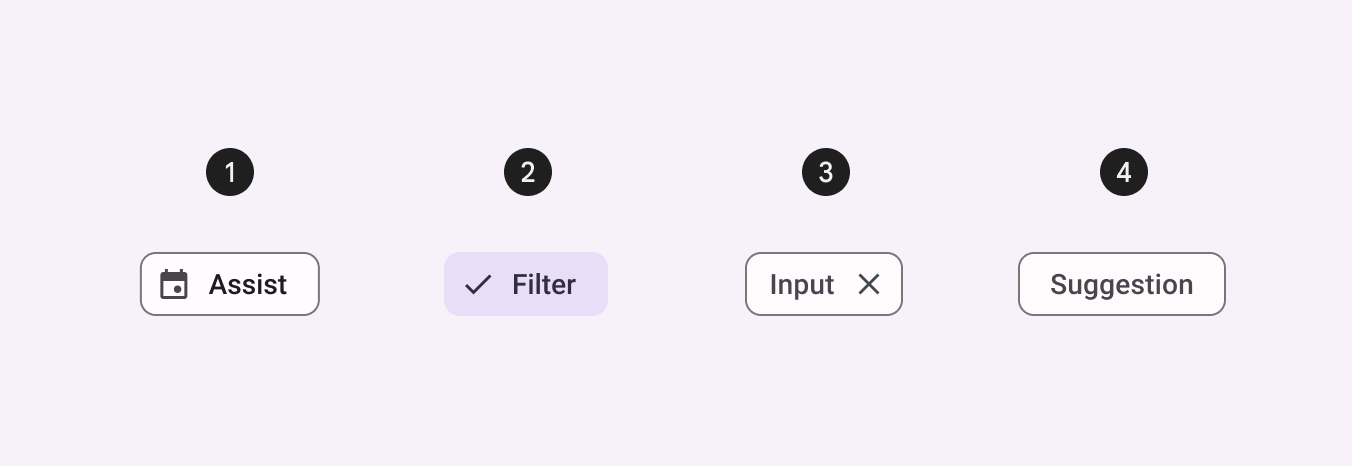
There are four types of chips: 1. assist, 2. filter, 3. input, 4.suggestion
API and source code:
ChipChipGroupChipDrawable
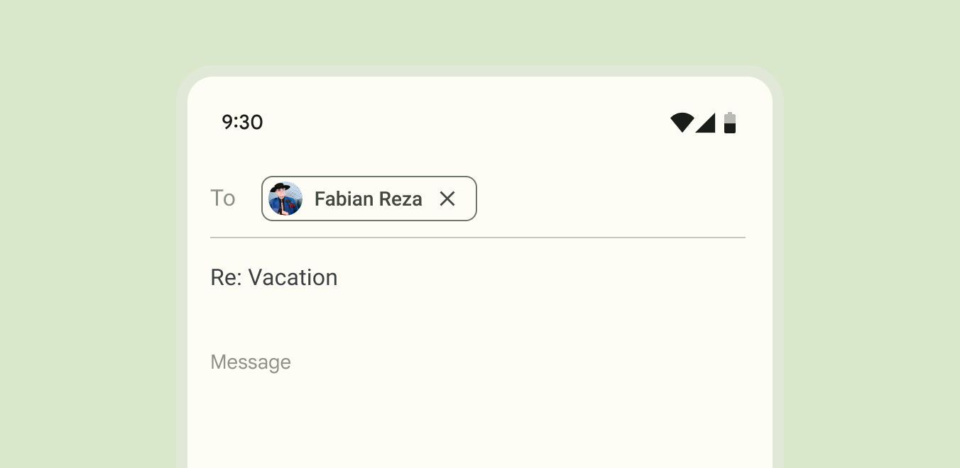
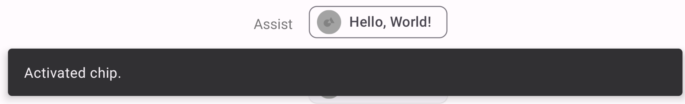
Assist chip
Assist chips represent smart or automated actions that can span multiple apps, such as opening a calendar event from the home screen. Assist chips function as though the user asked an assistant to complete the action.
Assist chip example
The following example shows an activated assist chip.
In the layout:
xml
<TextView
  android:id="@+id/textView_1"
  android:layout_width="wrap_content"
  android:layout_height="wrap_content"
  android:text="@string/label_1"
  android:textAlignment="viewEnd"/>

<com.google.android.material.chip.Chip
  android:id="@+id/chip_1"
  style="@style/Widget.Material3.Chip.Assist"
  android:layout_width="wrap_content"
  android:layout_height="wrap_content"
  android:text="@string/chip_text_1"
  app:chipIcon="@drawable/circle_1"
  app:ensureMinTouchTargetSize="true"/>
Filter chip
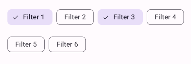
Filter chips use tags or descriptive words to filter content.
Filter chips clearly delineate and display options in a compact area. They are a good alternative to toggle buttons or checkboxes.
Filter chip example
The following example shows filter chips.
In the layout:
xml
<com.google.android.material.chip.ChipGroup
    ...>
  <com.google.android.material.chip.Chip
      android:id="@+id/chip_1"
      style="@style/Widget.Material3.Chip.Filter"
      android:layout_width="wrap_content"
      android:layout_height="wrap_content"
      android:checked="true"
      android:text="@string/text_filter_1"/>

  <com.google.android.material.chip.Chip
      ...
       style="@style/Widget.Material3.Chip.Filter"
       android:text="@string/text_filter_2"/>

  <com.google.android.material.chip.Chip
      ...
      style="@style/Widget.Material3.Chip.Filter"
      android:checked="true"
      android:text="@string/text_filter_3"/>

  <com.google.android.material.chip.Chip
      ...
      style="@style/Widget.Material3.Chip.Filter"
      android:text="@string/text_filter_4"/>

  <com.google.android.material.chip.Chip
      ...
      style="@style/Widget.Material3.Chip.Filter"
      android:text="@string/text_filter_5"/>

  <com.google.android.material.chip.Chip
      ...
      style="@style/Widget.Material3.Chip.Filter"
      android:text="@string/text_filter_6"/>

</com.google.android.material.chip.ChipGroup>
Input chip
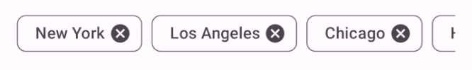
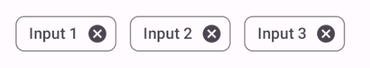
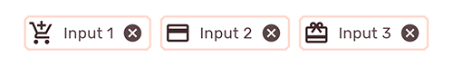
Input chips represent a discrete piece of information in compact form, such as an entity (person, place, or thing) or text. They enable user input and verify that input by converting text into chips.
Input chip example
The following example shows input chips.
In the layout:
xml
<com.google.android.material.chip.ChipGroup
    ...>
  <com.google.android.material.chip.Chip
      android:id="@+id/chip_1"
      style="@style/Widget.Material3.Chip.Input"
      android:layout_width="wrap_content"
      android:layout_height="wrap_content"
      android:text="@string/text_input_1"/>

  <com.google.android.material.chip.Chip
      ...
      style="@style/Widget.Material3.Chip.Input"
      android:text="@string/text_input_2"/>

  <com.google.android.material.chip.Chip
      ...
      style="@style/Widget.Material3.Chip.Input"
      android:text="@string/text_input_3"/>

</com.google.android.material.chip.ChipGroup>
Suggestion chip
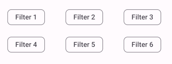
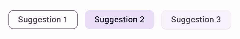
Suggestion chips help narrow a user’s intent by presenting dynamically generated suggestions, such as offering possible responses or providing search filters.
Suggestion chip example
The following example shows suggestion chips.
In the layout:
xml
<com.google.android.material.chip.ChipGroup
    ...>
   <com.google.android.material.chip.Chip
    android:layout_width="wrap_content"
    android:layout_height="wrap_content"
    style="@style/Widget.Material3.Chip.Suggestion"
    android:text="@string/chip_text_1"/>
  <com.google.android.material.chip.Chip
    ...
    style="@style/Widget.Material3.Chip.Suggestion"
    android:text="@string/chip_text_2"/>
  <com.google.android.material.chip.Chip
    ...
    style="@style/Widget.Material3.Chip.Suggestion.Elevated"
    android:text="@string/chip_text_3"/>

</com.google.android.material.chip.ChipGroup>
Anatomy and key properties
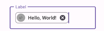
The following is an anatomy diagram of a chip:
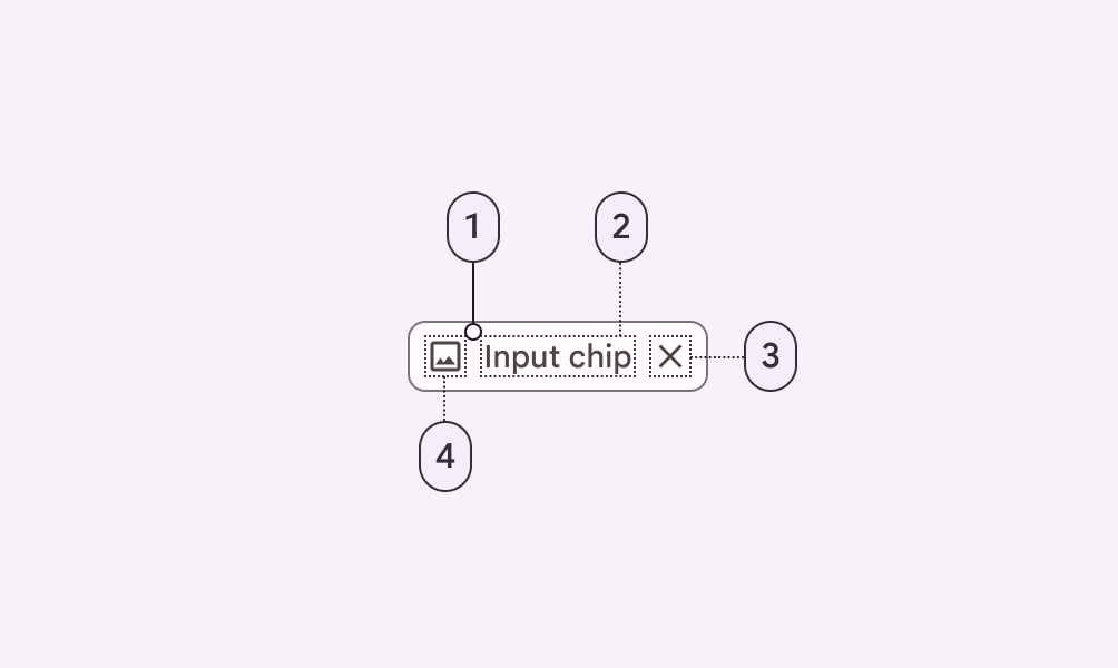
- Container
- Text
- Remove icon (optional)
- Thumbnail (optional)
Container attributes
| Element | Attribute | Related method(s) | Default value |
|---|---|---|---|
| Color | app:chipBackgroundColor | setChipBackgroundColorsetChipBackgroundColorResourcegetChipBackgroundColor | ?attr/colorOnSurface |
| Ripple color | app:rippleColor | setRippleColorsetRippleColorResourcegetRippleColor | ?attr/colorOnSecondaryContainer at 12% |
| Stroke width | app:chipStrokeWidth | setStrokeWidthsetChipStrokeWidthResourcegetChipStrokeWidth | 1dp |
| Stroke color | app:chipStrokeColor | setStrokeColorsetChipStrokeColorResourcegetChipStrokeColor | ?attr/colorOnSurface |
| Min height | app:chipMinHeight | setChipMinHeightsetChipMinHeightResourcegetChipMinHeight | 32dp |
| Padding | app:chipStartPaddingapp:chipEndPadding | setChip*PaddingsetChip*PaddingResourcegetChip*Padding | 4dp (start)6dp (end) |
| Shape | app:shapeAppearanceshapeAppearanceOverlay | setShapeAppearanceModelgetShapeAppearanceModel | ?attr/shapeAppearanceSmallComponent with 8dp cornerSize |
| Min touch target | app:chipMinTouchTargetSizeapp:ensureMinTouchTargetSize | ensureAccessibleTouchTargetsetEnsureAccessibleTouchTargetshouldEnsureAccessibleTouchTarget | 48dptrue |
| Checkable | android:checkable | setCheckablesetCheckableResourceisCheckable | true (input, suggestion, filter) |
Thumbnail attributes
Chip icon
| Element | Attribute | Related method(s) | Default value |
|---|---|---|---|
| Icon | app:chipIcon | setChipIconsetChipIconResourcegetChipIcon | null |
| Visibility | app:chipIconVisible | setChipIconVisibleisChipIconVisible | true (input and assist) |
| Color | app:chipIconTint | setChipIconTintsetChipIconTintResourcegetChipIconTint | null |
| Size | app:chipIconSize | setChipIconSizesetChipIconSizeResourcegetChipIconSize | 18dp |
| Padding | app:iconStartPaddingapp:iconEndPadding | setIcon*PaddingsetIcon*PaddingResourcegetIcon*Padding | 0dp, -2dp (filter end padding) |
Checked icon
If visible, the checked icon overlays the chip icon.
| Element | Attribute | Related method(s) | Default value |
|---|---|---|---|
| Icon | app:checkedIcon | setCheckedIconsetCheckedIconResourcegetCheckedIcon | @drawable/ic_m3_chip_checked_circle |
| Visibility | app:checkedIconVisible | setCheckedIconVisibleisCheckedIconVisible | true (input, filter) |
| Color | app:checkedIconTint | setCheckedIconTintsetCheckedIconTintResourcegetCheckedIconTint | null |
Text attributes
| Element | Attribute | Related method(s) | Default value |
|---|---|---|---|
| Text label | android:text | setChipTextsetChipTextResourcegetChipText | null |
| Color | android:textColor | setTextColorgetTextColors | ?attr/colorOnSurfaceVariant |
| Typography | android:textAppearance | setTextAppearancesetTextAppearanceResourcegetTextAppearance | ?attr/textAppearanceLabelLarge |
| Padding | app:textStartPaddingapp:textEndPadding | setText*PaddingsetText*PaddingResourcegetText*Padding | 8dp (start)6dp (end) |
Remove (close) icon attributes
| Element | Attribute | Related method(s) | Default value |
|---|---|---|---|
| Icon | app:closeIcon | setCloseIconsetCloseIconResourcegetCloseIcon | @drawable/ic_mtrl_chip_close_circle |
| Visibility | app:closeIconVisible | setCloseIconVisibleisCloseIconVisible | true for input |
| Color | app:closeIconTint | setCloseIconTintsetCloseIconTintResourcegetCloseIconTint | ?attr/colorOnSurfaceVariant |
| Size | app:closeIconSize | setCloseIconSizesetCloseIconSizeResourcegetCloseIconSize | 18dp |
| Padding | app:closeIconStartPaddingapp:closeIconEndPadding | setCloseIcon*PaddingsetCloseIcon*PaddingResourcegetCloseIcon*Padding | 4dp input end padding |
| Content description | N/A | setCloseIconContentDescriptiongetCloseIconContentDescription | @string/mtrl_chip_close_icon_content_description |
ChipGroup attributes
| Element | Attribute | Related method(s) | Default value |
|---|---|---|---|
| Layout | app:singleLine | setSingleLineisSingleLine | false |
| Selection | app:singleSelectionapp:selectionRequired | setSingleSelection*isSingleSelection* | falsefalse |
| Spacing | app:chipSpacingapp:chipSpacingHorizontalchipSpacingVertical | setSpacing*setChipSpacing*ResourcegetSpacing* | 8dp |
Styles
| Element | Style |
|---|---|
| Default style (assist chip) | Widget.Material3.Chip.Assist |
| Input chip | Widget.Material3.Chip.Input |
| Suggestion chip | Widget.Material3.Chip.Suggestion |
| Filter chip | Widget.Material3.Chip.Filter |
ChipGroup style | Widget.Material3.ChipGroup |
Theme attributes
| Element | Theme attribute | Default style |
|---|---|---|
Chip | ?attr/chipStyle | Widget.Material3.Chip.Assist |
ChipGroup | ?attr/chipGroupStyle | Widget.Material3.ChipGroup |
ChipDrawable | ?attr/chipStandaloneStyle | Widget.Material3.Chip.Input |
See the full list of styles and attributes.
Theming chips
Chips support Material Theming, which customizes color, typography and shape.
Chip theming example
API and source code:
ChipChipGroupChipDrawable
The following example shows chips with Material Theming.
Implementing chip theming
Use theme attributes and styles in res/values/styles.xml, which applies the theme to all chips and affects other components:
xml
<style name="Theme.App" parent="Theme.Material3.*">
    ...
    <item name="colorOnSurface">@color/shrine_pink_100</item>
    <item name="textAppearanceBodyMedium">@style/TextAppearance.App.BodyMedium</item>
    <item name="shapeAppearanceSmallComponent">@style/ShapeAppearance.App.SmallComponent</item>
    <item name="chipStyle">@style/Widget.App.Chip</item>
</style>

<style name="Widget.App.Chip" parent="Widget.Material3.Chip.Input">
    <item name="chipIconTint">@color/shrine_pink_900</item>
    <item name="chipBackgroundColor">@color/white</item>
    <item name="chipStrokeWidth">2dp</item>
    <item name="chipStrokeColor">@color/stroke_tint</item>
    <item name="checkedIconVisible">false</item>
    <item name="shapeAppearanceOverlay">@null</item>
</style>

<style name="TextAppearance.App.BodyMedium" parent="TextAppearance.Material3.BodyMedium">
    <item name="fontFamily">@font/rubik_regular</item>
    <item name="android:fontFamily">@font/rubik_regular</item>
</style>

<style name="ShapeAppearance.App.SmallComponent" parent="ShapeAppearance.Material3.SmallComponent">
    <item name="cornerFamily">cut</item>
    <item name="cornerSize">4dp</item>
</style>
in color/stroke_tint.xml:
xml
<selector xmlns:android="http://schemas.android.com/apk/res/android">
  <item android:color="?attr/colorOnSurface" android:state_checked="true"/>
  <item android:color="@color/shrine_pink_100"/>
</selector>
Use a default style theme attribute, styles and a theme overlay. This applies the theme to all chips but does not affect other components:
xml
<style name="Theme.App" parent="Theme.Material3.*">
    ...
    <item name="chipStyle">@style/Widget.App.Chip</item>
</style>

<style name="Widget.App.Chip" parent="Widget.Material3.Chip.Input">
    <item name="materialThemeOverlay">@style/ThemeOverlay.App.Chip</item>
    <item name="android:textAppearance">@style/TextAppearance.App.BodyMedium</item>
    <item name="shapeAppearance">@style/ShapeAppearance.App.SmallComponent</item>
    ...
</style>

<style name="ThemeOverlay.App.Chip" parent="">
    <item name="colorOnSurface">@color/shrine_pink_900</item>
</style>
Use the style in the layout, which affects only specific chips:
xml
<com.google.android.material.chip.Chip
      ...
      style="@style/Widget.App.Chip."  />