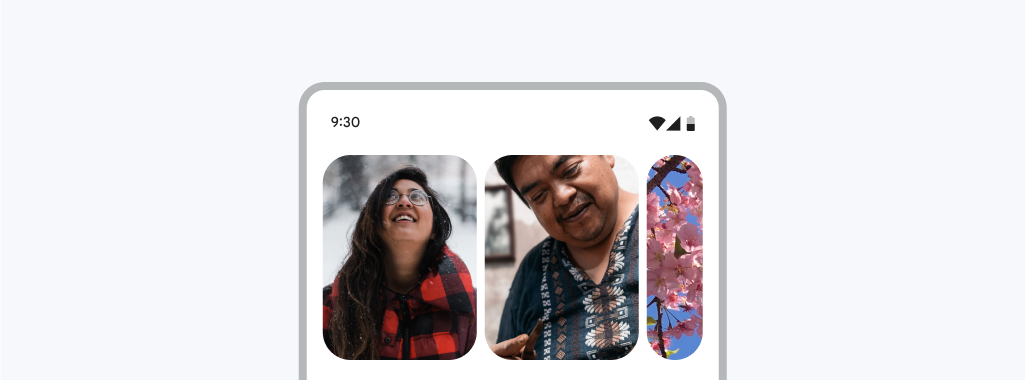
Appearance
Carousel
Carousels contain a collection of items that can move into or out of view

Contents
- Design and API Documentation
- Using carousel
- Multi-browse strategy
- Hero strategy
- Fullscreen strategy
- Attributes
- Customizing carousel
Design and API Documentation
Using carousel
API and source code:
RecyclerViewCarouselLayoutManagerCarouselStrategyMaskableFrameLayout
Before you can use Material carousels, you need to add a dependency on the Material Components for Android library. For more information, go to the Getting started page.
Carousel is built on top of RecyclerView. To learn how to use RecyclerView to display a list of items, please see Create dynamic lists with RecyclerView.
To turn a horizontal list into a carousel, first wrap your RecyclerView's item layout in a MaskableFrameLayout. MaskableFrameLayout is a FrameLayout that is able to mask (clip) itself, and its children, to a percentage of its width. When a mask is set to 0%, the the entire view is visible in its original, "unmasked" width. As a mask approaches 100%, the edges of the view begin to crop in towards the center, leaving a narrower and narrower sliver of the original view visible. Carousel masks and unmasks items as they are scrolled across the viewport to create a stylized look and feel.
xml
<com.google.android.material.carousel.MaskableFrameLayout
  xmlns:android="http://schemas.android.com/apk/res/android"
  xmlns:app="http://schemas.android.com/apk/res-auto"
  xmlns:tools="http://schemas.android.com/tools"
  android:id="@+id/carousel_item_container"
  android:layout_width="150dp"
  android:layout_height="match_parent"
  android:layout_marginStart="4dp"
  android:layout_marginEnd="4dp"
  android:foreground="?attr/selectableItemBackground"
  app:shapeAppearance="?attr/shapeAppearanceCornerExtraLarge">
  <ImageView
    android:id="@+id/carousel_image_view"
    android:layout_width="match_parent"
    android:layout_height="match_parent"
    android:scaleType="centerCrop"/>
</com.google.android.material.carousel.MaskableFrameLayout>
Note: Masking creates the best effect when MaskableFrameLayout contains a full-bleed image or other backgrounds that extend to or past the edges of its parent. If the shape or masking behavior of your item doesn't look correct, try removing any padding set on MaskableFrameLayout or margins set on children of MaskableFrameLayout.
Next, set your RecyclerViews layout manager to a new CarouselLayoutManager.
xml
<androidx.recyclerview.widget.RecyclerView
  android:id="@+id/carousel_recycler_view"
  android:layout_width="match_parent"
  android:layout_height="196dp"
  android:clipChildren="false"
  android:clipToPadding="false" />
kt
carouselRecyclerView.setLayoutManager(CarouselLayoutManager())These are the basic steps to create a carousel. The look of the carousel depends on which carousel strategy you are using; you can have a multi-browse strategy or hero strategy.
Multi-browse strategy

API and source code:
MultiBrowseCarouselStrategy
A multi-browse strategy allows quick browsing of many small items, like a photo thumbnail gallery. A start-aligned, multi-browse strategy is the default strategy for the carousel.
With a multi-browse strategy, large items are at the start of the list followed by medium and small items, depending on the size of the RecyclerView container.
You can use the multi-browse strategy by passing in no arguments to the CarouselLayoutManager constructor: CarouselLayoutManager().
With the multi-browse strategy, it is recommended to use the CarouselSnapHelper to snap to the nearest item like so:
kt
val snapHelper = CarouselSnapHelper()
snapHelper.attachToRecyclerView(carouselRecyclerView)
Hero strategy

A hero strategy highlights large content, like movies and other media, for more considered browsing and selection. It draws attention and focus to a main carousel item while hinting at the next item in line.
With a start-aligned hero strategy, typically there is one large item is at the start of the list followed by a small item. With a center-aligned hero strategy, there is typically one large item at the middle of the list surrounded by small items. When there is one large item, the large item takes up the entire size of the RecyclerView container, save some space for the small item(s). See focal alignment for more information about changing alignment of the large items.

There may be more than one large item depending on the dimensions of the carousel. On a horizontal carousel, the width of a large item will maximally be twice its height, and vice versa for vertical carousels. More large items are added when the maximum large item size has been reached. For example, horizontal carousels with match_parent as the width will have more and more large items as the screen size grows.
You can use the hero strategy by passing in the strategy to the CarouselLayoutManager constructor: CarouselLayoutManager(HeroCarouselStrategy()).
With the hero strategy, it is recommended to use the CarouselSnapHelper to snap to the nearest item like so:
kt
val snapHelper = CarouselSnapHelper()
snapHelper.attachToRecyclerView(carouselRecyclerView)
Fullscreen strategy

A fullscreen strategy shows one item at a time that takes up the entire space of the carousel.
You can use the fullscreen strategy by passing in the strategy to the CarouselLayoutManager constructor: CarouselLayoutManager(FullScreenCarouselStrategy()).
With the fullscreen strategy, it is recommended to use a vertical orientation carousel by either setting the orientation on the CarouselLayoutManager with the setter, or through its constructor: CarouselLayoutManager( FullScreenCarouselStrategy(), RecyclerView.VERTICAL). Stick to portrait orientation only, or adapt your layout to a different strategy when using landscape in order to maintain the aspect ratios of your images.
It is also recommended to use the CarouselSnapHelper to snap to the nearest item like so:
kt
val snapHelper = CarouselSnapHelper()
snapHelper.attachToRecyclerView(carouselRecyclerView)
Uncontained strategy

An uncontained strategy fits as many items as possible into the carousel without altering the item size. With the remaining space, it fits one item that is the smallest it can be to fill the space but still gets cut off in a way such that there is a visible effect of items getting smaller as it goes out of the carousel bounds.
You can use the uncontained strategy by passing in the strategy to the CarouselLayoutManager constructor: CarouselLayoutManager(UncontainedCarouselStrategy()).
As the uncontained strategy does not alter item sizes, it is ideal for use cases where aspect ratios of the items must be maintained. However, this can lead to aesthetically displeasing layouts when the carousel size is almost perfectly divisible by the item size, so it is advised to update the item sizes based on the carousel size.
Attributes
Note that in order to use these attributes on the RecyclerView, CarouselLayoutManager must be set through the RecyclerView attribute app:layoutManager.
| Element | Attribute | Related method(s) | Default value |
|---|---|---|---|
| Orientation | android:orientation | setOrientation | vertical (if layoutManager has been set through xml) |
| Alignment | app:carouselAlignment | setCarouselAlignment | start |
Customizing carousel
Item size
The main means of changing the look of carousel is by setting the height of your RecyclerView and width of your item's MaskableFrameLayout. The width set in the item layout is used by CarouselLayoutManager to determine the size items should be when they are fully unmasked. This width needs to be set to a specific dp value and cannot be set to wrap_content. CarouselLayoutManager tries to then use a size as close to your item layout's specified width as possible but may increase or decrease this size depending on the RecyclerView's available space. This is needed to create a pleasing arrangement of items which fit within the RecyclerView's bounds. Additionally, CarouselLayoutManager will only read and use the width set on the first list item. All remaining items will be laid out using this first item's width.
The small item size range may be customized for strategies that have small items by calling setSmallItemSizeMin/setSmallItemSizeMax. Note that these strategies choose the small item size within the range that alters the fully unmasked item size as little as possible, and may not correspond with the width of the carousel. For strategies that do not use small items, these methods are a no-op.
Item shape
MaskableFrameLayout takes an app:shapeAppearance attribute to determine its corner radius. It's recommended to use the ?attr/shapeAppearanceExtraLarge shape attribute but this can be set to any ShapeAppearance theme attribute or style. See Shape theming documentation for more details.
Reacting to changes in item mask size
If your RecyclerView's item layout contains text or other content that needs to react to changes in the item's mask, you can listen for changes in mask size by setting an onMaskChangedListener on your MaskableFrameLayout inside your RecyclerView.ViewHolder.
kt
(viewHolder.itemView as MaskableFrameLayout).setOnMaskChangedListener {
    maskRect ->
      // Any custom motion to run when mask size changes
      viewHolder.title.setTranslationX(maskRect.left)
      viewHolder.title.setAlpha(lerp(1F, 0F, 0F, 80F, maskRect.left))
}
In the example above, a title is translated so it appears pinned to the left masking edge of the item. As the item masks and becomes too small for the title, it is faded out.
Focal Alignment
You can control the alignment of the focal (large) items in the carousel by setting the app:carousel_alignment attribute on your RecyclerView, if you are also setting the RecyclerView's LayoutManager through app:layoutManager:
xml
    <androidx.recyclerview.widget.RecyclerView
      ...
      app:layoutManager="com.google.android.material.carousel.CarouselLayoutManager"
      app:carousel_alignment="center"
      android:orientation="horizontal"/>
If CarouselLayoutManager is being set programmatically, you may set the alignment as well programmatically:
kt
carouselLayoutManager.setCarouselAlignment(CarouselLayoutManager.CENTER)By default, the focal alignment is start-aligned.