Appearance
Selection controls: switches
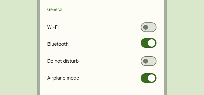
Selection controls allow the user to select options.
Switches toggle the state of a single setting on or off. They are the preferred way to adjust settings on mobile devices.
Contents
Design and API Documentation
Using switches
Before you can use Material switches, you need to add a dependency on the Material Components for Android library. For more information, go to the Getting started page.
Note: The MaterialSwitch widget provides a complete implementation of Material Design's switch component. It extends from the support library's SwitchCompat widget, but not from the framework Switch widget. As such, it does not auto-inflate, unlike other selection controls, and must be explicitly specified in layouts.
Use switches to:
- Toggle a single item on or off, on mobile and tablet
- Immediately activate or deactivate something
Making switches accessible
Switches support content labeling for accessibility and are readable by most screen readers, such as TalkBack. Text rendered in switches is automatically provided to accessibility services. Additional content labels are usually unnecessary.
Switch
A Switch represents a button with two states, on and off. Switches are most often used on mobile devices to enable and disable options in an options menu. A switch consists of a track and thumb; the thumb moves along the track to indicate its current state.
API and source code:
MaterialSwitch
Note: Since version 1.7.0, the new MaterialSwitch class will replace the obsolete SwitchMaterial class. In most cases you should be able to just replace all SwitchMaterial class reference with MaterialSwitch to achieve the default look and feel. Please refer to the following sections if you need to customize the new styles.
Note: For the old SwitchMaterial documentation, please refer to Switch (deprecated) and Theming switches (deprecated).
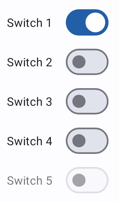
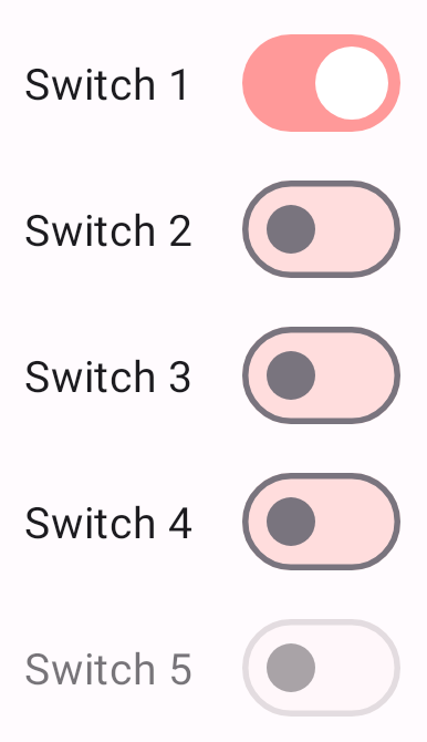
Switches example
The following example shows a list of five switches.
In the layout:
xml
<com.google.android.material.materialswitch.MaterialSwitch
    android:layout_width="wrap_content"
    android:layout_height="match_parent"
    android:checked="true"
    android:text="@string/label_1"/>
<com.google.android.material.materialswitch.MaterialSwitch
    android:layout_width="wrap_content"
    android:layout_height="match_parent"
    android:text="@string/label_2"/>
<com.google.android.material.materialswitch.MaterialSwitch
    android:layout_width="wrap_content"
    android:layout_height="match_parent"
    android:text="@string/label_3"/>
<com.google.android.material.materialswitch.MaterialSwitch
    android:layout_width="wrap_content"
    android:layout_height="match_parent"
    android:text="@string/label_4"/>
<com.google.android.material.materialswitch.MaterialSwitch
    android:layout_width="wrap_content"
    android:layout_height="match_parent"
    android:enabled="false"
    android:text="@string/label_5"/>
In code:
kt
// To check a switch
materialSwitch.isChecked = true

// To listen for a switch's checked/unchecked state changes
materialSwitch.setOnCheckedChangeListener { buttonView, isChecked
    // Responds to switch being checked/unchecked
}
Anatomy and key properties
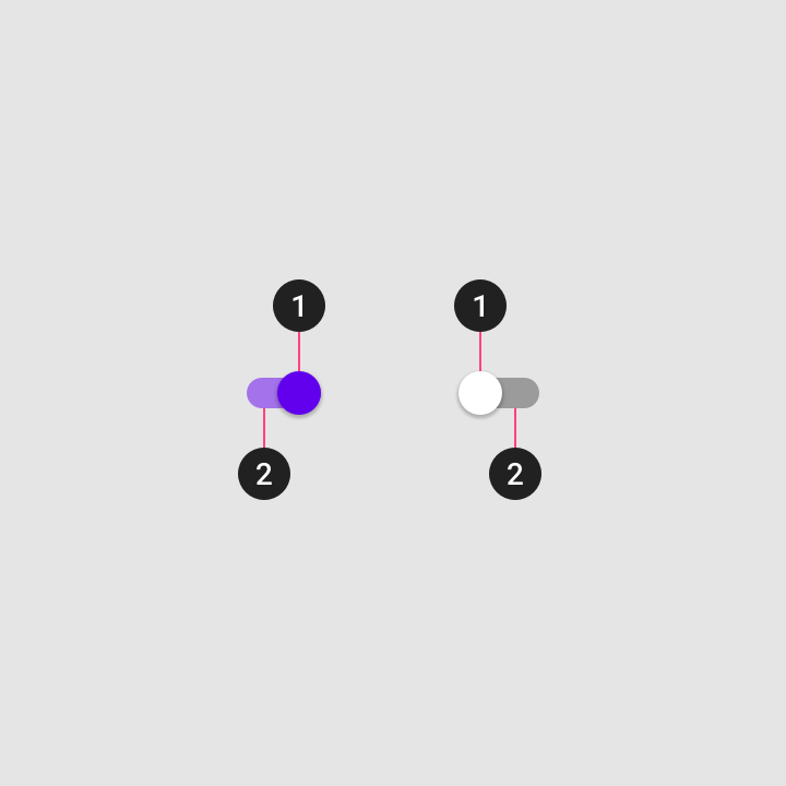
The following is an anatomy diagram that shows a switch thumb and a switch track:
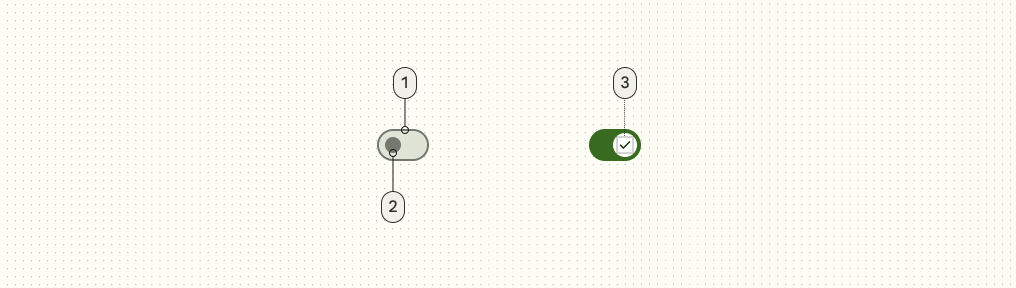
- Track
- Thumb
- Icon (optional)
Switch attributes
| Element | Attribute | Related method(s) | Default value |
|---|---|---|---|
| Min height | android:minHeight | setMinHeightgetMinHeight | ?attr/minTouchTargetSize |
Thumb attributes
| Element | Attribute | Related method(s) | Default value |
|---|---|---|---|
| Thumb | android:thumb | setThumbDrawablegetThumbDrawable | @drawable/mtrl_switch_thumb |
| Color | app:thumbTint | setThumbTintListgetThumbTintList | ?attr/colorOutline (unchecked)?attr/colorOnPrimary (checked) |
Icon attributes
You can add an optional icon to enhance the on/off indication of your custom switch by assigning app:thumbIcon. This icon will be centered and displayed on top of the thumb drawable.
| Element | Attribute | Related method(s) | Default value |
|---|---|---|---|
| Icon | app:thumbIcon | setThumbIconDrawablegetThumbIconDrawable | null |
| Size | app:thumbIconSize | setThumbIconSizegetThumbIconSize | 16dp |
| Color | app:thumbIconTint | setThumbIconTintListgetThumbIconTintList | ?attr/colorSurfaceContainerHighest (unchecked)?attr/colorOnPrimaryContainer (checked) |
Track attributes
| Element | Attribute | Related method(s) | Default value |
|---|---|---|---|
| Track | app:track | setTrackDrawablegetTrackDrawable | @drawable/mtrl_switch_track |
| Color | app:trackTint | setTrackTintListgetTrackTintList | ?attr/colorSurfaceContainerHighest (unchecked)?attr/colorPrimary (checked) |
| Decoration | app:trackDecoration | setTrackDecorationDrawablegetTrackDecorationDrawable | @drawable/mtrl_switch_track_decoration(Shows an outline of the track.) |
| Decoration color | app:trackDecorationTint | setTrackDecorationTintListgetTrackDecorationTintList | ?attr/colorOutline (unchecked)@android:color/transparent (checked) |
Text label attributes
| Element | Attribute | Related method(s) | Default value |
|---|---|---|---|
| Text label | android:text | setTextgetText | null |
| Color | android:textColor | setTextColorgetTextColors | ?android:attr/textColorPrimaryDisableOnly |
| Typography | android:textAppearance | setTextAppearance | ?attr/textAppearanceBodyMedium |
| Padding | app:switchPadding | setSwitchPaddinggetSwitchPadding | 16dp |
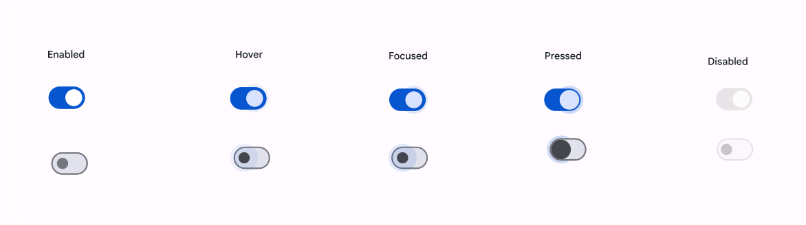
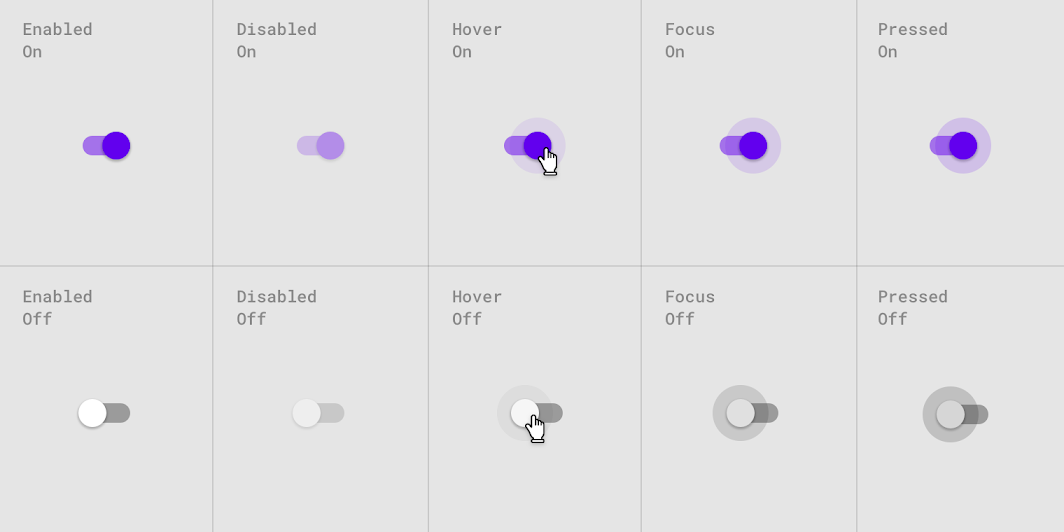
Switch states
Switches can be on or off. Switches have enabled, hover, focused, and pressed states.
Styles
| Element | Style |
|---|---|
| Default style | Widget.Material3.CompoundButton.MaterialSwitch |
Default style theme attribute: ?attr/materialSwitchStyle
See the full list of styles and attrs.
Theming switches
Switches support Material Theming, which can customize color and typography.
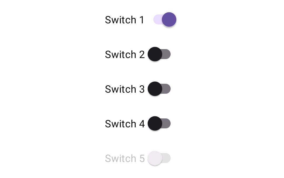
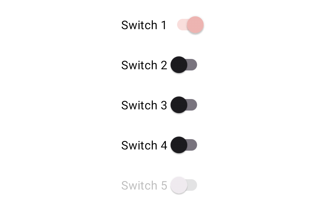
Switch theming example
The following example shows a list of switches with Material Theming.
Implementing switch theming
Use theme attributes in res/values/styles.xml, which applies to all switches and affects other components:
xml
<style name="Theme.App" parent="Theme.Material3.*">
    ...
    <item name="colorPrimary">@color/pink_200</item>
    <item name="colorSurfaceVariant">@color/pink_100</item>
</style>
Use default style theme attributes, styles and theme overlays, which apply to all switches but do not affect other components:
xml
<style name="Theme.App" parent="Theme.Material3.*">
    ...
    <item name="materialSwitchStyle">@style/Widget.App.Switch</item>
</style>

<style name="Widget.App.Switch" parent="Widget.Material3.CompoundButton.MaterialSwitch">
    <item name="materialThemeOverlay">@style/ThemeOverlay.App.Switch</item>
</style>

<style name="ThemeOverlay.App.Switch" parent="">
    <item name="colorPrimary">@color/pink_200</item>
    <item name="colorSurfaceVariant">@color/pink_100</item>
</style>
Use the styles in the layout, which affects only this switch:
xml
<com.google.android.material.materialswitch.MaterialSwitch
        ...
    style="@style/Widget.App.Switch"
    />
Switch (deprecated)
Switches example (deprecated)
API and source code:
SwitchMaterial
The following example shows a list of five switches.
In the layout:
xml
<com.google.android.material.switchmaterial.SwitchMaterial
    android:layout_width="wrap_content"
    android:layout_height="match_parent"
    android:checked="true"
    android:text="@string/label_1"/>
<com.google.android.material.switchmaterial.SwitchMaterial
    android:layout_width="wrap_content"
    android:layout_height="match_parent"
    android:text="@string/label_2"/>
<com.google.android.material.switchmaterial.SwitchMaterial
    android:layout_width="wrap_content"
    android:layout_height="match_parent"
    android:text="@string/label_3"/>
<com.google.android.material.switchmaterial.SwitchMaterial
    android:layout_width="wrap_content"
    android:layout_height="match_parent"
    android:text="@string/label_4"/>
<com.google.android.material.switchmaterial.SwitchMaterial
    android:layout_width="wrap_content"
    android:layout_height="match_parent"
    android:enabled="false"
    android:text="@string/label_5"/>
In code:
kt
// To check a switch
switchmaterial.isChecked = true

// To listen for a switch's checked/unchecked state changes
switchmaterial.setOnCheckedChangeListener { buttonView, isChecked
    // Responds to switch being checked/unchecked
}
Anatomy and key properties (deprecated)
The following is an anatomy diagram that shows a switch thumb and a switch track:
- Thumb
- Track
Switch attributes (deprecated)
| Element | Attribute | Related method(s) | Default value |
|---|---|---|---|
| To use material colors | app:useMaterialThemeColors | setUseMaterialThemeColorsisUseMaterialThemeColors | true (ignored if specific tint attrs are set) |
| Min size | android:minWidthandroid:minHeight | (set/get)MinWidth(set/get)MinHeight | ?attr/minTouchTargetSize |
The color of the switch defaults to using ?attr/colorPrimary, ?attr/colorPrimaryContainer, ?attr/colorOnSurface, and ?attr/colorOutline defined in your app theme. If you want to override this behavior, as you might with a custom drawable that should not be tinted, set app:useMaterialThemeColors to false:
xml
<com.google.android.material.switchmaterial.SwitchMaterial
        ...
    app:useMaterialThemeColors="false"
    />
Thumb attributes (deprecated)
| Element | Attribute | Related method(s) | Default value |
|---|---|---|---|
| Thumb | android:thumb | setThumbDrawablegetThumbDrawable | inherits from SwitchCompat |
| Color | app:thumbTint | setThumbTintListgetThumbTintList | ?attr/colorOnSurface (unchecked)?attr/colorPrimary (checked) |
| Elevation | N/A | N/A | 4dp |
Track attributes (deprecated)
| Element | Attribute | Related method(s) | Default value |
|---|---|---|---|
| Track | app:track | setTrackDrawablegetTrackDrawable | inherits from SwitchCompat |
| Color | app:trackTint | setTrackTintListgetTrackTintList | ?attr/colorOutline (unchecked)?attr/colorPrimaryContainer (checked) |
Text label attributes (deprecated)
| Element | Attribute | Related method(s) | Default value |
|---|---|---|---|
| Text label | android:text | setTextgetText | null |
| Color | android:textColor | setTextColorgetTextColors | ?android:attr/textColorPrimaryDisableOnly |
| Typography | android:textAppearance | setTextAppearance | ?attr/textAppearanceBodyMedium |
Switch states (deprecated)
Switches can be on or off. Switches have enabled, hover, focused, and pressed states.
Display the outer radial reaction only on form factors that use touch, where interaction may obstruct the element completely.
For desktop, the radial reaction isn't needed.
Styles (deprecated)
| Element | Style |
|---|---|
| Default style | Widget.Material3.CompoundButton.Switch |
Default style theme attribute: ?attr/switchStyle
See the full list of styles and attrs.
Theming switches (deprecated)
Switches support Material Theming, which can customize color and typography.
Switch theming example (deprecated)
API and source code:
SwitchMaterial
The following example shows a list of switches with Material Theming.
Implementing switch theming (deprecated)
Use theme attributes in res/values/styles.xml, which applies to all switches and affects other components:
xml
<style name="Theme.App" parent="Theme.Material3.*">
    ...
    <item name="colorPrimaryContainer">@color/pink_100</item>
    <item name="colorPrimary">@color/pink_200</item>
</style>
Use default style theme attributes, styles and theme overlays, which apply to all switches but do not affect other components:
xml
<style name="Theme.App" parent="Theme.Material3.*">
    ...
    <item name="switchStyle">@style/Widget.App.Switch</item>
</style>

<style name="Widget.App.Switch" parent="Widget.Material3.CompoundButton.Switch">
    <item name="materialThemeOverlay">@style/ThemeOverlay.App.Switch</item>
</style>

<style name="ThemeOverlay.App.Switch" parent="">
    <item name="colorPrimaryContainer">@color/pink_100</item>
    <item name="colorPrimary">@color/pink_200</item>
</style>
Use the styles in the layout, which affects only this switch:
xml
<com.google.android.material.switchmaterial.SwitchMaterial
        ...
    style="@style/Widget.App.Switch"
    />