Appearance
Selection controls: checkboxes
Selection controls allow the user to select options.
Use checkboxes to:
- Select one or more options from a list
- Present a list containing sub-selections
- Turn an item on or off in a desktop environment
Contents
Design and API Documentation
Using checkboxes
Before you can use Material checkboxes, you need to add a dependency to the Material Components for Android library. For more information, go to the Getting started page.
xml
<CheckBox
    android:layout_width="match_parent"
    android:layout_height="wrap_content"
    android:text="@string/label"/>
Note: <CheckBox> is auto-inflated as <com.google.android.material.button.MaterialCheckBox> via MaterialComponentsViewInflater when using a Theme.Material3.* theme.
Making checkboxes accessible
Checkboxes support content labeling for accessibility and are readable by most screen readers, such as TalkBack. Text rendered in check boxes is automatically provided to accessibility services. Additional content labels are usually unnecessary.
Checking a checkbox
In the layout:
xml
<CheckBox
    ...
    android:checked="true"/>
In code:
kt
// To check a checkbox
checkbox.isChecked = true

// To listen for a checkbox's checked/unchecked state changes
checkbox.setOnCheckedChangeListener { buttonView, isChecked ->
    // Responds to checkbox being checked/unchecked
}

// Alternatively, you can check a checkbox via setCheckedState
checkBox.setCheckedState(MaterialCheckbox.STATE_CHECKED);

// To uncheck:
checkBox.setCheckedState(MaterialCheckbox.STATE_UNCHECKED);

// And to listen for changes:
checkbox.addOnCheckedStateChangedListener { checkBox, state ->
  // Responds to when the checkbox changes state.
}
Setting the error state on checkbox
In the layout:
xml
<CheckBox
    ...
    app:errorShown="true"/>
In code:
kt
// Set error.
checkbox.errorShown = true

// Optional listener:
checkbox.addOnErrorChangedListener { checkBox, errorShown ->
    // Responds to when the checkbox enters/leaves error state
}

// To set a custom accessibility label:
checkbox.errorAccessibilityLabel = "Error: custom error announcement."
Making a checkbox indeterminate
In the layout:
xml
<CheckBox
    ...
    app:checkedState="indeterminate"/>
In code:
kt
// You can set the state of the checkbox (STATE_CHECKED, STATE_UNCHECKED,
// or STATE_INDETERMINATE) via setCheckedState.
checkBox.setCheckedState(MaterialCheckbox.STATE_INDETERMINATE);

// Checkbox state listener.
checkbox.addOnCheckedStateChangedListener { checkBox, state ->
  // Responds to when the checkbox changes state.
}
Checkbox
A checkbox is a square button with a check to denote its current state. Checkboxes allow the user to select one or more items from a set. Checkboxes can be used to turn an option on or off. Unlike radio buttons, changes in the states of one checkbox do not usually affect other checkboxes.
Note: Checkboxes do not support shape theming and are only rounded square checkboxes.
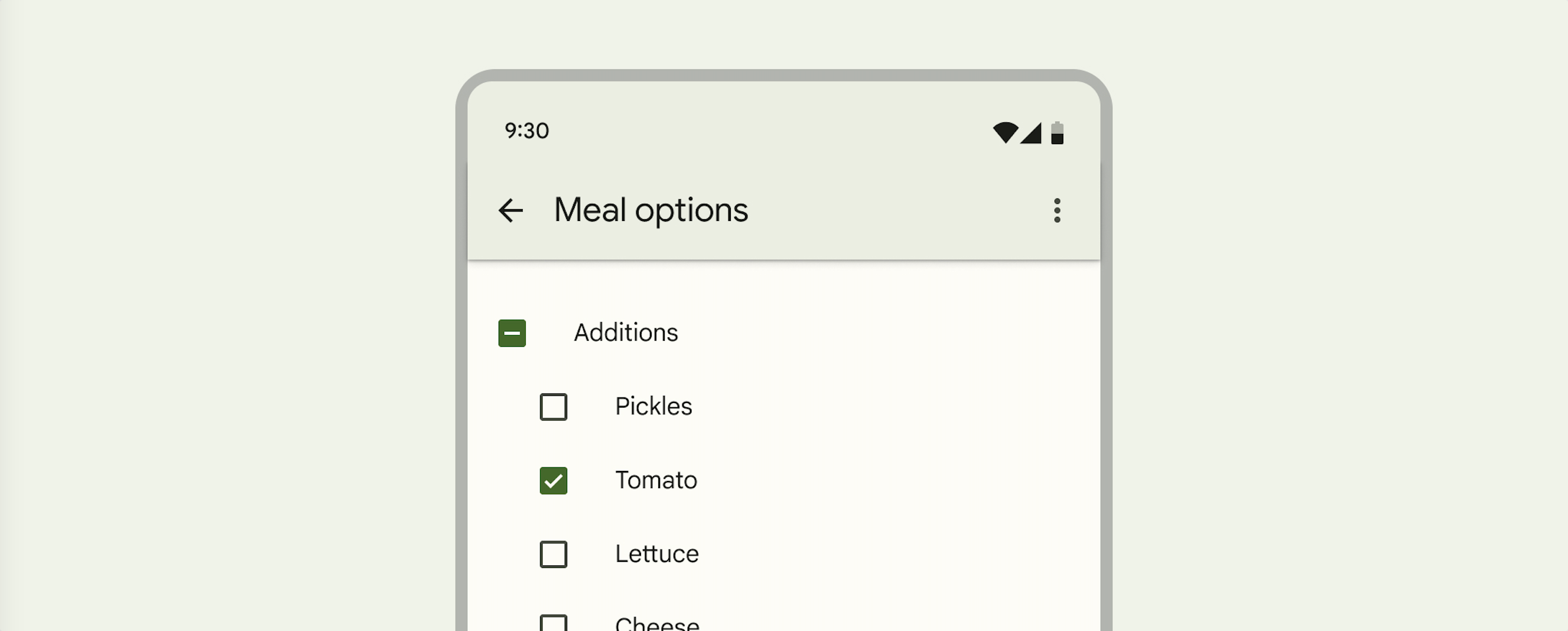
Checkboxes example
API and source code:
MaterialCheckBox
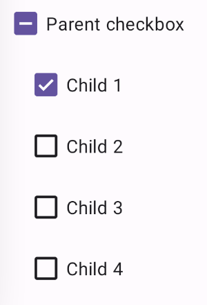
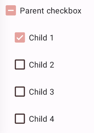
The following example shows a list of checkboxes with a parent/children relationship.
The first checkbox (the parent) will be checked if all children are checked, unchecked if all of the children are unchecked, and indeterminate if only some of the children are checked.
In the layout:
xml
<CheckBox
    android:id="@+id/checkbox_parent"
    android:layout_width="match_parent"
    android:layout_height="wrap_content"
    app:checkedState="indeterminate"
    android:text="@string/label_parent"/>

<LinearLayout
    android:id="@+id/checkbox_container"
    android:layout_width="match_parent"
    android:layout_height="wrap_content"
    android:layout_marginStart="@dimen/checkbox_margin"
    android:orientation="vertical">

  <CheckBox
      android:id="@+id/checkbox_child_1"
      android:layout_width="match_parent"
      android:layout_height="wrap_content"
      android:text="@string/label_child_1"/>

  <CheckBox
      android:id="@+id/checkbox_child_2"
      android:layout_width="match_parent"
      android:layout_height="wrap_content"
      android:text="@string/label_child_2"/>

  <CheckBox
      android:id="@+id/checkbox_child_3"
      android:layout_width="match_parent"
      android:layout_height="wrap_content"
      android:text="@string/label_child_3"/>


  <CheckBox
      android:id="@+id/checkbox_child_4"
      android:layout_width="match_parent"
      android:layout_height="wrap_content"
      android:text="@string/label_child_4"/>

</LinearLayout>
In code:
kt
// Class variable
private var isUpdatingChildren = false

...

// Parent's checked state changed listener
val parentOnCheckedStateChangedListener =
  OnCheckedStateChangedListener { checkBox: MaterialCheckBox, state: Int ->
    val isChecked = checkBox.isChecked
    if (state != MaterialCheckBox.STATE_INDETERMINATE) {
      isUpdatingChildren = true
      for (child in childrenCheckBoxes) {
        child.isChecked = isChecked
      }
      isUpdatingChildren = false
    }
  }
checkBoxParent.addOnCheckedStateChangedListener(parentOnCheckedStateChangedListener)

// Checked state changed listener for each child
val childOnCheckedStateChangedListener =
  OnCheckedStateChangedListener { checkBox: MaterialCheckBox?, state: Int ->
    if (!isUpdatingChildren) {
      setParentState(checkBoxParent, childrenCheckBoxes, parentOnCheckedStateChangedListener)
    }
  }
for (child in childrenCheckBoxes) {
  (child as MaterialCheckBox)
    .addOnCheckedStateChangedListener(childOnCheckedStateChangedListener)
}

// Set first child to be checked
firstChild.isChecked = true
// Set parent's state
setParentState(checkBoxParent, childrenCheckBoxes, parentOnCheckedStateChangedListener)

...

private fun setParentState(
  checkBoxParent: MaterialCheckBox,
  childrenCheckBoxes: List<CheckBox>,
  parentOnCheckedStateChangedListener: OnCheckedStateChangedListener
) {
  val checkedCount = childrenCheckBoxes.stream().filter { obj: CheckBox -> obj.isChecked }
    .count()
    .toInt()
  val allChecked = checkedCount == childrenCheckBoxes.size
  val noneChecked = checkedCount == 0
  checkBoxParent.removeOnCheckedStateChangedListener(parentOnCheckedStateChangedListener)
  if (allChecked) {
    checkBoxParent.isChecked = true
  } else if (noneChecked) {
    checkBoxParent.isChecked = false
  } else {
    checkBoxParent.checkedState = MaterialCheckBox.STATE_INDETERMINATE
  }
  checkBoxParent.addOnCheckedStateChangedListener(parentOnCheckedStateChangedListener)
}
Anatomy and key properties
The following is an anatomy diagram that shows a checkbox container and icon:

- Container
- Icon
Checkbox attributes
The checkbox is composed of an app:buttonCompat drawable (the container) and an app:buttonIcon drawable (the icon) layered on top of it.
| Element | Attribute | Related method(s) | Default value |
|---|---|---|---|
| Button tint | app:buttonTint | setButtonTintListgetButtonTintList | ?attr/colorOnSurface (see all states) |
| Button icon drawable | app:buttonIcon | setButtonIconDrawablegetButtonIconDrawable | @mtrl_checkbox_button_icon |
| Button icon tint | app:buttonIconTint | setButtonIconTintListgetButtonIconTintList | ?attr/colorOnPrimary (see all states) |
| Min size | android:minWidthandroid:minHeight | (set/get)MinWidth(set/get)MinHeight | ?attr/minTouchTargetSize |
| Centered icon if no text | app:centerIfNoTextEnabled | setCenterIfNoTextEnabledisCenterIfNoTextEnabled | true |
Note: If setting a custom app:buttonCompat, make sure to also set app:buttonIcon if an icon is desired. The checkbox does not support having a custom app:buttonCompat and preserving the default app:buttonIcon checkmark at the same time.
Text label attributes
| Element | Attribute | Related method(s) | Default value |
|---|---|---|---|
| Text label | android:text | setTextgetText | null |
| Color | android:textColor | setTextColorgetTextColors | inherits from AppCompatCheckBox |
| Typography | android:textAppearance | setTextAppearance | ?attr/textAppearanceBodyMedium |
Checkbox states
Checkboxes can be selected, unselected, or indeterminate, and those states on error. Checkboxes have enabled, disabled, hover, focused, and pressed states.
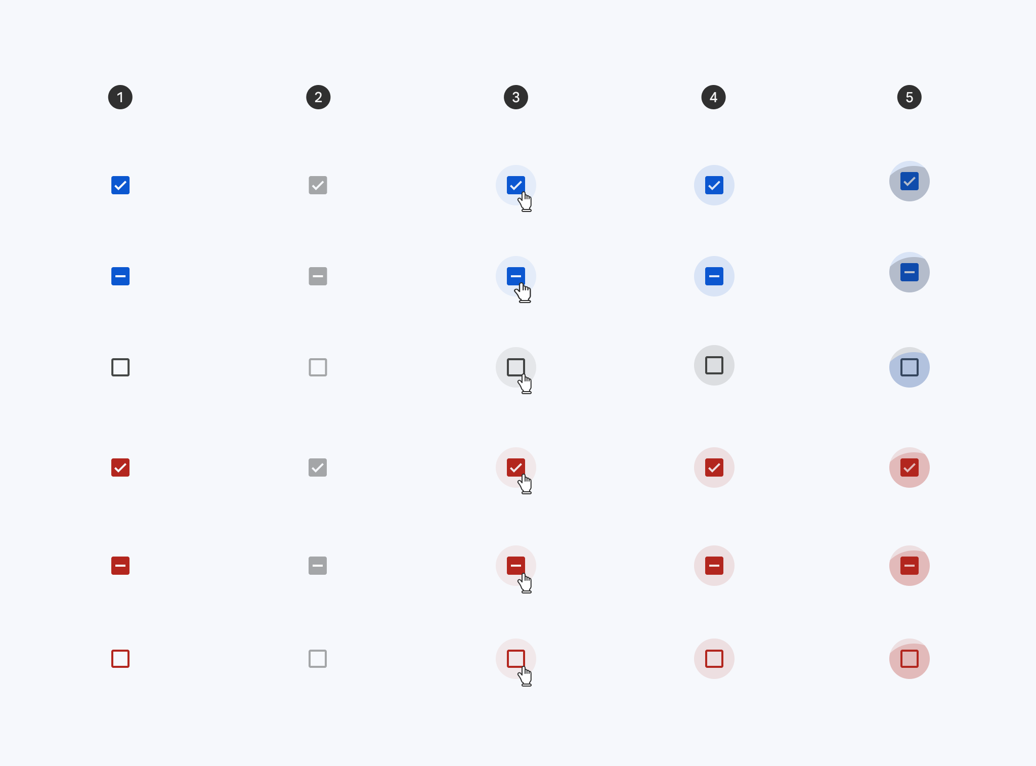
- Enabled
- Disabled
- Hover
- Focused
- Pressed
Styles
| Element | Style |
|---|---|
| Default style | Widget.Material3.CompoundButton.CheckBox |
Default style theme attribute: ?attr/checkboxStyle
See the full list of styles and attrs.
Theming checkboxes
Checkboxes support Material Theming which can customize color and typography.
Checkbox theming example
API and source code:
MaterialCheckBox
The following example shows a checkbox with Material Theming.
Implementing checkbox theming
Use theme attributes in res/values/styles.xml, which adds a theme to all checkboxes and affects other components:
xml
<style name="Theme.App" parent="Theme.Material3.*">
    ...
    <item name="colorOnSurface">@color/shrine_on_surface</item>
    <item name="colorPrimary">@color/shrine_primary</item>
    <item name="colorSurface">@color/shrine_surface</item>
    <item name="colorOnPrimary">@color/shrine_on_primary</item>
</style>
Use default style theme attributes, styles and theme overlays, which will add a theme to all checkboxes but does not affect other components:
xml
<style name="Theme.App" parent="Theme.Material3.*">
    ...
    <item name="checkboxStyle">@style/Widget.App.CheckBox</item>
</style>

<style name="Widget.App.CheckBox" parent="Widget.Material3.CompoundButton.CheckBox">
    <item name="materialThemeOverlay">@style/ThemeOverlay.App.CheckBox</item>
</style>

<style name="ThemeOverlay.App.CheckBox" parent="">
    <!-- Container colors -->
    <item name="colorOnSurface">@color/shrine_on_surface</item>
    <item name="colorPrimary">@color/shrine_primary</item>
    <item name="colorError">@color/shrine_error</item>
    <!-- Icon colors -->
    <item name="colorSurface">@color/shrine_surface</item>
    <item name="colorOnPrimary">@color/shrine_on_primary</item>
    <item name="colorOnError">@color/shrine_on_error</item>
</style>
You can also change the checkbox colors via the ?attr/buttonTint and ?attr/buttonIconTint attributes:
xml
<style name="Widget.App.CheckBox" parent="Widget.Material3.CompoundButton.CheckBox">
   <item name="buttonTint">@color/button_tint</item>
   <item name="buttonIconTint">@color/button_icon_tint</item>
</style>
in color/button_tint.xml:
xml
<selector xmlns:android="http://schemas.android.com/apk/res/android">
  <item android:alpha="0.38" android:color="@color/shrine_on_surface" android:state_enabled="false"/>
  <item android:color="@color/shrine_error" app:state_error="true"/>
  <item android:color="@color/shrine_primary" app:state_indeterminate="true"/>
  <item android:color="@color/shrine_primary" android:state_checked="true"/>
</selector>
an in color/button_icon_tint.xml:
xml
<selector xmlns:android="http://schemas.android.com/apk/res/android">
  <item android:color="@color/shrine_surface" android:state_enabled="false"/>
  <item android:color="@color/shrine_on_error" app:state_error="true"/>
  <item android:color="@color/shrine_on_primary" app:state_indeterminate="true"/>
  <item android:color="@color/shrine_on_primary" android:state_checked="true"/>
</selector>
Use the styles in the layout. That affects only this checkbox:
xml
<CheckBox
        ...
    style="@style/Widget.App.CheckBox"
    />