Appearance
Snackbars
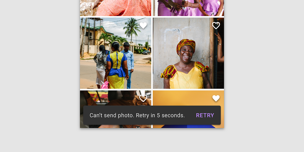
Snackbars provide brief messages about app processes at the bottom of the screen.

Contents
Design and API Documentation
Using snackbars
Before you can use Material snackbars, you need to add a dependency to the Material Components for Android library. For more information, go to the Getting started page.
The Snackbar class provides static make methods to produce a snackbar configured in the desired way. These methods take a View, which will be used to find a suitable ancestor ViewGroup to display the snackbar, a text string to display, and a duration to display the snackbar. A suitable ancestor ViewGroup will be either the nearest CoordinatorLayout to the View passed in, or the root DecorView if none could be found.
Available duration presets are:
LENGTH_INDEFINITE(Show the snackbar until it's either dismissed or another snackbar is shown)LENGTH_LONG(Show the snackbar for a long period of time)LENGTH_SHORT(Show the snackbar for a short period of time)
Note: Snackbars work best if they are displayed inside of a CoordinatorLayout, which allows the snackbar to enable behavior like swipe-to-dismiss.
Making snackbars accessible
Snackbars support content labeling for accessibility and are readable by most screen readers, such as TalkBack. Text rendered in snackbars is automatically provided to accessibility services. Additional content labels are usually unnecessary.
Showing a snackbar
Calling make creates the snackbar, but doesn't cause it to be visible on the screen. To show it, use the show method on the returned Snackbar instance.
Note: Only one snackbar will be shown at a time. Showing a new snackbar will dismiss any previous ones first.
To show a snackbar with a message and no action:
kt
// The view used to make the snackbar.
// This should be contained within the view hierarchy where you want to display
// the snackbar. Generally it can be the view that triggered the snackbar,
// such as a button that was clicked, or a card that was swiped.
val contextView = findViewById<View>(R.id.context_view)

Snackbar.make(contextView, R.string.text_label, Snackbar.LENGTH_SHORT)
    .show()
Adding an action
To add an action, use the setAction method on the object returned from make. Snackbars are automatically dismissed when the action is clicked.
To show a snackbar with a message and an action:
kt
Snackbar.make(contextView, R.string.text_label, Snackbar.LENGTH_LONG)
    .setAction(R.string.action_text) {
        // Responds to click on the action
    }
    .show()
Anchoring a snackbar
By default, Snackbars will be anchored to the bottom edge of their parent view. However, you can use the setAnchorView method to make a Snackbar appear above a specific view within your layout, for example a FloatingActionButton.
kt
Snackbar.make(...)
    .setAnchorView(fab)
    ...
This is especially helpful if you would like to place a Snackbar above navigational elements at the bottom of the screen, such as a BottomAppBar or BottomNavigationView.
Related concepts
Temporary bottom bars can be implemented with other sorts of content layouts by subclassing BaseTransientBottomBar.
Android also provides a Toast class with a similar API that can be used for displaying system-level notifications. Generally, snackbars are the preferred mechanism for displaying feedback messages to users, because they can be displayed in the context of the UI where the action occurred. Reserve Toast for cases where this cannot be done.
Snackbar
Snackbars inform users of a process that an app has performed or will perform. They appear temporarily, towards the bottom of the screen. They shouldn’t interrupt the user experience, and they don’t require user input to disappear. They disappear either after a timeout or after a user interaction elsewhere on the screen, but can also be swiped off the screen.
Snackbars can also offer the ability to perform an action, such as undoing an action that was just taken, or retrying an action that had failed.
Snackbars example
API and source code:
Snackbar
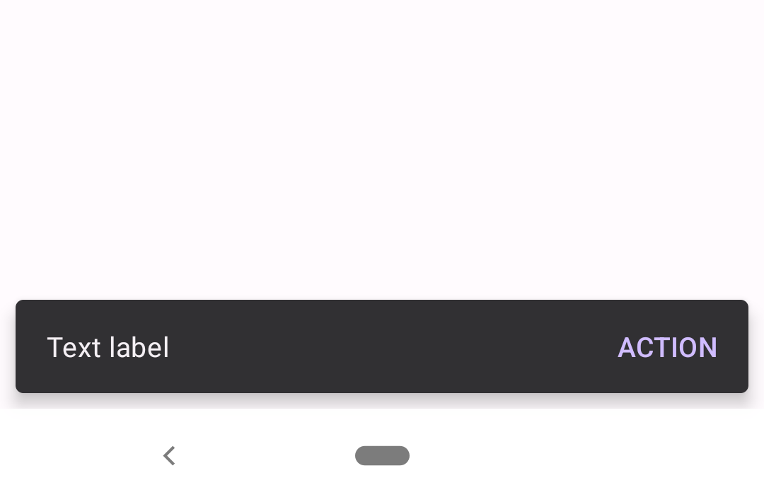
The following is an example of a snackbar with an action button:

In code:
kt
Snackbar.make(contextView, "Text label", Snackbar.LENGTH_LONG)
    .setAction("Action") {
        // Responds to click on the action
    }
    .show()
Anatomy and key properties
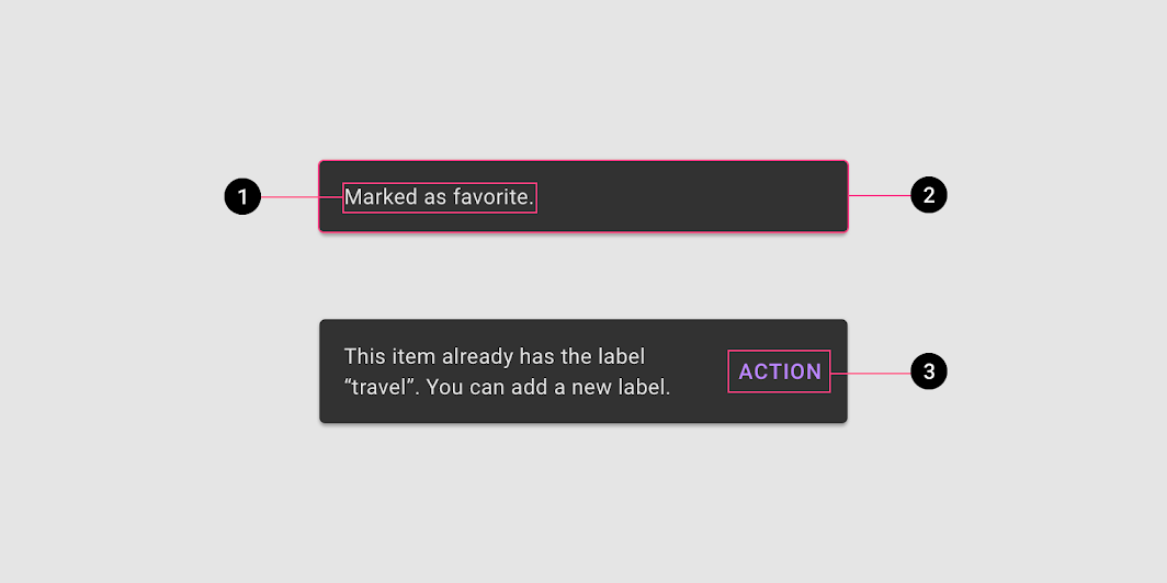
The following is an anatomy diagram of a snackbar:

- Text label
- Container
- Action (optional)
Text label attributes
| Element | Attribute | Related method(s) | Default value |
|---|---|---|---|
| Text label style | N/A | N/A | ?attr/snackbarTextViewStyle |
| Text label | android:text | setText | null |
| Color | android:textColor | setTextColor | ?attr/colorOnSurfaceInverse |
| Typography | android:textAppearance | N/A | ?attr/textAppearanceBodyMedium |
Container attributes
| Element | Attribute | Related method(s) | Default value |
|---|---|---|---|
| Color | app:backgroundTint | setBackgroundTintsetBackgroundTintList | ?attr/colorSurfaceInverse |
| Color overlay alpha | app:backgroundOverlayColorAlpha | N/A | 0.8f (ignored if app:backgroundTint is set) |
| Shape | app:shapeAppearanceapp:shapeAppearanceOverlay | N/A | ?attr/shapeAppearanceCornerExtraSmall |
| Margin | android:layout_margin | N/A | 8dp |
| Elevation | app:elevation | N/A | 6dp |
| Animation mode | app:animationMode | setAnimationModegetAnimationMode | fade |
Action attributes
| Element | Attribute | Related method(s) | Default value |
|---|---|---|---|
| Button style | N/A | N/A | ?attr/snackbarButtonStyle |
| Text color alpha | app:actionTextColorAlpha | N/A | 1.0f |
| Text Color | android:textColor | setTextActionColor | ?attr/colorPrimaryInverse |
Styles
| Element | Theme attribute | Default value |
|---|---|---|
| Default style | ?attr/snackbarStyle | @style/Widget.Material3.Snackbar |
| Action button style | ?attr/snackbarButtonStyle | @style/Widget.Material3.Button.TextButton.Snackbar |
| Text label style | ?attr/snackbarTextViewStyle | @style/Widget.Material3.Snackbar.TextView |
See the full list of styles and attrs.
Theming snackbars
Snackbars support Material Theming which can customize color and typography.
Snackbar theming example
API and source code:
Snackbar
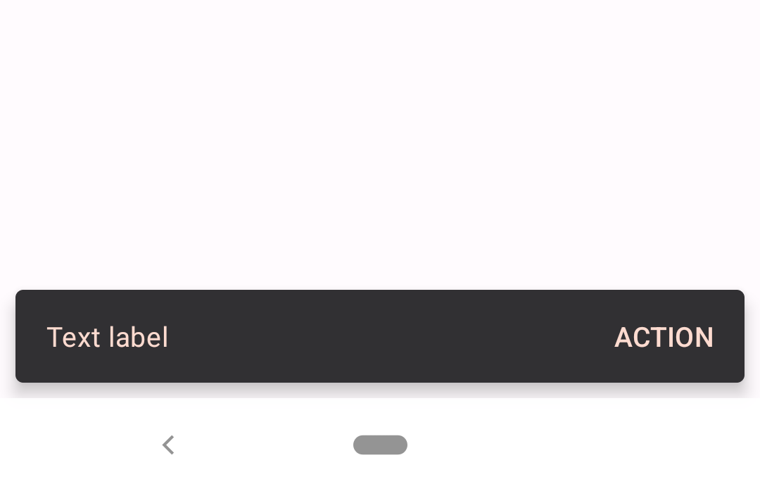
The following is an example of a snackbar with an action button that uses the Material.io Shrine color theming:

Implementing snackbar theming
Use theme attributes in res/values/styles.xml to style all snackbars. This will affect other components:
xml
<style name="Theme.App" parent="Theme.Material3.*">
    ...
    <item name="colorPrimaryInverse">@color/shrine_pink_100</item>
    <item name="colorOnSurfaceInverse">@color/shrine_pink_100</item>
</style>
Use default style theme attributes, styles and theme overlays to style all snackbars. This will not affect other components:
xml
<style name="Theme.App" parent="Theme.Material3.*">
    ...
    <item name="snackbarStyle">@style/Widget.App.Snackbar</item>
    <item name="snackbarButtonStyle">@style/Widget.App.SnackbarButton</item>
</style>

<style name="Widget.App.Snackbar" parent="Widget.Material3.Snackbar">
    <item name="materialThemeOverlay">@style/ThemeOverlay.App.Snackbar</item>
  </style>

<style name="Widget.App.SnackbarButton" parent="Widget.Material3.Button.TextButton.Snackbar">
    <item name="android:textColor">@color/shrine_pink_100</item>
</style>

<style name="ThemeOverlay.App.Snackbar" parent="">
    <item name="colorPrimaryInverse">@color/shrine_pink_100</item>
    <item name="colorOnSurfaceInverse">@color/shrine_pink_100</item>
</style>
Set style attributes in code, which only affects this snackbar:
kt
Snackbar.make(contextView, "Text label", Snackbar.LENGTH_LONG)
    .setAction("Action") {
        // Responds to click on the action
    }
    .setBackgroundTint(resources.getColor(R.color.backgroundTint))
    .setActionTextColor(resources.getColor(R.color.actionTextColor))
    .show()
Set in values/colors.xml:
xml
<color name="backgroundTint">@color/shrine_pink_900</color>
<color name="actionTextColor">@color/shrine_pink_100</color>