Appearance
Selection controls: radio buttons
Selection controls allow the user to select options.
Use radio buttons to:
- Select a single option from a list
- Expose all available options
- If available options can be collapsed, consider using a dropdown menu instead, as it uses less space.
Contents
Design and API Documentation
Using radio buttons
Before you can use Material radio buttons, you need to add a dependency to the Material Components for Android library. For more information, go to the Getting started page.
Note: <RadioButton> is auto-inflated as <com.google.android.material.button.MaterialRadioButton> via MaterialComponentsViewInflater when using a Theme.Material3.* theme.
Making radio buttons accessible
Radio buttons support content labeling for accessibility and are readable by most screen readers, such as TalkBack. Text rendered in radio buttons is automatically provided to accessibility services. Additional content labels are usually unnecessary.
Grouping radio buttons
Changes in the states of one radio button can affect other buttons in the group. Specifically, selecting a RadioButton in a RadioGroup will de-select all other buttons in that group. See the example section below for implementation details.
Radio button
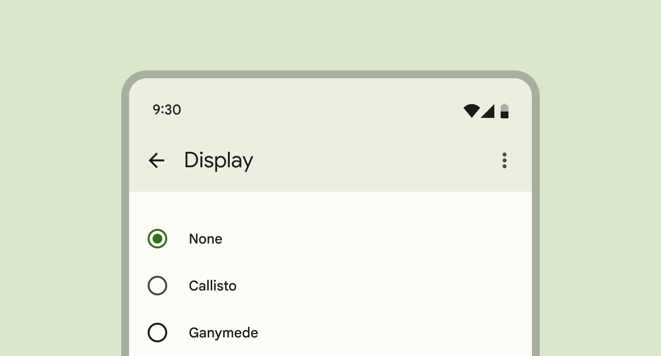
A radio button is a circle that is filled in with an inset when selected. Radio buttons allow the user to select one option from a set. Use radio buttons when the user needs to see all available options. If available options can be collapsed, consider using a dropdown menu because it uses less space.
API and source code:
MaterialRadioButtonRadioGroup
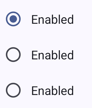
Radio buttons example
The following example shows a radio button group with three radio buttons.
In the layout:
xml
<RadioGroup
    android:checkedButton="@+id/enabled_selected"
    android:layout_width="match_parent"
    android:layout_height="wrap_content">
    <RadioButton
        android:id="@+id/enabled_selected"
        android:layout_width="match_parent"
        android:layout_height="match_parent"
        android:enabled="true"
        android:paddingStart="@dimen/padding_start"
        android:text="@string/radiobutton_text"/>
    <RadioButton
        android:layout_width="match_parent"
        android:layout_height="match_parent"
        android:checked="false"
        android:enabled="true"
        android:paddingStart="@dimen/padding_start"
        android:text="@string/radiobutton_text"/>
    <RadioButton
        android:layout_width="match_parent"
        android:layout_height="match_parent"
        android:checked="false"
        android:enabled="true"
        android:paddingStart="@dimen/padding_start"
        android:text="@string/radiobutton_text"/>
</RadioGroup>
In code:
kt
val checkedRadioButtonId = radioGroup.checkedRadioButtonId // Returns View.NO_ID if nothing is checked.
radioGroup.setOnCheckedChangeListener { group, checkedId ->
    // Responds to child RadioButton checked/unchecked
}

// To check a radio button
radioButton.isChecked = true

// To listen for a radio button's checked/unchecked state changes
radioButton.setOnCheckedChangeListener { buttonView, isChecked
    // Responds to radio button being checked/unchecked
}
Key properties
Radio button attributes
| Element | Attribute | Related method(s) | Default value |
|---|---|---|---|
| To use material colors | app:useMaterialThemeColors | setUseMaterialThemeColorsisUseMaterialThemeColors | true (ignored if app:buttonTint is set) |
| Color | app:buttonTint | setButtonTintListgetButtonTintList | ?attr/colorOnSurface (see all states) |
| Min size | android:minWidthandroid:minHeight | (set/get)MinWidth(set/get)MinHeight | ?attr/minTouchTargetSize |
The color of the radio button defaults to ?attr/colorOnSurface (unchecked) and ?attr/colorPrimary (checked) defined in your app theme. If you want to override this behavior, you could use a custom drawable that should not be tinted, set app:useMaterialThemeColors to false:
xml
<RadioButton
    ...
    app:useMaterialThemeColors="false"
/>
Text label attributes
| Element | Attribute | Related method(s) | Default value |
|---|---|---|---|
| Text label | android:text | setTextgetText | null |
| Color | android:textColor | setTextColorgetTextColors | inherits from AppCompatRadioButton |
| Typography | android:textAppearance | setTextAppearance | ?attr/textAppearanceBodyMedium |
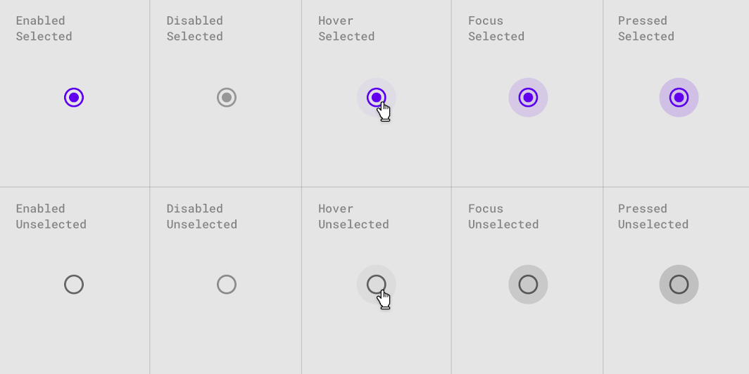
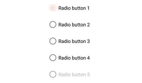
Radio button states
Radio buttons can be selected or unselected. Radio buttons have enabled, disabled, hover, focused, and pressed states.
Styles
| Element | Style |
|---|---|
| Default style | Widget.Material3.CompoundButton.RadioButton |
Default style theme attribute: ?attr/radioButtonStyle
See the full list of styles and attrs.
Theming radio buttons
Radio buttons support Material Theming which can customize color and typography.
Radio button theming example
API and source code:
MaterialRadioButtonRadioGroup
The following example shows a radio button with Material Theming.
Implementing radio button theming
Use theme attributes in res/values/styles.xml which applies to all radio buttons and affects other components:
xml
<style name="Theme.App" parent="Theme.Material3.*">
    ...
    <item name="colorOnSurface">@color/shrine_pink_900</item>
    <item name="colorPrimary">@color/shrine_pink_100</item>
</style>
Use default style theme attributes, styles and theme overlays which apply to all radio buttons but do not affect other components:
xml
<style name="Theme.App" parent="Theme.Material3.*">
    ...
    <item name="radioButtonStyle">@style/Widget.App.RadioButton</item>
</style>

<style name="Widget.App.RadioButton" parent="Widget.Material3.CompoundButton.RadioButton">
    <item name="materialThemeOverlay">@style/ThemeOverlay.App.RadioButton</item>
</style>

<style name="ThemeOverlay.App.RadioButton" parent="">
    <item name="colorOnSurface">@color/shrine_pink_900</item>
    <item name="colorPrimary">@color/shrine_pink_100</item>
</style>
You can also change the radio button colors via the ?attr/buttonTint attribute:
xml
<style name="Widget.App.RadioButton" parent="Widget.Material3.CompoundButton.RadioButton">
    <item name="buttonTint">@color/button_tint</item>
</style>
and in color/button_tint.xml:
xml
<selector xmlns:android="http://schemas.android.com/apk/res/android">
    <item android:color="@color/shrine_pink_900" android:state_checked="true"/>
    <item android:alpha="0.38" android:color="@color/shrine_pink_100" android:state_enabled="false"/>
    <item android:color="@color/shrine_pink_100"/>
</selector>
You can use the styles in the layout, which affects only this radio button:
xml
<RadioButton
    ...
    style="@style/Widget.App.RadioButton"
/>