Appearance
Menus
Menus display a list of choices on temporary surfaces.

Contents
Design and API Documentation
Using menus
A menu displays a list of choices on a temporary surface. They appear when users interact with a button, action, or other control.
Before you can use Material menus, you need to add a dependency to the Material Components for Android library. For more information, go to the Getting started page.
A typical menu resource looks like this:
xml
<?xml version="1.0" encoding="utf-8"?>
<menu xmlns:android="http://schemas.android.com/apk/res/android">
    <item android:id="@+id/option_1"
          android:title="@string/option_1" />
    <item android:id="@+id/option_2"
          android:title="@string/option_2" />
    <item android:id="@+id/option_3"
          android:title="@string/option_3" />
</menu>
A typical exposed dropdown menu looks like this:
xml
<com.google.android.material.textfield.TextInputLayout
    android:id="@+id/menu"
    style="@style/Widget.Material3.TextInputLayout.FilledBox.ExposedDropdownMenu"
    android:layout_width="match_parent"
    android:layout_height="wrap_content"
    android:hint="@string/label">

    <AutoCompleteTextView
        android:layout_width="match_parent"
        android:layout_height="wrap_content"
        android:inputType="none"
    />

</com.google.android.material.textfield.TextInputLayout>
See the dropdown menus and exposed dropdown menus sections for detailed usage information.
Making menus accessible
Menus are readable by most screen readers, such as TalkBack. Text rendered in menus is automatically provided to accessibility services. Additional content labels are usually unnecessary.
Android's exposed dropdown menu component APIs support both label text and helper text, which tell the user what information is requested for a menu. While optional, their use is strongly encouraged. For more information about this component's accessibility, check out the text field's a11y section.
Types
Menus allow users to make a selection from multiple options. They are less prominent and take up less space than selection controls, such as a set of radio buttons.
There are two types of menus: 1. Dropdown menus (overflow, context, popup, and list popup window menus), 2. Exposed dropdown menus.
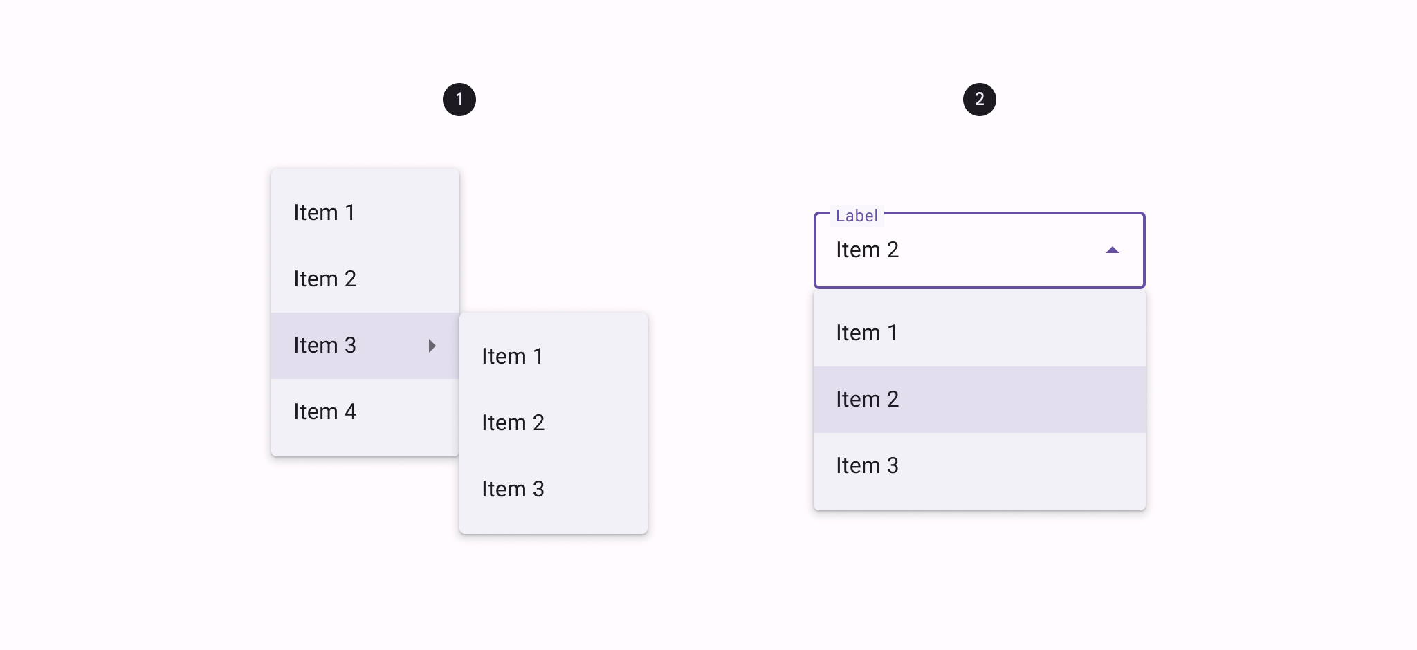
Dropdown menus
Dropdown menus display a list of options, triggered by an icon, button, or action. Their placement varies based on the element that opens them.
API and source code:
MenuMenuInflaterContextMenuPopupMenuListPopupWindow
Dropdown menu examples
Overflow menus
The following example shows an overflow menu.
In code:
kt
override fun onCreateOptionsMenu(menu: Menu): Boolean {
    val inflater: MenuInflater = menuInflater
    inflater.inflate(R.menu.overflow_menu, menu)
    return true
}
In res/menu/overflow_menu.xml:
xml
<menu xmlns:android="http://schemas.android.com/apk/res/android">
<item android:id="@+id/option_1"
android:title="@string/option_1" />
<item android:id="@+id/option_2"
android:title="@string/option_2" />
<item android:id="@+id/option_3"
android:title="@string/option_3" />
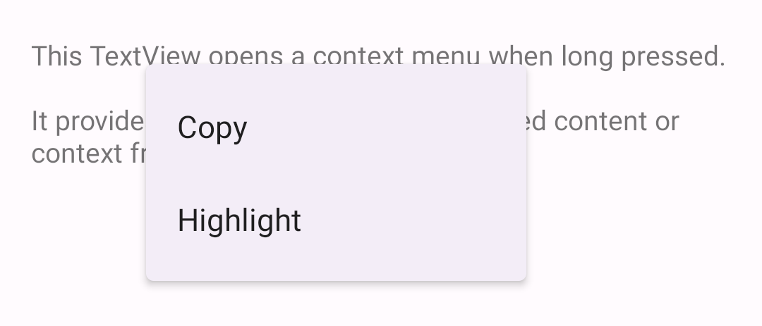
</menu>Context menus
The following example shows a context menu that appears when a TextView is pressed for a designated amount of time.
In code:
kt
override fun onCreate(savedInstanceState: Bundle?) {
    ...
    val contextMenuTextView = view.findViewById<TextView>(R.id.context_menu_tv)
    // Register context menu for TextView
    registerForContextMenu(contextMenuTextView)
}

override fun onCreateContextMenu(menu: ContextMenu, v: View, menuInfo: ContextMenu.ContextMenuInfo?) {
    val contextMenuTextView = v as TextView
    val context = context
    // Add menu items via menu.add
    menu.add(R.string.option_1)
        .setOnMenuItemClickListener { item: MenuItem? ->
            // Respond to item click.
      }
    menu.add(R.string.option_2)
        .setOnMenuItemClickListener { item: MenuItem? ->
            // Respond to item click.
      }
}

override fun onContextMenuClosed(menu: Menu) {
    // Respond to context menu being closed.
}
In the layout:
xml
<TextView
    android:id="@+id/context_menu_tv"
    android:layout_width="match_parent"
    android:layout_height="wrap_content"
    android:padding="16dp"
    android:text="@string/menu_context_menu_description"/>
Alternatively, you can inflate a context menu in onCreateContextMenu (as with the overflow menu):
kt
override fun onCreateContextMenu(menu: ContextMenu, v: View, menuInfo: ContextMenu.ContextMenuInfo?) {
  super.onCreateContextMenu(menu, v, menuInfo)
  val inflater: MenuInflater = menuInflater
  inflater.inflate(R.menu.context_menu, menu)
}

// Then, to handle clicks:
override fun onContextItemSelected(item: MenuItem): Boolean {
  val info = item.menuInfo as AdapterView.AdapterContextMenuInfo
  return when (item.itemId) {
    R.id.option_1 -> {
      // Respond to context menu item 1 click.
      true
    }
    R.id.option_2 -> {
      // Respond to context menu item 2 click.
      true
    }
    else -> super.onContextItemSelected(item)
  }
}
with a res/menu/context_menu.xml:
xml
<menu xmlns:android="http://schemas.android.com/apk/res/android">
    <item android:id="@+id/option_1"
          android:title="@string/option_1" />
    <item android:id="@+id/option_2"
          android:title="@string/option_2" />
</menu>
Popup menus
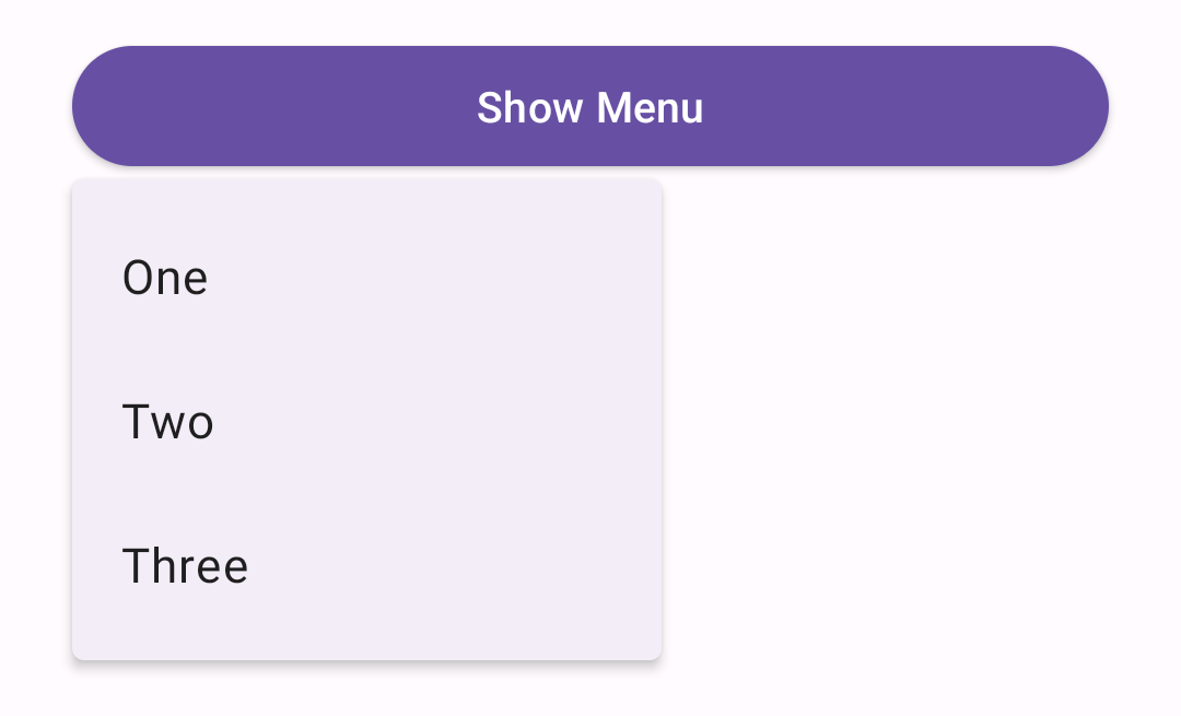
The following example shows a popup menu that displays when a button is clicked.
In code:
kt
override fun onCreate(savedInstanceState: Bundle?) {
    ...
    val button = view.findViewById<Button>(R.id.menu_button)
    button.setOnClickListener { v: View ->
        showMenu(v, R.menu.popup_menu)
    }
}

private fun showMenu(v: View, @MenuRes menuRes: Int) {
    val popup = PopupMenu(context!!, v)
    popup.menuInflater.inflate(menuRes, popup.menu)

    popup.setOnMenuItemClickListener { menuItem: MenuItem ->
        // Respond to menu item click.
    }
    popup.setOnDismissListener {
        // Respond to popup being dismissed.
    }
    // Show the popup menu.
    popup.show()
}
In the layout:
xml
<Button
    android:id="@+id/menu_button"
    android:layout_width="match_parent"
    android:layout_height="wrap_content"
    android:text="@string/show_menu"/>
In res/menu/popup_menu.xml:
xml
<menu xmlns:android="http://schemas.android.com/apk/res/android">
    <item android:id="@+id/option_1"
          android:title="@string/option_1" />
    <item android:id="@+id/option_2"
          android:title="@string/option_2" />
    <item android:id="@+id/option_3"
          android:title="@string/option_3" />
</menu>
Adding icons to popup menus
Currently, there is no public API to add icons to popup menus. The following workaround is for API 21+, and uses library-only APIs, and is not guaranteed to work in future versions.
The following example shows a popup menu with icons.
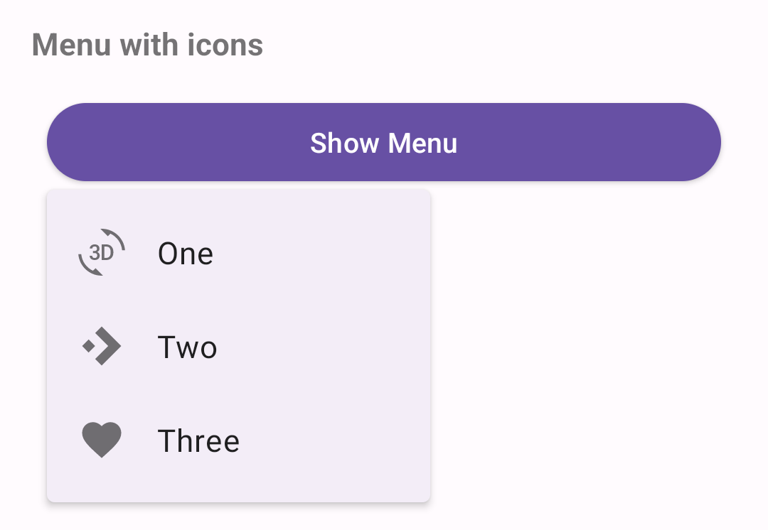
In code:
kt
//In the showMenu function from the previous example:
private fun showMenu(v: View, @MenuRes menuRes: Int) {
    val popup = PopupMenu(context!!, v)
    popup.menuInflater.inflate(menuRes, popup.menu)
    ...
    if (popup.menu is MenuBuilder) {
        val menuBuilder = popup.menu as MenuBuilder
        menuBuilder.setOptionalIconsVisible(true)
        for (item in menuBuilder.visibleItems) {
            val iconMarginPx =
                TypedValue.applyDimension(
                    TypedValue.COMPLEX_UNIT_DIP, ICON_MARGIN.toFloat(), resources.displayMetrics)
                .toInt()
            if (item.icon != null) {
              if (Build.VERSION.SDK_INT > Build.VERSION_CODES.LOLLIPOP) {
                  item.icon = InsetDrawable(item.icon, iconMarginPx, 0, iconMarginPx,0)
              } else {
                  item.icon =
                      object : InsetDrawable(item.icon, iconMarginPx, 0, iconMarginPx, 0) {
                          override fun getIntrinsicWidth(): Int {
                              return intrinsicHeight + iconMarginPx + iconMarginPx
                      }
                }
              }
          }
      }
    }
    ...
    popup.show()
}
In res/menu/popup_menu.xml:
xml
<menu xmlns:android="http://schemas.android.com/apk/res/android">
    <item android:id="@+id/option_1"
          android:icon="@drawable/ic_3d_rotation_24dp"
          android:title="@string/option_1" />
    <item android:id="@+id/option_2"
          android:icon="@drawable/ic_accelerator_24dp"
          android:title="@string/option_2" />
    <item android:id="@+id/option_3"
          android:icon="@drawable/ic_favorite_24dp"
          android:title="@string/option_3" />
</menu>
List popup window menus
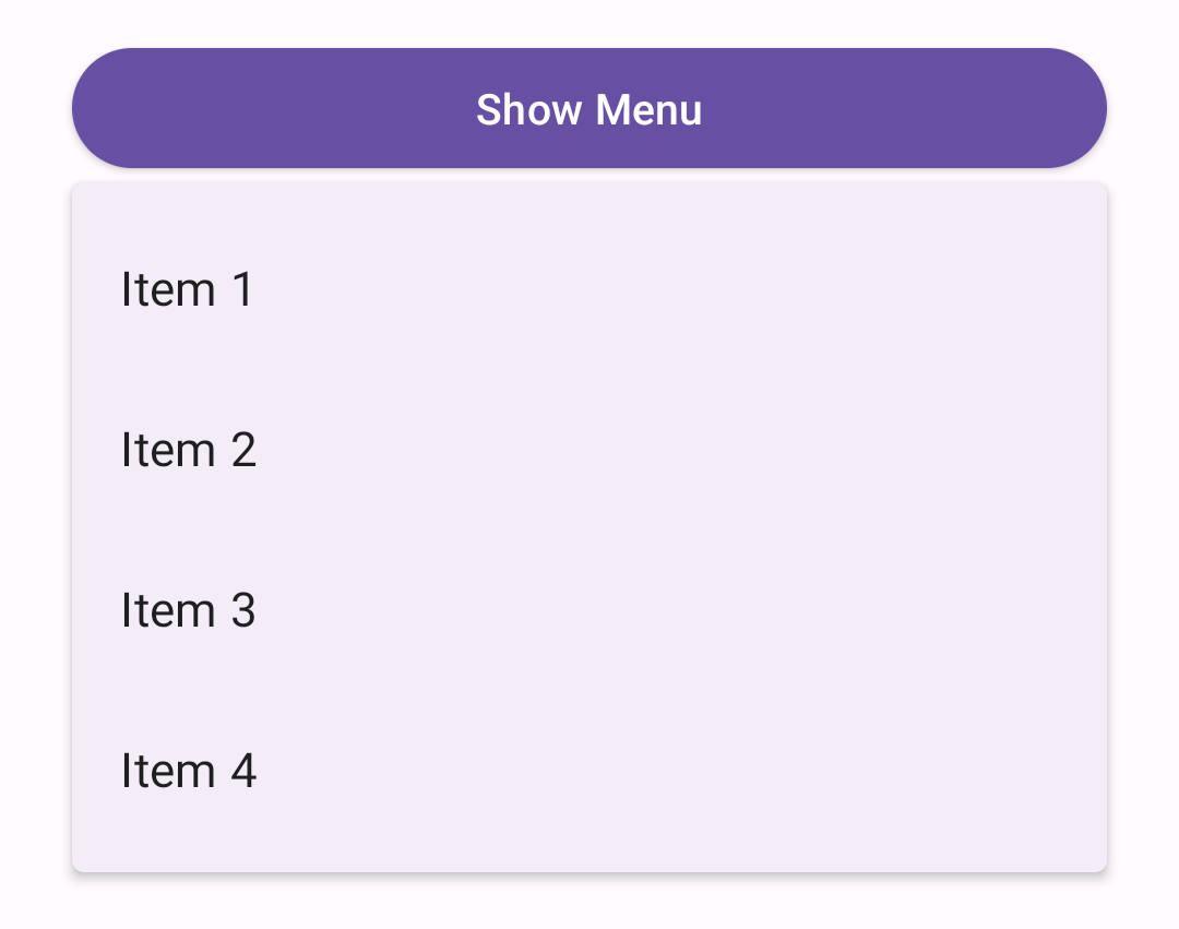
The following example shows a list popup window menu that appears when a button is clicked.
In code:
kt
val listPopupWindowButton = view.findViewById<Button>(R.id.list_popup_button)
val listPopupWindow = ListPopupWindow(context!!, null, R.attr.listPopupWindowStyle)

// Set button as the list popup's anchor
listPopupWindow.anchorView = listPopupWindowButton

// Set list popup's content
val items = listOf("Item 1", "Item 2", "Item 3", "Item 4")
val adapter = ArrayAdapter(requireContext(), R.layout.list_popup_window_item, items)
listPopupWindow.setAdapter(adapter)

// Set list popup's item click listener
listPopupWindow.setOnItemClickListener { parent: AdapterView<*>?, view: View?, position: Int, id: Long ->
  // Respond to list popup window item click.

  // Dismiss popup.
  listPopupWindow.dismiss()
}

// Show list popup window on button click.
listPopupWindowButton.setOnClickListener { v: View? -> listPopupWindow.show() }
In the layout:
xml
<Button
    android:id="@+id/list_popup_button"
    android:layout_width="match_parent"
    android:layout_height="wrap_content"
    android:text="@string/show_menu"/>
In the item layout res/layout/list_popup_window_item.xml:
xml
<TextView
    xmlns:android="http://schemas.android.com/apk/res/android"
    android:layout_width="match_parent"
    android:layout_height="wrap_content"
    android:padding="16dp"
    android:ellipsize="end"
    android:maxLines="1"
    android:textAppearance="?attr/textAppearanceBodyLarge"
/>
Anatomy and key properties
The following are menu anatomy diagrams showing all possible elements:
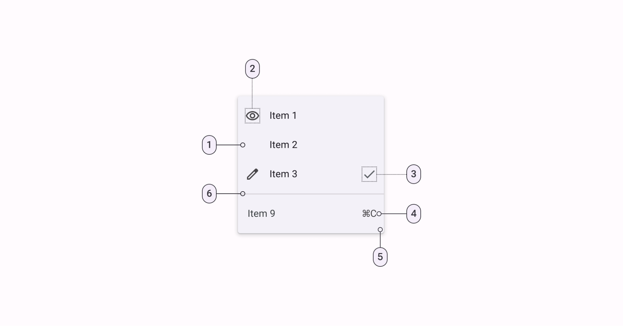
- List item
- Leading icon
- Trailing icon
- Trailing text
- Container
- Divider
Container attributes
| Element | Attribute | Related method(s) | Default value |
|---|---|---|---|
| Background | android:popupMenuBackground | N/A | ?attr/popupMenuBackground |
| Color | N/A | N/A | ?attr/colorSurfaceContainer |
| Elevation | android:popupElevation | N/A | 3dp |
Text attributes
| Element | Attribute | Related method(s) | Default value |
|---|---|---|---|
| Text label | android:title | getMenu().addgetMenu().addSubMenugetMenu().getItem | N/A |
| Typography | ?attr/textAppearanceLargePopupMenu?attr/textAppearanceSmallPopupMenu | N/A | ?attr/textAppearanceBodyLarge |
Styles
| Element | Theme attribute | Default value |
|---|---|---|
| Popup menus | ?attr/popupMenuStyle | @style/Widget.Material3.PopupMenu |
| List popup window style | ?attr/listPopupWindowStyle | @style/Widget.Material3.PopupMenu.ListPopupWindow |
| Context menus | ?android:contextPopupMenuStyle | @style/Widget.Material3.PopupMenu.ContextMenu |
| Overflow menus | ?attr/actionOverflowMenuStyle | @style/Widget.Material3.PopupMenu.Overflow |
See the full list of styles and attrs.
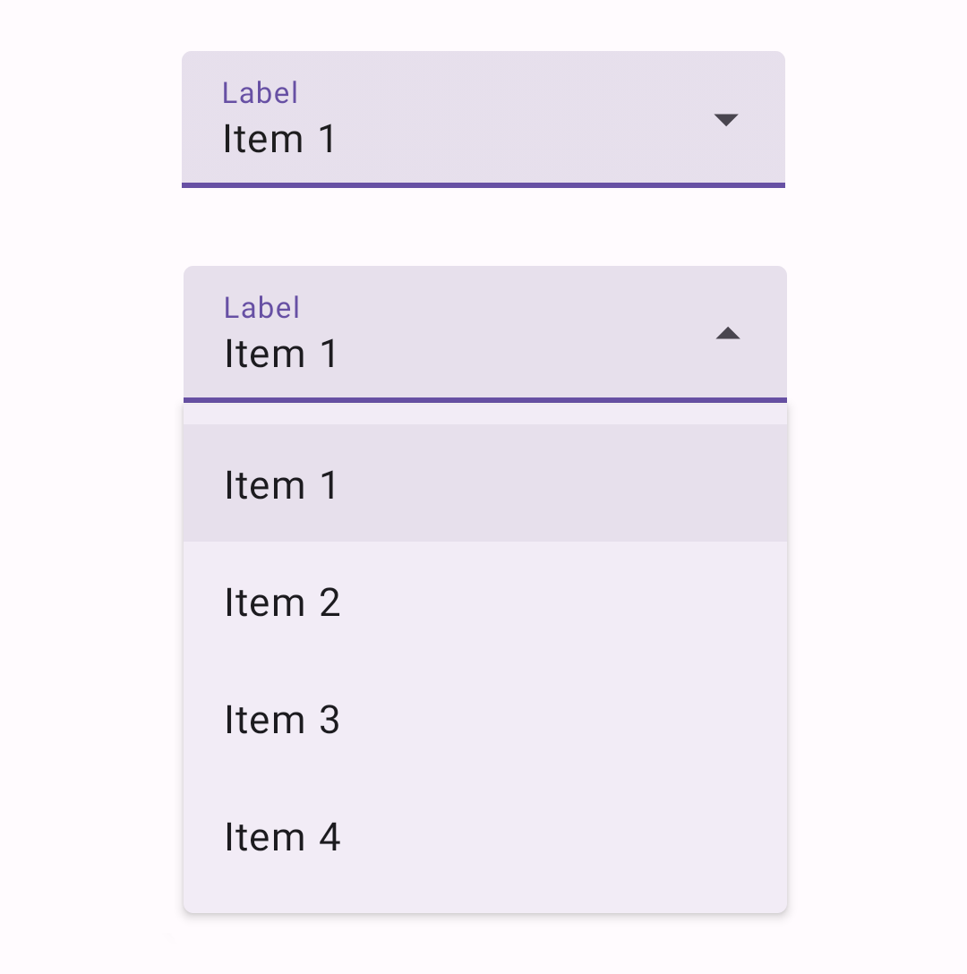
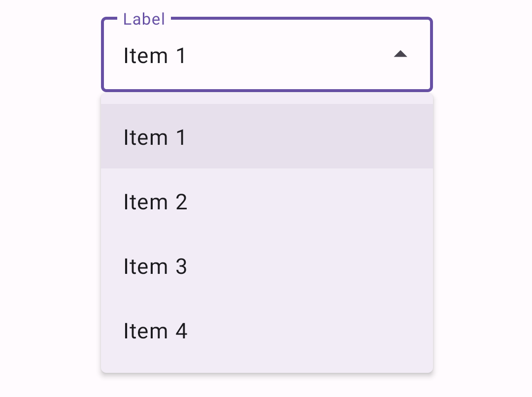
Exposed dropdown menus
Exposed dropdown menus display the currently selected menu item above a list of options. Some variations can accept user-entered input.
Note: The exposed dropdown menu is implemented through the TextInputLayout. For detailed information on Material text fields and their usage, see the TextInputLayout documentation.
API and source code:
TextInputLayoutAutoCompleteTextViewMaterialAutoCompleteTextView
Exposed dropdown menu example
Note: MaterialComponentsViewInflater auto-inflates <AutoCompleteTextView> to <com.google.android.material.textfield.MaterialAutoCompleteTextView> when using Theme.Material3.* themes.
The following is an example of a filled exposed dropdown menu:
In the layout:
xml
<com.google.android.material.textfield.TextInputLayout
    android:id="@+id/menu"
    style="@style/Widget.Material3.TextInputLayout.FilledBox.ExposedDropdownMenu"
    android:layout_width="match_parent"
    android:layout_height="wrap_content"
    android:hint="@string/label">

    <AutoCompleteTextView
        android:layout_width="match_parent"
        android:layout_height="wrap_content"
        android:inputType="none"
        app:simpleItems="@array/simple_items"
    />

</com.google.android.material.textfield.TextInputLayout>
The string array specified by app:simpleItems will be used as the default item strings for auto-completion. Or you can also set it programmatically:
kt
val items = arrayOf("Item 1", "Item 2", "Item 3", "Item 4")
(textField.editText as? MaterialAutoCompleteTextView)?.setSimpleItems(items)
Alternatively, to have more control over the auto-completion items rendering, you can also provide a custom item adapter by:
kt
val items = listOf("Item 1", "Item 2", "Item 3", "Item 4")
val adapter = ArrayAdapter(requireContext(), R.layout.list_item, items)
(textField.editText as? AutoCompleteTextView)?.setAdapter(adapter)
And a custom item layout (list_item.xml):
xml
<TextView
    xmlns:android="http://schemas.android.com/apk/res/android"
    android:layout_width="match_parent"
    android:layout_height="wrap_content"
    android:padding="16dp"
    android:ellipsize="end"
    android:maxLines="1"
    android:textAppearance="?attr/textAppearanceBodyLarge"
/>
To use the exposed dropdown menu with an outlined text field, set the style to @style/Widget.Material3.TextInputLayout.OutlinedBox.ExposedDropdownMenu:
Non editable variation
For a non-editable menu, disable the user input in the AutoCompleteTextView by setting android:inputType="none" on the AutoCompleteTextView.
Setting a default value
In order to have a pre-selected value displayed, you can call setText(CharSequence text, boolean filter) on the AutoCompleteTextView with the filter set to false.
Anatomy and key properties
The exposed dropdown menu is an AutoCompleteTextView within a TextInputLayout. It displays a dropdown menu below a text field.
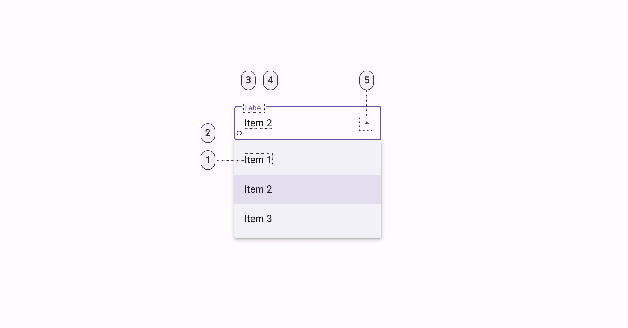
- Text
- Container
- Label
- Selection/Input text
- Trailing icon
TextInputLayout attributes (container, label, trailing icon)
For all attributes that apply to the TextInputLayout, see the TextInputLayout documentation.
MaterialAutoCompleteTextView attributes (input text, dropdown menu)
| Element | Attribute | Related method(s) | Default value |
|---|---|---|---|
| Input text | android:text | setTextgetText | @null |
| Typography | android:textAppearance | setTextAppearance | ?attr/textAppearanceBodyLarge |
| Input accepted | android:inputType | N/A | framework's default |
| Input text color | android:textColor | setTextColorgetTextColorsgetCurrentTextColor | ?android:textColorPrimary |
| Cursor color | N/A (color comes from the theme attr ?attr/colorControlActivated) | N/A | ?attr/colorPrimary |
| Dropdown menu container color | app:dropDownBackgroundTint | setDropDownBackgroundTintsetDropDownBackgroundTintListgetDropDownBackgroundTintList | colorSurfaceContainer |
| Dropdown menu elevation | android:popupElevation | getPopupElevation | 3dp |
| Simple items | app:simpleItems | setSimpleItems | null |
| Simple item layout | app:simpleItemLayout | N/A | @layout/m3_auto_complete_simple_item |
| Selected simple item color | app:simpleItemSelectedColor | setSimpleItemSelectedColorgetSimpleItemSelectedColor | ?attr/colorSurfaceContainerHighest |
| Selected simple item ripple color | app:simpleItemSelectedRippleColor | setSimpleItemSelectedRippleColorgetSimpleItemSelectedRippleColor | @color/m3_simple_item_ripple_color |
Styles
| Element | Style |
|---|---|
| Filled style | Widget.Material3.TextInputLayout.FilledBox.ExposedDropdownMenu |
| Outlined style | Widget.Material3.TextInputLayout.OutlinedBox.ExposedDropdownMenu |
| Filled dense | Widget.Material3.TextInputLayout.FilledBox.Dense.ExposedDropdownMenu |
| Outlined dense | Widget.Material3.TextInputLayout.OutlinedBox.Dense.ExposedDropdownMenu |
Default style theme attribute: ?attr/textInputStyle
See the full list of styles and attrs.
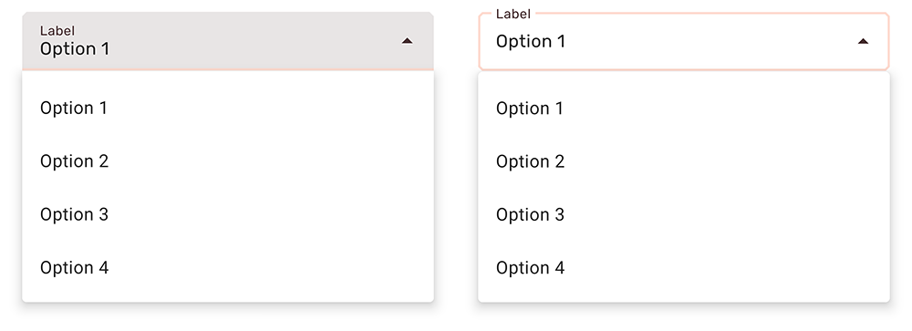
Theming menus
Menus drawers support Material Theming which can customize color, typography and shape.
Menu theming examples
Popup, overflow, and list popup window menus support Material Theming which can customize typography.
API and source code:
MenuMenuInflaterContextMenuPopupMenuListPopupWindow
The following example shows a menu with Material Theming.
Implementing menu theming
Use default style theme attributes, which affect all menus but do not affect other components:
xml
<style name="Theme.App" parent="Theme.Material3.*">
    ...
    <item name="textAppearanceLargePopupMenu">@style/TextAppearance.App.BodyLarge</item>
    <item name="textAppearanceSmallPopupMenu">@style/TextAppearance.App.BodyLarge</item>
    <item name="popupMenuBackground">@drawable/custom_popup_background</item>
</style>

<style name="TextAppearance.App.BodyLarge" parent="TextAppearance.Material3.BodyLarge">
    <item name="fontFamily">@font/rubik</item>
    <item name="android:fontFamily">@font/rubik</item>
    <item name="android:textColor">@color/shrine_pink_900</item>
</style>
In res/drawable/custom_popup_background:
xml
<?xml version="1.0" encoding="UTF-8"?>
<shape xmlns:android="http://schemas.android.com/apk/res/android">
  <solid android:color="?attr/colorSurface"/>
  <corners
    android:radius="16dp"/>
  <padding
      android:bottom="8dp"
      android:top="8dp"/>
</shape>
Use a custom style instead of overriding ?attr/popupMenuBackground if you want to set a custom background for one type of menu:
xml
<style name="Theme.App" parent="Theme.Material3.*">
    ...
    <item name="popupMenuStyle">@style/Widget.App.PopupMenu</item>
</style>

<style name="Widget.App.PopupMenu" parent="Widget.Material3.PopupMenu">
    <item name="android:popupBackground">@drawable/custom_popupmenu_background</item>
</style>
Exposed dropdown menu theming example
Exposed dropdown menus support Material Theming which can customize color, typography, and shape.
Note: The exposed dropdown menu is implemented through the TextInputLayout. For detailed information on how Material text fields work, see the TextInputLayout documentation.
API and source code:
TextInputLayoutAutoCompleteTextViewMaterialAutoCompleteTextView
The following example shows filled and outlined exposed dropdown menu types with Material Theming.
Implementing exposed dropdown menu theming
Use default style theme attributes, styles and theme overlays which adds themes to all menus but does not affect other components:
xml
<style name="Theme.App" parent="Theme.Material3.*">
    ...
    <item name="textInputStyle">@style/Widget.App.ExposedDropdownMenu</item>
</style>

<style name="Widget.App.ExposedDropdownMenu" parent="Widget.Material3.TextInputLayout.*.ExposedDropdownMenu">
    <item name="materialThemeOverlay">@style/ThemeOverlay.App.ExposedDropdownMenu</item>
    <item name="shapeAppearance">@style/ShapeAppearance.App.SmallComponent</item>
    <item name="hintTextColor">?attr/colorOnSurface</item>
    <item name="endIconTint">?attr/colorOnSurface</item>
</style>

<style name="ThemeOverlay.App.ExposedDropdownMenu" parent="">
    <item name="colorPrimary">@color/shrine_pink_100</item>
    <item name="colorOnSurface">@color/shrine_pink_900</item>
    <item name="colorError">@color/shrine_red</item>
    <item name="textAppearanceBodyLarge">@style/TextAppearance.App.BodyLarge</item>
    <item name="textAppearanceBodySmall">@style/TextAppearance.App.BodySmall</item>
    <item name="autoCompleteTextViewStyle">@style/Widget.Material3.AutoCompleteTextView.*</item>
</style>

<style name="TextAppearance.App.BodyLarge" parent="TextAppearance.Material3.BodyLarge">
    <item name="fontFamily">@font/rubik</item>
    <item name="android:fontFamily">@font/rubik</item>
</style>

<style name="TextAppearance.App.BodySmall" parent="TextAppearance.Material3.BodySmall">
    <item name="fontFamily">@font/rubik</item>
    <item name="android:fontFamily">@font/rubik</item>
</style>

<style name="ShapeAppearance.App.SmallComponent" parent="ShapeAppearance.Material3.SmallComponent">
    <item name="cornerFamily">cut</item>
    <item name="cornerSize">4dp</item>
</style>
or use the style in the layout, which affects only this menu:
xml
<com.google.android.material.textfield.TextInputLayout
    ...
    style="@style/Widget.App.ExposedDropdownMenu">

    ...

</com.google.android.material.textfield.TextInputLayout>
Note: When setting a materialThemeOverlay on a custom TextInputLayout style, set autoCompleteTextViewStyle to either a @style/Widget.Material3.AutoCompleteTextView.* style or to a custom one that inherits from that.
The TextInputLayout.*.ExposedDropdownMenu styles set materialThemeOverlay to override autoCompleteTextViewStyle with the specific AutoCompleteTextView style needed. Therefore, you don't need to specify a style tag on the AutoCompleteTextView.