Appearance
Dividers
Dividers separate content into clear groups.
Contents
Design and API Documentation
Using dividers
Before you can use Material dividers, you need to add a dependency to the Material Components for Android library. For more information, go to the Getting started page.
MaterialDivider
API and source code:
MaterialDivider
The MaterialDivider is a view that can be used in layouts to separate content into clear groups.
Note: Make sure to set android:layout_height="wrap_content" on the MaterialDivider to ensure that the correct size is set for the divider.
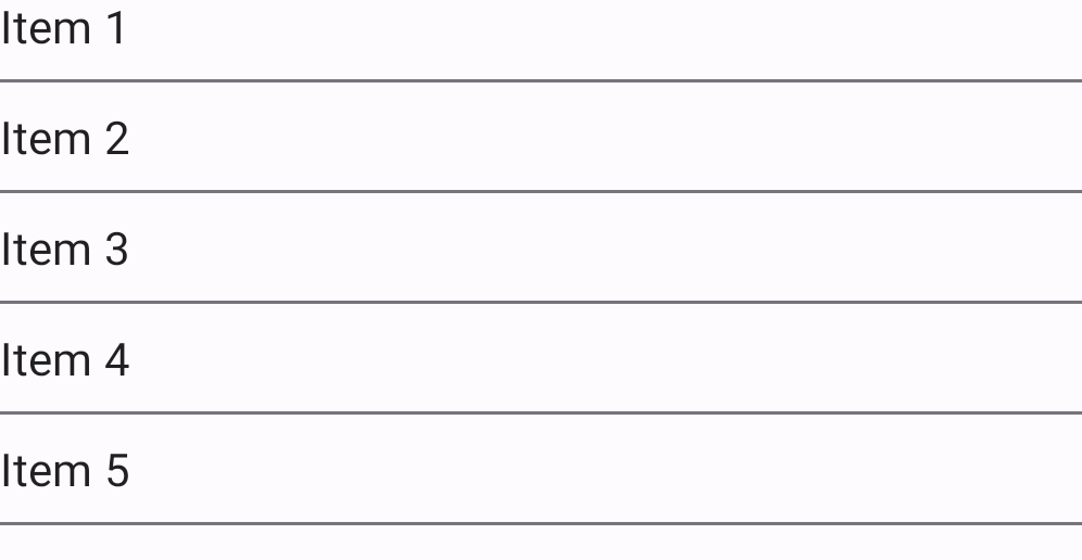
The full-bleed divider is displayed below:

On the layout:
xml
<com.google.android.material.divider.MaterialDivider
    android:layout_width="match_parent"
    android:layout_height="wrap_content"/>
By default, dividers will be full-bleed. You can use app:dividerInsetStart and app:dividerInsetEnd to achieve the look of an inset or middle divider:
xml
<com.google.android.material.divider.MaterialDivider
    android:layout_width="match_parent"
    android:layout_height="wrap_content"
    app:dividerInsetStart="16dp"
    app:dividerInsetEnd="16dp"/>
Or in code:
kt
divider.setDividerInsetStart(insetStart)
divider.setDividerInsetEnd(insetEnd)
MaterialDividerItemDecoration
API and source code:
MaterialDividerItemDecoration
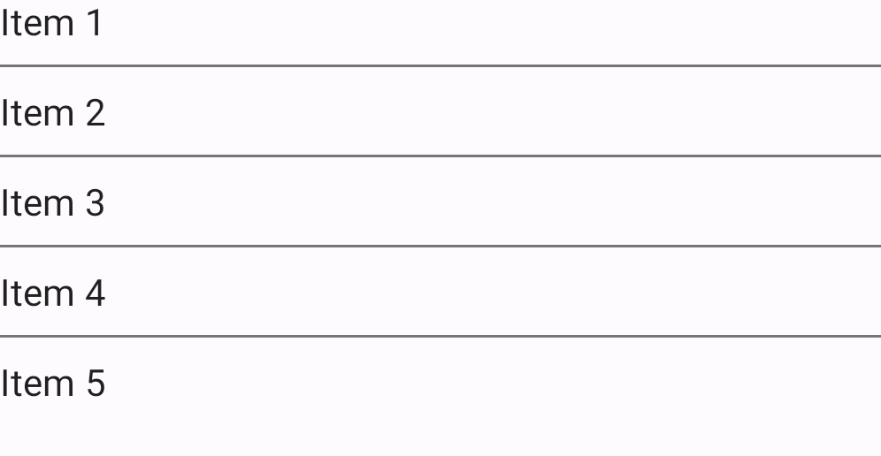
The MaterialDividerItemDecoration is a RecyclerView.ItemDecoration, similar to a DividerItemDecoration, that can be used as a divider between items of a LinearLayoutManager. It supports both horizontal and vertical orientations.
A list with full-bleed dividers is displayed below:
In code:
kt
val divider = MaterialDividerItemDecoration(context!!, LinearLayoutManager.VERTICAL /*or LinearLayoutManager.HORIZONTAL*/)
recyclerView.addItemDecoration(divider)
By default, dividers will be full-bleed. To achieve the look of an inset or middle divider:

In code:
kt
divider.setDividerInsetStart(insetStart)
divider.setDividerInsetEnd(insetEnd)
Optionally, you can hide the last divider of a list:
In code:
kt
divider.setLastItemDecorated(false)Making dividers accessible
The divider is a decorative element. There are no special accessibility precautions for the divider.
Key properties
Dividers attributes
| Element | Attribute | Related method(s) | Default value |
|---|---|---|---|
| Thickness | app:dividerThickness | setDividerThicknesssetDividerThicknessResourcegetDividerThickness | 1dp for the regular divider 8dp for the heavy divider |
| Color | app:dividerColor | setDividerColorsetDividerColorResourcegetDividerColor | ?attr/colorOutlineVariant |
| Start inset | app:dividerInsetStart | setDividerInsetStartsetDividerInsetStartResourcegetDividerInsetStart | 0dp |
| End inset | app:dividerInsetEnd | setDividerInsetEndsetDividerInsetEndResourcegetDividerInsetEnd | 0dp |
| Last item decorated | app:lastItemDecorated | setLastItemDecoratedisLastItemDecorated | true |
Styles
| Element | Style |
|---|---|
| Default style | Widget.Material3.MaterialDivider |
Default style theme attribute: ?attr/materialDividerStyle
See the full list of styles and attrs.
Theming dividers
Dividers support Material Theming and therefore can have their colors customized.
Divider theming example
API and source code:
MaterialDividerMaterialDividerItemDecoration
The following example shows a divider with Material Theming.

Implementing divider theming
Use theme attributes in res/values/styles.xml, which applies to all dividers and affects other components:
xml
<style name="Theme.App" parent="Theme.Material3.*">
    ...
    <item name="colorOutline">@color/shrine_pink_900</item>
</style>
Use default style theme attributes, styles and theme overlays, which apply to all dividers but do not affect other components:
xml
<style name="Theme.App" parent="Theme.Material3.*">
    ...
    <item name="materialDividerStyle">@style/Widget.App.MaterialDivider</item>
</style>

<style name="Widget.App.MaterialDivider" parent="Widget.Material3.MaterialDivider">
    <item name="materialThemeOverlay">@style/ThemeOverlay.App.MaterialDivider</item>
</style>

<style name="ThemeOverlay.App.MaterialDivider" parent="">
    <item name="colorOutline">@color/shrine_pink_900</item>
</style>
More easily, you can also change the divider color via the ?attr/dividerColor attribute:
xml
<style name="Widget.App.MaterialDivider" parent="Widget.Material3.MaterialDivider">
   <item name="dividerColor">@color/shrine_divider_color</item>
</style>
or use the style in the layout, which affects only this divider:
xml
<com.google.android.material.divider.MaterialDivider
    style="@style/Widget.App.MaterialDivider"
    android:layout_width="match_parent"
    android:layout_height="wrap_content"/>