Appearance
Bottom app bars
A bottom app bar displays navigation and key actions at the bottom of mobile screens.
Note: This doc reflects the Bottom App Bar after the changes in 1.7 to reflect the current M3 style. Use Widget.Material3.BottomAppBar.Legacy to revert back to the previous style.
Contents
Design and API Documentation
Using bottom app bars
Before you can use Material bottom app bars, you need to add a dependency to the Material Components for Android library. For more information, go to the Getting started page.
Making bottom app bars accessible
Android's bottom app bar component APIs provide support for the navigation icon, action items, overflow menu and more to tell the user what each action performs. While optional, their use is strongly encouraged.
Content descriptions
When using navigation icons, action items and other elements of bottom app bars, you should set a content description for them so that screen readers like TalkBack are able to announce their purpose or action.
For an overall content description of the bottom app bar, set an android:contentDescription or use the setContentDescription method on the BottomAppBar.
For the navigation icon, use the app:navigationContentDescription attribute or setNavigationContentDescription method.
For action items and items within the overflow menu, set the content description in the menu:
xml
<menu ...>
    ...
    <item
          ...
          android:contentDescription="@string/content_description_one" />
    <item
          ...
          android:contentDescription="@string/content_description_two" />
</menu>
Bottom app bar
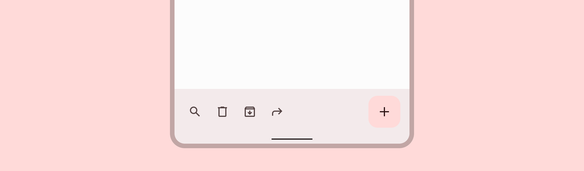
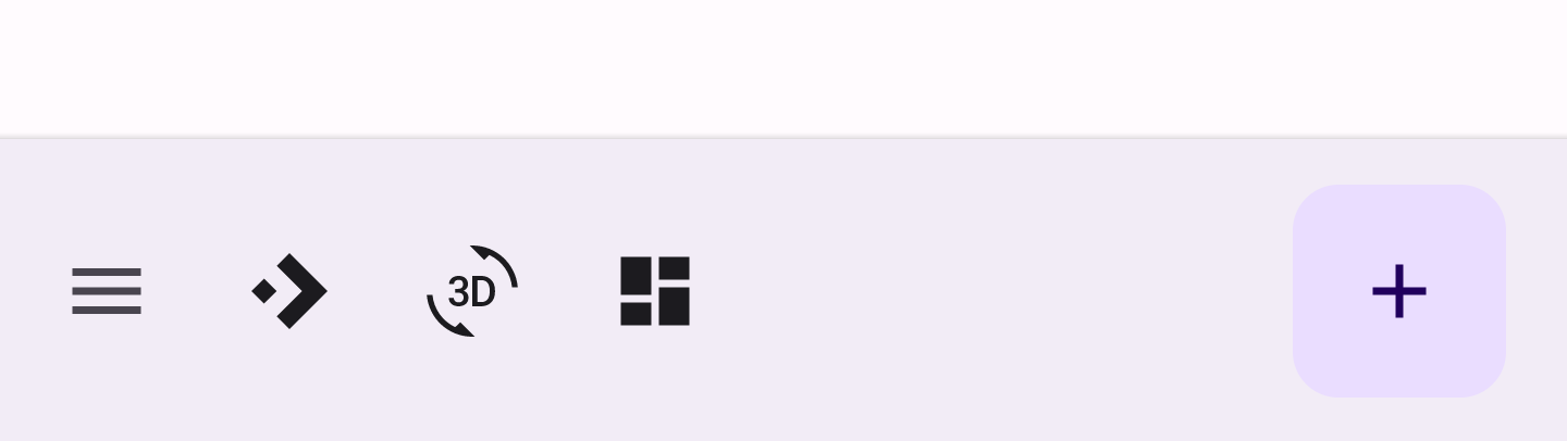
Bottom app bars provide access to up to four actions, including the floating action button (FAB).
Bottom app bar examples
API and source code:
CoordinatorLayoutBottomAppBarFloatingActionButton
The following example shows a bottom app bar with a navigation icon, 3 action icons, and an embedded FAB.
In the layout:
xml
<androidx.coordinatorlayout.widget.CoordinatorLayout
    ...
    android:layout_width="match_parent"
    android:layout_height="match_parent">

    <!-- Note: A RecyclerView can also be used -->
    <androidx.core.widget.NestedScrollView
        android:layout_width="match_parent"
        android:layout_height="match_parent"
        android:paddingBottom="100dp"
        android:clipToPadding="false">

        <!-- Scrollable content -->

    </androidx.core.widget.NestedScrollView>

    <com.google.android.material.bottomappbar.BottomAppBar
        android:id="@+id/bottomAppBar"
        android:layout_width="match_parent"
        android:layout_height="wrap_content"
        android:layout_gravity="bottom"
        style="@style/Widget.Material3.BottomAppBar"
        app:navigationIcon="@drawable/ic_drawer_menu_24px"
        app:menu="@menu/bottom_app_bar"
        />

    <com.google.android.material.floatingactionbutton.FloatingActionButton
        android:layout_width="wrap_content"
        android:layout_height="wrap_content"
        app:srcCompat="@drawable/ic_add_24dp"
        app:layout_anchor="@id/bottomAppBar"
        />

</androidx.coordinatorlayout.widget.CoordinatorLayout>
In menu/bottom_app_bar.xml:
xml
<menu
      ...>
    <item
      android:id="@+id/accelerator"
      android:icon="@drawable/ic_accelerator_24px"
      android:title="@string/accelerator"
      android:contentDescription="@string/content_description_accelerator"
      app:showAsAction="ifRoom"/>

    <item
      android:id="@+id/rotation"
      android:icon="@drawable/ic_3d_rotation_24px"
      android:title="@string/rotation"
      android:contentDescription="@string/content_description_rotation"
      app:showAsAction="ifRoom"/>

    <item
      android:id="@+id/dashboard"
      android:icon="@drawable/ic_dashboard_24px"
      android:title="@string/dashboard"
      android:contentDescription="@string/content_description_dashboard"
      app:showAsAction="ifRoom"/>

</menu>
In menu/navigation icon drawables:
xml
<vector
    ...
    android:tint="?attr/colorControlNormal">
    ...
</vector>
In code:
kt
bottomAppBar.setNavigationOnClickListener {
    // Handle navigation icon press
}

bottomAppBar.setOnMenuItemClickListener { menuItem ->
    when (menuItem.itemId) {
        R.id.accelerator -> {
            // Handle accelerator icon press
            true
        }
        R.id.rotation -> {
            // Handle rotation icon press
            true
        }
        R.id.dashboard -> {
            // Handle dashboard icon press
            true
        }
        else -> false
    }
}
Applying scrolling behavior to the bottom app bar
The following example shows the bottom app bar hiding when scrolling the scrollable content down, and appearing when scrolling up.
xml
<androidx.coordinatorlayout.widget.CoordinatorLayout
    ...>

    ...

    <com.google.android.material.bottomappbar.BottomAppBar
        ...
        app:hideOnScroll="true"
        />

    ...

</androidx.coordinatorlayout.widget.CoordinatorLayout>
Anatomy and key properties
A bottom app bar has a container and an optional navigation icon, anchored floating action button (FAB), action item(s) and an overflow menu.
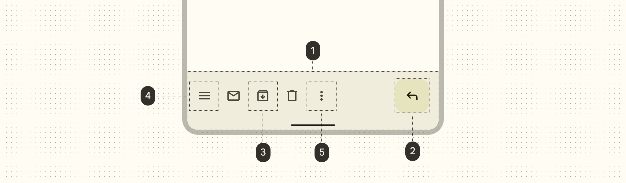
- Container
- Floating action button (FAB) (optional)
- Action item(s) (optional)
- Navigation icon (optional)
- Overflow menu (optional)
Container attributes
| Element | Attribute | Related method(s) | Default value |
|---|---|---|---|
| Color | app:backgroundTint | setBackgroundTintgetBackgroundTint | ?attr/colorSurfaceContainer |
| Elevation | app:elevation | setElevation | 3dp |
| Height | android:minHeight | setMinimumHeightgetMinimumHeight | 80dp |
| Shadows | app:addElevationShadow | N/A | false |
Navigation icon attributes
| Element | Attribute | Related method(s) | Default value |
|---|---|---|---|
| Icon | app:navigationIcon | setNavigationIcongetNavigationIcon | null |
| Color | app:navigationIconTint | setNavigationIconTint | ?attr/colorOnSurfaceVariant (as Drawable tint) |
FAB attributes
| Element | Attribute | Related method(s) | Default value |
|---|---|---|---|
| Alignment mode | app:fabAlignmentMode | setFabAlignmentModegetFabAlignmentMode | end |
| Animation mode | app:fabAnimationMode | setFabAnimationModegetFabAnimationMode | slide |
| Anchor mode | app:fabAnchorMode | setFabAnchorMode getFabAnchorMode | embed |
| Cradle margin | app:fabCradleMargin | setFabCradleMargingetFabCradleMargin | 6dp |
| Cradle rounded corner radius | app:fabCradleRoundedCornerRadius | setFabCradleRoundedCornerRadiusgetFabCradleRoundedCornerRadius | 4dp |
| Cradle vertical offset | app:fabCradleVerticalOffset | setCradleVerticalOffsetgetCradleVerticalOffset | 12dp |
| End margin | app:fabAlignmentModeEndMargin | setFabAlignmentModeEndMargin getFabAlignmentModeEndMargin | 16dp |
| Embedded elevation | app:removeEmbeddedFabElevation | N/A | true |
See the FAB documentation for more attributes.
Action item(s) attributes
| Element | Attribute | Related method(s) | Default value |
|---|---|---|---|
| Menu | app:menu | replaceMenugetMenu | null |
| Icon color | N/A | N/A | ?attr/colorControlNormal (as Drawable tint) |
| Alignment mode | app:menuAlignmentMode | setMenuAlignmentMode getMenuAlignmentMode | start |
Overflow menu attributes
| Element | Attribute | Related method(s) | Default value |
|---|---|---|---|
| Icon | android:src and app:srcCompat in actionOverflowButtonStyle (in app theme) | setOverflowIcongetOverflowIcon | @drawable/abc_ic_menu_overflow_material (before API 23) or @drawable/ic_menu_moreoverflow_material (after API 23) |
| Theme | app:popupTheme | setPopupThemegetPopupTheme | @style/ThemeOverlay.Material3.* |
| Item typography | textAppearanceSmallPopupMenu and textAppearanceLargePopupMenu in app:popupTheme or app theme | N/A | ?attr/textAppearanceTitleMedium |
Styles
| Element | Style |
|---|---|
| Default style | Widget.Material3.BottomAppBar |
Default style theme attribute: bottomAppBarStyle
See the full list of styles and attrs.
Theming bottom app bars
Bottom app bars support Material Theming which can customize color, typography and shape.
Bottom app bar theming example
API and source code:
CoordinatorLayoutBottomAppBarFloatingActionButtonBottomAppBarCutCornersTopEdge:
The following example shows a bottom app bar with Material Theming.
Implementing bottom app bar theming
Use theme attributes in res/values/styles.xml, which applies the theme to all bottom app bars and FABs and affects other components:
xml
<style name="Theme.App" parent="Theme.Material3.*">
    ...
    <item name="colorPrimary">@color/shrine_pink_100</item>
    <item name="colorOnPrimary">@color/shrine_pink_900</item>
    <item name="colorSecondary">@color/shrine_pink_50</item>
    <item name="colorOnSecondary">@color/shrine_pink_900</item>
    <item name="textAppearanceTitleMedium">@style/TextAppearance.App.Medium</item>
    <item name="shapeAppearanceSmallComponent">@style/ShapeAppearance.App.SmallComponent</item>
</style>

<style name="TextAppearance.App.Medium" parent="TextAppearance.Material3.TitleMedium">
    <item name="fontFamily">@font/rubik</item>
    <item name="android:fontFamily">@font/rubik</item>
</style>

<style name="ShapeAppearance.App.SmallComponent" parent="ShapeAppearance.Material3.SmallComponent">
    <item name="cornerFamily">cut</item>
    <item name="cornerSize">4dp</item>
</style>
Use default style theme attributes, styles and theme overlays, which applies the theme to all bottom app bars and FABs but does not affect other components:
xml
<style name="Theme.App" parent="Theme.Material3.*">
    ...
    <item name="bottomAppBarStyle">@style/Widget.App.BottomAppBar</item>
    <item name="floatingActionButtonStyle">@style/Widget.App.FloatingActionButton</item>
</style>

<style name="Widget.App.BottomAppBar" parent="Widget.Material3.BottomAppBar">
    <item name="materialThemeOverlay">@style/ThemeOverlay.App.BottomAppBar</item>
</style>

<style name="Widget.App.FloatingActionButton" parent="Widget.Material3.FloatingActionButton">
    <item name="materialThemeOverlay">@style/ThemeOverlay.App.FloatingActionButton</item>
</style>

<style name="ThemeOverlay.App.BottomAppBar" parent="">
    <item name="colorPrimary">@color/shrine_pink_100</item>
    <item name="colorOnPrimary">@color/shrine_pink_900</item>
    <item name="textAppearanceTitleMedium">@style/TextAppearance.App.TitleMedium</item>
</style>

<style name="ThemeOverlay.App.FloatingActionButton" parent="">
    <item name="colorSecondary">@color/shrine_pink_50</item>
    <item name="colorOnSecondary">@color/shrine_pink_900</item>
    <item name="shapeAppearanceSmallComponent">@style/ShapeAppearance.App.SmallComponent</item>
</style>
Use the styles in the layout, which affects only this bottom app bar and FAB:
xml
<com.google.android.material.bottomappbar.BottomAppBar
    ...
    style="@style/Widget.App.BottomAppBar"
    />

<com.google.android.material.floatingactionbutton.FloatingActionButton
    ...
    style="@style/Widget.App.FloatingActionButton"
    />
In code:
kt
val topEdge = BottomAppBarCutCornersTopEdge(
    bottomAppBar.fabCradleMargin,
    bottomAppBar.fabCradleRoundedCornerRadius,
    bottomAppBar.cradleVerticalOffset
)
val background = bottomAppBar.background as MaterialShapeDrawable
background.shapeAppearanceModel = background.shapeAppearanceModel.toBuilder().setTopEdge(topEdge).build()
Note: Using BottomAppBarCutCornersTopEdge is not necessary with rounded shapeAppearance corners.