Appearance
Menus
Menus display a list of choices on a temporary surface.
Usage
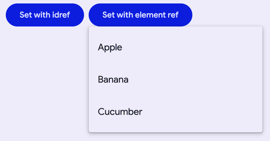
When opened, menus position themselves to an anchor. Thus, either anchor or anchorElement must be supplied to md-menu before opening. Additionally, a shared parent of position:relative should be present around the menu and it's anchor, because the default menu is positioned relative to the anchor element.
Menus also render menu items such as md-menu-item and handle keyboard navigation between md-menu-items as well as typeahead functionality. Additionally, md-menu interacts with md-menu-items to help you determine how a menu was closed. Listen for and inspect the close-menu custom event's details to determine what action and items closed the menu.
html
<!-- Note the position: relative style -->
<span style="position: relative">
  <md-filled-button id="usage-anchor">Set with idref</md-filled-button>
  <md-menu id="usage-menu" anchor="usage-anchor">
    <md-menu-item>
      <div slot="headline">Apple</div>
    </md-menu-item>
    <md-menu-item>
      <div slot="headline">Banana</div>
    </md-menu-item>
    <md-menu-item>
      <div slot="headline">Cucumber</div>
    </md-menu-item>
  </md-menu>
</span>

<script type="module">
  // This example uses anchor as an ID reference
  const anchorEl = document.body.querySelector('#usage-anchor');
  const menuEl = document.body.querySelector('#usage-menu');

  anchorEl.addEventListener('click', () => { menuEl.open = !menuEl.open; });
</script>

<span style="position: relative">
  <md-filled-button id="usage-anchor-2">Set with element ref</md-filled-button>
  <md-menu id="usage-menu-2">
    <md-menu-item>
      <div slot="headline">Apple</div>
    </md-menu-item>
    <md-menu-item>
      <div slot="headline">Banana</div>
    </md-menu-item>
    <md-menu-item>
      <div slot="headline">Cucumber</div>
    </md-menu-item>
  </md-menu>
</span>

<script type="module">
  // This example uses MdMenu.prototype.anchorElement to set the anchor as an
  // HTMLElement reference.
  const anchorEl = document.body.querySelector('#usage-anchor-2');
  const menuEl = document.body.querySelector('#usage-menu-2');
  menuEl.anchorElement = anchorEl;

  anchorEl.addEventListener('click', () => { menuEl.open = !menuEl.open; });
</script>
Submenus
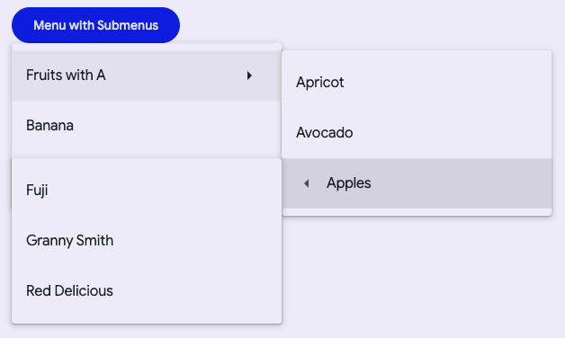
You can compose <md-menu>s inside of an <md-sub-menu>'s menu slot, but first the has-overflow attribute must be set on the root <md-menu> to disable overflow scrolling and display the nested submenus.
html
<!-- Note the position: relative style -->
<span style="position: relative">
  <md-filled-button id="usage-submenu-anchor">
    Menu with Submenus
  </md-filled-button>
  <!-- Note the has-overflow attribute -->
  <md-menu has-overflow id="usage-submenu" anchor="usage-submenu-anchor">
    <md-sub-menu>
      <md-menu-item slot="item">
      <div slot="headline">Fruits with A</div>
        <!-- Arrow icons are helpful affordances -->
        <md-icon slot="end">arrow_right</md-icon>
      </md-menu-item>
      <!-- Submenu must be slotted into sub-menu's menu slot -->
      <md-menu slot="menu">
        <md-menu-item>
          <div slot="headline">Apricot</div>
        </md-menu-item>
        <md-menu-item>
          <div slot="headline">Avocado</div>
        </md-menu-item>

        <!-- Nest as many as you want and control menu anchoring -->
        <md-sub-menu
            menu-corner="start-end"
            anchor-corner="start-start">
          <md-menu-item slot="item">
            <div slot="headline">Apples</div>
            <!-- Arrow icons are helpful affordances -->
            <md-icon slot="start">
              arrow_left
            </md-icon>
          </md-menu-item>
          <md-menu slot="menu">
            <md-menu-item>
              <div slot="headline">Fuji</div>
            </md-menu-item>
            <md-menu-item>
              <div slot="headline" style="white-space: nowrap;">Granny Smith</div>
            </md-menu-item>
            <md-menu-item>
              <div slot="headline" style="white-space: nowrap;">Red Delicious</div>
            </md-menu-item>
          </md-menu>

        </md-sub-menu>
      </md-menu>
    </md-sub-menu>

    <md-menu-item>
      <div slot="headline">Banana</div>
    </md-menu-item>
    <md-menu-item>
      <div slot="headline">Cucumber</div>
    </md-menu-item>
  </md-menu>
</span>

<script type="module">
  const anchorEl = document.body.querySelector('#usage-submenu-anchor');
  const menuEl = document.body.querySelector('#usage-submenu');

  anchorEl.addEventListener('click', () => { menuEl.open = !menuEl.open; });
</script>
Popover-positioned menus
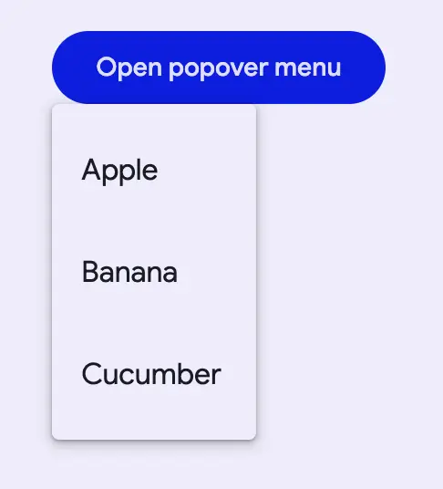
Internally menu uses position: absolute by default. Though there are cases when the anchor and the node cannot share a common ancestor that is position: relative, or sometimes, menu will render below another item due to limitations with position: absolute.
Popover-positioned menus use the native Popover API to render above all other content. This may fix most issues where the default menu positioning (positioning="absolute") is not positioning as expected by rendering into the top layer.
Warning: Popover API support was added in Chrome 114 and Safari 17. At the time of writing, Firefox does not support the Popover API (see latest browser compatibility).
For browsers that do not support the Popover API,
md-menuwill fall back to using fixed-positioned menus.
html
<!-- Note the lack of position: relative parent. -->
<div style="margin: 16px;">
  <md-filled-button id="usage-popover-anchor">Open popover menu</md-filled-button>
</div>

<!-- popover menus do not require a common ancestor with the anchor. -->
<md-menu positioning="popover" id="usage-popover" anchor="usage-popover-anchor">
  <md-menu-item>
    <div slot="headline">Apple</div>
  </md-menu-item>
  <md-menu-item>
    <div slot="headline">Banana</div>
  </md-menu-item>
  <md-menu-item>
    <div slot="headline">Cucumber</div>
  </md-menu-item>
</md-menu>

<script type="module">
  const anchorEl = document.body.querySelector('#usage-popover-anchor');
  const menuEl = document.body.querySelector('#usage-popover');

  anchorEl.addEventListener('click', () => { menuEl.open = !menuEl.open; });
</script>
Fixed-positioned menus
This is the fallback implementation of popover-positioned menus and uses position: fixed rather than the default position: absolute which calculates its position relative to the window rather than the element.
Note: Fixed menu positions are positioned relative to the window and not the document. This means that the menu will not scroll with the anchor as the page is scrolled.

html
<!-- Note the lack of position: relative parent. -->
<div style="margin: 16px;">
  <md-filled-button id="usage-fixed-anchor">Open fixed menu</md-filled-button>
</div>

<!-- Fixed menus do not require a common ancestor with the anchor. -->
<md-menu positioning="fixed" id="usage-fixed" anchor="usage-fixed-anchor">
  <md-menu-item>
    <div slot="headline">Apple</div>
  </md-menu-item>
  <md-menu-item>
    <div slot="headline">Banana</div>
  </md-menu-item>
  <md-menu-item>
    <div slot="headline">Cucumber</div>
  </md-menu-item>
</md-menu>

<script type="module">
  const anchorEl = document.body.querySelector('#usage-fixed-anchor');
  const menuEl = document.body.querySelector('#usage-fixed');

  anchorEl.addEventListener('click', () => { menuEl.open = !menuEl.open; });
</script>
Document-positioned menus
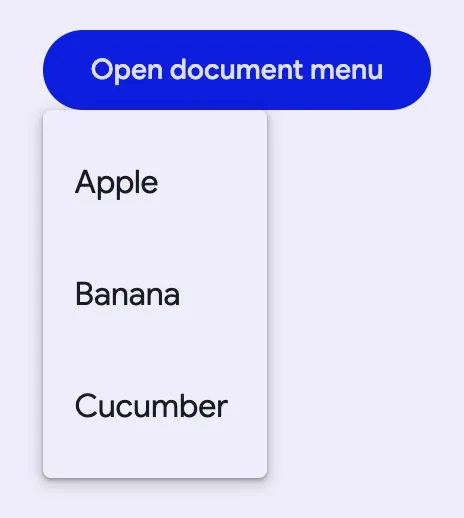
When set to positioning="document", md-menu will position itself relative to the document as opposed to the element or the window from "absolute" and "fixed" values respectively.
Document level positioning is useful for the following cases:
There are no ancestor elements that produce a
relativepositioning context.position: relativeposition: absoluteposition: fixedtransform: translate(x, y)- etc.
The menu is hoisted to the top of the DOM
- The last child of
<body> - Top layer
- The last child of
The same
md-menuis being reused and the contents and anchors are being dynamically changed
html
<!-- Note the lack of position: relative parent. -->
<div style="margin: 16px;">
  <md-filled-button id="usage-document-anchor">Open document menu</md-filled-button>
</div>

<!-- document menus do not require a common ancestor with the anchor. -->
<md-menu positioning="document" id="usage-document" anchor="usage-document-anchor">
  <md-menu-item>
    <div slot="headline">Apple</div>
  </md-menu-item>
  <md-menu-item>
    <div slot="headline">Banana</div>
  </md-menu-item>
  <md-menu-item>
    <div slot="headline">Cucumber</div>
  </md-menu-item>
</md-menu>

<script type="module">
  const anchorEl = document.body.querySelector('#usage-document-anchor');
  const menuEl = document.body.querySelector('#usage-document');

  anchorEl.addEventListener('click', () => { menuEl.open = !menuEl.open; });
</script>
Accessibility
By default Menu is set up to function as a role="menu" with children as role="menuitem". A common use case for this is the menu button example, where you would need to add keyboard interactions to the button to open the menu (see W3C example).
Menu can also be adapted for other use cases.
The role of the md-list inside the menu can be set with the type attribute. The role of each individual md-menu-item can also be set with the type attribute. Anything else slotted into the menu that is not a list item in most cases should be set to role="none", and md-divider should have role="separator" and tabindex="-1".
html
<!--
  A simplified example of an autocomplete component – missing javascript logic for interaction.
-->
<md-filled-text-field
    id="textfield"
    type="combobox"
    aria-controls="menu"
    aria-autocomplete="list"
    aria-expanded="true"
    aria-activedescendant="1"
    value="Ala">
</md-filled-text-field>
<md-menu
    id="menu"
    anchor="textfield"
    role="listbox"
    aria-label="states"
    open>
  <md-menu-item type="option" id="0">
    <div slot="headline">Alabama</div>
  </md-menu-item>
  <md-divider role="separator" tabindex="-1"></md-divider>
  <md-menu-item type="option" id="1" selected aria-selected="true">
    <div slot="headline">Alabama</div>
  </md-menu-item>
</md-menu>
Theming
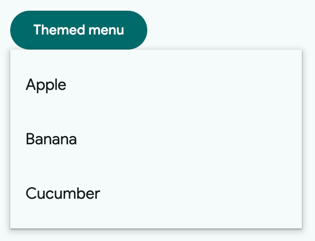
Menus support Material theming and can be customized in terms of color. Additionally, md-menu composes md-list, and each menu item extends md-list-item (see theming documentation), so most the tokens for those components can also be used for Menu.
Menu Tokens
| Token | Default value |
|---|---|
--md-menu-container-color | --md-sys-color-surface-container |
--md-menu-container-shape | --md-sys-shape-corner-extra-small |
--md-menu-item-container-color | --md-sys-color-surface-container |
--md-menu-item-selected-container-color | --md-sys-color-secondary-container |
Example
html
<style>
  :root {
    background-color: #f4fbfa;
    --md-menu-container-color: #f4fbfa;
    --md-menu-container-shape: 0px;
    --md-sys-color-on-surface: #161d1d;
    --md-sys-typescale-body-large-font: system-ui;
  }
  md-menu-item {
    border-radius: 28px;
  }
  md-menu-item::part(focus-ring) {
    border-radius: 28px;
  }
  /* Styles for button and not relevant to menu */
  md-filled-button {
    --md-sys-color-primary: #006a6a;
    --md-sys-color-on-primary: #ffffff;
  }
</style>

<span style="position: relative">
  <md-filled-button id="theming-anchor">Themed menu</md-filled-button>
  <md-menu id="theming-menu" anchor="theming-anchor">
    <md-menu-item>
      <div slot="headline">Apple</div>
    </md-menu-item>
    <md-menu-item>
      <div slot="headline">Banana</div>
    </md-menu-item>
    <md-menu-item>
      <div slot="headline">Cucumber</div>
    </md-menu-item>
  </md-menu>
</span>

<script type="module">
  const anchorEl = document.body.querySelector("#theming-anchor");
  const menuEl = document.body.querySelector("#theming-menu");

  anchorEl.addEventListener("click", () => {
    menuEl.show();
  });
</script>
API
MdMenu <md-menu>
Methods
| Method | Parameters | Returns | Description |
|---|---|---|---|
getBoundingClientRect | None | DOMRect | |
getClientRects | None | DOMRectList | |
close | None | void | |
show | None | void | |
activateNextItem | None | MenuItem | Activates the next item in the menu. If at the end of the menu, the first item will be activated. |
activatePreviousItem | None | MenuItem | Activates the previous item in the menu. If at the start of the menu, the last item will be activated. |
reposition | None | void | Repositions the menu if it is open. Useful for the case where document or window-positioned menus have their anchors moved while open. |
Events
| Event | Type | Bubbles | Composed | Description |
|---|---|---|---|---|
opening | Event | No | No | Fired before the opening animation begins |
opened | Event | No | No | Fired once the menu is open, after any animations |
closing | Event | No | No | Fired before the closing animation begins |
closed | Event | No | No | Fired once the menu is closed, after any animations |
MdMenuItem <md-menu-item>
Properties
| Property | Attribute | Type | Default | Description |
|---|---|---|---|---|
disabled | disabled | boolean | false | Disables the item and makes it non-selectable and non-interactive. |
type | type | string | 'menuitem' | Sets the behavior and role of the menu item, defaults to "menuitem". |
href | href | string | '' | Sets the underlying HTMLAnchorElement's href resource attribute. |
target | target | string | '' | Sets the underlying HTMLAnchorElement's target attribute when href is set. |
keepOpen | keep-open | boolean | false | Keeps the menu open if clicked or keyboard selected. |
selected | selected | boolean | false | Sets the item in the selected visual state when a submenu is opened. |
typeaheadText | string | undefined |
Events
| Event | Type | Bubbles | Composed | Description |
|---|---|---|---|---|
close-menu | CustomEvent<{initiator: SelectOption, reason: Reason, itemPath: SelectOption[]}> | Yes | Yes | Closes the encapsulating menu on closable interaction. |
MdSubMenu <md-sub-menu>
Properties
| Property | Attribute | Type | Default | Description |
|---|---|---|---|---|
anchorCorner | anchor-corner | string | Corner.START_END | The anchorCorner to set on the submenu. |
menuCorner | menu-corner | string | Corner.START_START | The menuCorner to set on the submenu. |
hoverOpenDelay | hover-open-delay | number | 400 | The delay between mouseenter and submenu opening. |
hoverCloseDelay | hover-close-delay | number | 400 | The delay between ponterleave and the submenu closing. |
isSubMenu | md-sub-menu | boolean | true | READONLY: self-identifies as a menu item and sets its identifying attribute |
item | MenuItem | undefined | ||
menu | Menu | undefined |
Methods
| Method | Parameters | Returns | Description |
|---|---|---|---|
show | None | Promise<void> | Shows the submenu. |
close | None | Promise<void> | Closes the submenu. |
Events
| Event | Type | Bubbles | Composed | Description |
|---|---|---|---|---|
deactivate-items | Event | Yes | Yes | Requests the parent menu to deselect other items when a submenu opens. |
request-activation | Event | Yes | Yes | Requests the parent to make the slotted item focusable and focus the item. |
deactivate-typeahead | Event | Yes | Yes | Requests the parent menu to deactivate the typeahead functionality when a submenu opens. |
activate-typeahead | Event | Yes | Yes | Requests the parent menu to activate the typeahead functionality when a submenu closes. |