Appearance
Icon
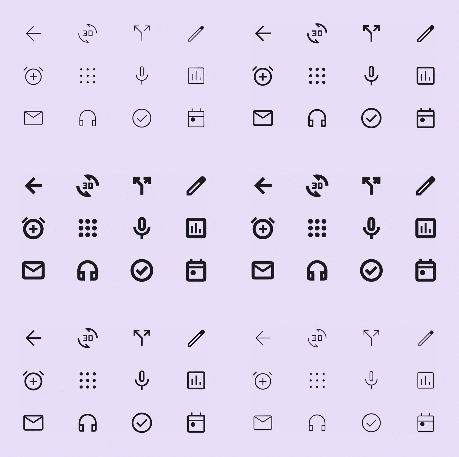
Icons can be used to represent common actions. Material Symbols are a set of variable icon fonts created at seven weights across three different styles.

Usage
Icons can be specified by name, unicode code point, or have an <svg> child element.
html
<md-icon>settings</md-icon>
<md-icon></md-icon>
<md-icon><svg xmlns="http://www.w3.org/2000/svg" viewBox="0 0 48 48"><path d="M10 40V24H4L24 6l10 8.85V9h4v9.55L44 24h-6v16H26.5V28h-5v12Zm3-3h5.5V25h11v12H35V19.95l-11-10-11 10Zm5.5-12h11-11Zm1.25-5.5h8.5q0-1.65-1.275-2.725Q25.7 15.7 24 15.7q-1.7 0-2.975 1.075Q19.75 17.85 19.75 19.5Z"/></svg></md-icon>The full range of icons can be found on the Material Symbols font page.
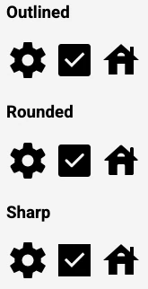
Material Symbols icons are available in three styles: outlined, rounded, and sharp.
In addition, Material Symbols have four adjustable stylistic variable font attributes called axes. An axis is a typographic term referring to the attribute of a symbol that can be altered to create visual variations.
Each style symbol contains four axes: weight, fill, grade, and optical size.
The weight and optical size attributes are handled automatically, but the fill and grade attributes are custom to the Material Symbols font, and must be set with the font-variation-settings property.
Outlined
Outlined symbols use stroke and fill attributes for a light, clean style that works well in dense UIs. The stroke weight of outlined icons can be adjusted to complement or contrast the weight of your typography.
Load the font with
html
<link href="https://fonts.googleapis.com/icon?family=Material+Symbols+Outlined" rel="stylesheet">Rounded
Rounded symbols use a corner radius that pairs well with brands that use heavier typography, curved logos, or circular elements to express their style.
Load the font with
html
<link href="https://fonts.googleapis.com/icon?family=Material+Symbols+Rounded" rel="stylesheet">To use Rounded icons, set --md-icon-font to 'Material Symbols Rounded'.
Sharp
Sharp symbols display corners with straight edges, for a crisp style that remains legible even at smaller scales. These rectangular shapes can support brand styles that aren’t well-reflected by rounded shapes.
Load the font with
html
<link href="https://fonts.googleapis.com/icon?family=Material+Symbols+Sharp" rel="stylesheet">To use Sharp icons, set font-family to 'Material Symbols Sharp'.
Fill

Filled Icons gives you the ability to transition from a more outlined style to a reversed or more filled style.
A fill attribute can be used to convey a state of transition, such as unfilled and filled states. Values range from 0 to 1, with 1 being completely filled. Along with weight, fill is a primary attribute that impacts the overall look of a symbol.
All styles of Material Symbols can be filled by setting font-variation-settings to 'FILL' 1.
Accessibility
Icons are mostly intended to be used inside of other components that have accessibility settings.
If used on their own, Icons should be given an accessible name if they are focusable. If you use icons by name, they will be announced by screen readers without any extra steps.
If using codepoints, wrap the codepoint in a <span> with an aria-label attribute.
html
<md-icon tabindex="-1"><span aria-label="home"></span></md-icon>If using SVG icons, add an aria-label attribute to the SVG element.
html
<md-icon tabindex="-1"><svg aria-label="paper airplane" viewBox="0 0 48 48"><path d="M6 40V8l38 16Zm3-4.65L36.2 24 9 12.5v8.4L21.1 24 9 27Zm0 0V12.5 27Z"/></svg></md-icon>Theming
Tokens
| Token | Default value |
|---|---|
--md-icon-font | 'Material Symbols Outlined' |
--md-icon-size | 24px |
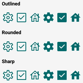
Example

html
<link href="https://fonts.googleapis.com/css2?family=Material+Symbols+Outlined:opsz,wght,[email protected],100..700,0..1" rel="stylesheet">
<link href="https://fonts.googleapis.com/css2?family=Material+Symbols+Rounded:opsz,wght,[email protected],100..700,0..1"  rel="stylesheet">
<link href="https://fonts.googleapis.com/css2?family=Material+Symbols+Sharp:opsz,wght,[email protected],100..700,0..1" rel="stylesheet">

<style>
md-icon {
  color: #006A6A;
  --md-icon-size: 48px;
}
.rounded {
  --md-icon-font: 'Material Symbols Rounded';
}
.sharp {
  --md-icon-font: 'Material Symbols Sharp';
}
md-icon[filled] {
  font-variation-settings: 'FILL' 1;
}
</style>

<h3>Outlined</h3>
<span>
  <md-icon>settings</md-icon>
  <md-icon>check_box</md-icon>
  <md-icon>house</md-icon>
  <md-icon filled>settings</md-icon>
  <md-icon filled>check_box</md-icon>
  <md-icon filled>house</md-icon>
</span>
<h3>Rounded</h3>
<span class="rounded">
  <md-icon>settings</md-icon>
  <md-icon>check_box</md-icon>
  <md-icon>house</md-icon>
  <md-icon filled>settings</md-icon>
  <md-icon filled>check_box</md-icon>
  <md-icon filled>house</md-icon>
</span>
<h3>Sharp</h3>
<span class="sharp">
  <md-icon>settings</md-icon>
  <md-icon>check_box</md-icon>
  <md-icon>house</md-icon>
  <md-icon filled>settings</md-icon>
  <md-icon filled>check_box</md-icon>
  <md-icon filled>house</md-icon>
</span>