Appearance
Floating action buttons (FAB)
FAB represents the most important action on a screen. It puts key actions within reach.
Extended FABs help people take primary actions. They're wider than FABs to accommodate a text label and larger target area.
Design articles
API Documentation (coming soon)
Types

Extended FAB

Usage
FABs should have an icon, such as a font md-icon, an svg, or an img.

html
<md-fab aria-label="Edit">
  <md-icon slot="icon">edit</md-icon>
</md-fab>
Lowered
FABs can be set to a lower elevation with the lowered attribute.

html
<md-fab lowered aria-label="Edit">
  <md-icon slot="icon">edit</md-icon>
</md-fab>
Accessibility
Icon-only FABs must include an aria-label that describes its action. Otherwise if aria-label is not provided, the FAB will default to announcing its visible contents.
html
<md-fab aria-label="Edit">
  <md-icon slot="icon">edit</md-icon>
</md-fab>
Extended FABs use their label for accessibility. Add an aria-label for additional context if needed. By supplying the label attribute, the extended FAB will make sure that the icon is not announced.
html
<md-fab label="Edit" aria-label="Edit Comment">
  <md-icon slot="icon">edit</md-icon>
</md-fab>
FAB
FABs should display a clear and understandable icon.
html
<md-fab aria-label="Edit">
  <md-icon slot="icon">edit</md-icon>
</md-fab>
Extended
FABs may be extended with a label for additional emphasis. Extended FABs can omit their icon.

html
<md-fab label="Edit">
  <md-icon slot="icon">edit</md-icon>
</md-fab>
Without icon
Extended FABs are the only FABs that can be used without an icon.

html
<md-fab label="Reroute"></md-fab>Colors
FAB colors may be changed with the variant attribute. It can be set to "surface" (default), "primary", "secondary", or "tertiary".

html
<md-fab variant="primary" aria-label="Edit">
  <md-icon slot="icon">edit</md-icon>
</md-fab>
<md-fab variant="secondary" aria-label="Edit">
  <md-icon slot="icon">edit</md-icon>
</md-fab>
<md-fab variant="tertiary" aria-label="Edit">
  <md-icon slot="icon">edit</md-icon>
</md-fab>
Sizes
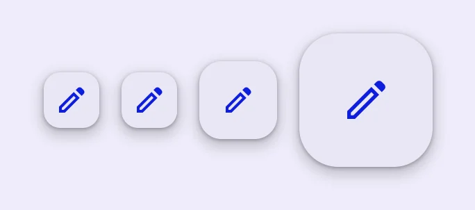
FABs may be small, medium (default), or large by setting the size attribute. Small FABs can optionally further reduce their touch target.
html
<md-fab size="small" touch-target="none" aria-label="Edit">
  <md-icon slot="icon">edit</md-icon>
</md-fab>
<md-fab size="small" aria-label="Edit">
  <md-icon slot="icon">edit</md-icon>
</md-fab>
<md-fab aria-label="Edit">
  <md-icon slot="icon">edit</md-icon>
</md-fab>
<md-fab size="large" aria-label="Edit">
  <md-icon slot="icon">edit</md-icon>
</md-fab>
Branded FAB
Branded FABs use a brightly colored logo for their icon. Unlike FAB, branded FABs do not have color variants.

html
<md-branded-fab size="small" aria-label="Add">
  <svg slot="icon" viewBox="0 0 36 36">
    <path fill="#34A853" d="M16 16v14h4V20z"></path>
    <path fill="#4285F4" d="M30 16H20l-4 4h14z"></path>
    <path fill="#FBBC05" d="M6 16v4h10l4-4z"></path>
    <path fill="#EA4335" d="M20 16V6h-4v14z"></path>
    <path fill="none" d="M0 0h36v36H0z"></path>
  </svg>
</md-branded-fab>
Extended
Branded FABs may be extended with a label for additional emphasis. Unlike FAB, branded FABs should always display their logo icon.

html
<md-branded-fab label="Add">
  <svg slot="icon" viewBox="0 0 36 36">
    <path fill="#34A853" d="M16 16v14h4V20z"></path>
    <path fill="#4285F4" d="M30 16H20l-4 4h14z"></path>
    <path fill="#FBBC05" d="M6 16v4h10l4-4z"></path>
    <path fill="#EA4335" d="M20 16V6h-4v14z"></path>
    <path fill="none" d="M0 0h36v36H0z"></path>
  </svg>
</md-branded-fab>
Sizes
Branded FABs may be medium (default) or large by setting the size attribute.

html
<md-branded-fab aria-label="Add">
  <svg slot="icon" viewBox="0 0 36 36">
    <path fill="#34A853" d="M16 16v14h4V20z"></path>
    <path fill="#4285F4" d="M30 16H20l-4 4h14z"></path>
    <path fill="#FBBC05" d="M6 16v4h10l4-4z"></path>
    <path fill="#EA4335" d="M20 16V6h-4v14z"></path>
    <path fill="none" d="M0 0h36v36H0z"></path>
  </svg>
</md-branded-fab>
<md-branded-fab size="large" aria-label="Add">
  <svg slot="icon" viewBox="0 0 36 36">
    <path fill="#34A853" d="M16 16v14h4V20z"></path>
    <path fill="#4285F4" d="M30 16H20l-4 4h14z"></path>
    <path fill="#FBBC05" d="M6 16v4h10l4-4z"></path>
    <path fill="#EA4335" d="M20 16V6h-4v14z"></path>
    <path fill="none" d="M0 0h36v36H0z"></path>
  </svg>
</md-branded-fab>
Theming
FAB supports Material theming and can be customized in terms of color, typography, and shape.
FAB tokens
| Token | Default value |
|---|---|
--md-fab-container-color | --md-sys-color-surface-container-high |
--md-fab-lowered-container-color | --md-sys-color-surface-container-low |
--md-fab-container-shape | --md-sys-shape-corner-large |
--md-fab-icon-color | --md-sys-color-primary |
--md-fab-icon-size | 24px |
FAB example

html
<style>
  :root {
    --md-sys-color-surface-container-high: #e3e9e9;
    --md-sys-color-primary: #006a6a;
    --md-fab-container-shape: 0px;
    --md-fab-icon-size: 36px;
    background-color: #f4fbfa;
  }
</style>
<md-fab aria-label="Edit">
  <md-icon slot="icon">edit</md-icon>
</md-fab>
Sizes tokens
| Token | Default value |
|---|---|
--md-fab-small-container-shape | --md-sys-shape-corner-medium |
--md-fab-small-icon-size | 24px |
--md-fab-large-container-shape | --md-sys-shape-corner-extra-large |
--md-fab-large-icon-size | 36px |
Extended FAB tokens
| Token | Default value |
|---|---|
--md-fab-label-text-font | --md-sys-typescale-label-large-font |
Extended FAB example

html
<style>
  :root {
    --md-sys-color-surface-container-high: #e3e9e9;
    --md-sys-color-on-surface: #161d1d;
    --md-sys-color-primary: #006a6a;
    --md-fab-container-shape: 0px;
    --md-fab-icon-size: 36px;
    background-color: #f4fbfa;
  }
</style>
<md-fab label="Edit">
  <md-icon slot="icon">edit</md-icon>
</md-fab>
Branded FAB tokens
| Token | Default value |
|---|---|
--md-fab-branded-container-color | --md-sys-color-surface-container-high |
--md-fab-branded-container-shape | --md-sys-shape-corner-large |
--md-fab-branded-icon-size | 36px |
--md-fab-branded-label-text-font | --md-sys-typescale-label-large-font |
Branded FAB example

html
<style>
  :root {
    --md-sys-color-surface-container-high: #e3e9e9;
    --md-sys-color-on-surface: #161d1d;
    --md-fab-branded-icon-size: 48px;
    --md-fab-branded-container-shape: 0px;
    background-color: #f4fbfa;
  }
</style>
<md-branded-fab size="small" aria-label="Add">
  <svg slot="icon" viewBox="0 0 36 36">
    <path fill="#34A853" d="M16 16v14h4V20z"></path>
    <path fill="#4285F4" d="M30 16H20l-4 4h14z"></path>
    <path fill="#FBBC05" d="M6 16v4h10l4-4z"></path>
    <path fill="#EA4335" d="M20 16V6h-4v14z"></path>
    <path fill="none" d="M0 0h36v36H0z"></path>
  </svg>
</md-branded-fab>
<md-branded-fab size="small" label="Add">
  <svg slot="icon" viewBox="0 0 36 36">
    <path fill="#34A853" d="M16 16v14h4V20z"></path>
    <path fill="#4285F4" d="M30 16H20l-4 4h14z"></path>
    <path fill="#FBBC05" d="M6 16v4h10l4-4z"></path>
    <path fill="#EA4335" d="M20 16V6h-4v14z"></path>
    <path fill="none" d="M0 0h36v36H0z"></path>
  </svg>
</md-branded-fab>
API
MdFab <md-fab>
Properties
| Property | Attribute | Type | Default | Description |
|---|---|---|---|---|
variant | variant | string | 'surface' | The FAB color variant to render. |
size | size | string | 'medium' | The size of the FAB. NOTE: Branded FABs cannot be sized to small, and Extended FABs do not have different sizes. |
label | label | string | '' | The text to display on the FAB. |
lowered | lowered | boolean | false | Lowers the FAB's elevation. |
MdBrandedFab <md-branded-fab>
Properties
| Property | Attribute | Type | Default | Description |
|---|---|---|---|---|
variant | variant | string | 'surface' | The FAB color variant to render. |
size | size | string | 'medium' | The size of the FAB. NOTE: Branded FABs cannot be sized to small, and Extended FABs do not have different sizes. |
label | label | string | '' | The text to display on the FAB. |
lowered | lowered | boolean | false | Lowers the FAB's elevation. |
Methods
| Method | Parameters | Returns | Description |
|---|---|---|---|
getRenderClasses | None | { primary: boolean; secondary: boolean; tertiary: boolean; small: boolean; lowered: boolean; large: boolean; extended: boolean; } |